- Essentials
- Getting Started
- Datadog
- Datadog Site
- DevSecOps
- Serverless for AWS Lambda
- Agent
- Integrations
- Containers
- Dashboards
- Monitors
- Logs
- APM Tracing
- Profiler
- Tags
- API
- Service Catalog
- Session Replay
- Continuous Testing
- Synthetic Monitoring
- Incident Management
- Database Monitoring
- Cloud Security Management
- Cloud SIEM
- Application Security Management
- Workflow Automation
- CI Visibility
- Test Visibility
- Test Impact Analysis
- Code Analysis
- Learning Center
- Support
- Glossary
- Standard Attributes
- Guides
- Agent
- Integrations
- OpenTelemetry
- Developers
- Authorization
- DogStatsD
- Custom Checks
- Integrations
- Create an Agent-based Integration
- Create an API Integration
- Create a Log Pipeline
- Integration Assets Reference
- Build a Marketplace Offering
- Create a Tile
- Create an Integration Dashboard
- Create a Recommended Monitor
- Create a Cloud SIEM Detection Rule
- OAuth for Integrations
- Install Agent Integration Developer Tool
- Service Checks
- IDE Plugins
- Community
- Guides
- Administrator's Guide
- API
- Datadog Mobile App
- CoScreen
- Cloudcraft
- In The App
- Dashboards
- Notebooks
- DDSQL Editor
- Sheets
- Monitors and Alerting
- Infrastructure
- Metrics
- Watchdog
- Bits AI
- Service Catalog
- API Catalog
- Error Tracking
- Service Management
- Infrastructure
- Application Performance
- APM
- Continuous Profiler
- Database Monitoring
- Data Streams Monitoring
- Data Jobs Monitoring
- Digital Experience
- Real User Monitoring
- Product Analytics
- Synthetic Testing and Monitoring
- Continuous Testing
- Software Delivery
- CI Visibility
- CD Visibility
- Test Optimization
- Code Analysis
- Quality Gates
- DORA Metrics
- Security
- Security Overview
- Cloud SIEM
- Cloud Security Management
- Application Security Management
- AI Observability
- Log Management
- Observability Pipelines
- Log Management
- Administration
Exploring Query Samples
The Samples page helps you understand which queries were running at a given time. Compare each execution to the average performance of the query and related queries.
The Samples page shows a snapshot in time of running and recently finished queries. Because it’s a snapshot in time, it doesn’t necessarily show a representation of all queries, but can indicate proportions.
Search and filter
The Samples page shows queries on all supported database products together (unlike on the Query Metrics page where you select which database you want to dive into). Filter on the source facet to see data for a particular database (Postgres or MySQL).
Enter tags into the Search field to filter the list of query samples, or use the facets listed on the left side. The facets include:
- Core: Services, database product sources (Postgres or MySQL), host, and duration.
- Network: Client IP address and ports for applications or proxies that connect to the database.
- Database: Database names, an explain plan cost slider, indexes, a row count slider for the number of rows returned or affected by queries, query statements, and users.
- Postgres and MySQL specific facets
Click Options to add columns to the table. Click on column headers to sort by a particular metric.
Explain plan cost
Explain plan cost is a unitless measure that the database uses to compare two plans with each other. It roughly corresponds to number of things on the database—blocks or pages—but it is primarily useful for relative comparisons of two plans, not in absolute terms for a single plan. Explain plan cost calculation helps the database choose which plan it’s going to use.
The Query Samples page lets you filter, sort, and compare the explain plan costs of multiple queries. In this context, explain plan cost is not to be taken absolutely. A query with an explain plan cost of 8.5 is not necessarily performing better than one with a cost of 8.7. But if two queries have vastly different costs when you’d expect them to be similar, it can be beneficial to investigate why. Also, you can sort your queries by cost to see what your expensive queries are, separate from external factors like network latency.
Indexes
You can filter queries that have explain plans by database index, so you can see which queries are using a specific index. Alternatively, you can find infrequently used indexes by selecting a long time frame such as a week (so a good representation of query samples over time), and looking at least used indexes (the lowest number in the list of index facets). You can then consider whether the performance gained from having that index is worth the cost of keeping it in the database.
Row count
Filter or sort to find queries that return or affect a large number of rows, over the time frame selected.
Duration
Filter or sort to find queries that take the longest to run over the time frame selected. If you’re looking to optimize your overall performance, you can track down the owner of these slow queries and discuss improving them.
Sample details
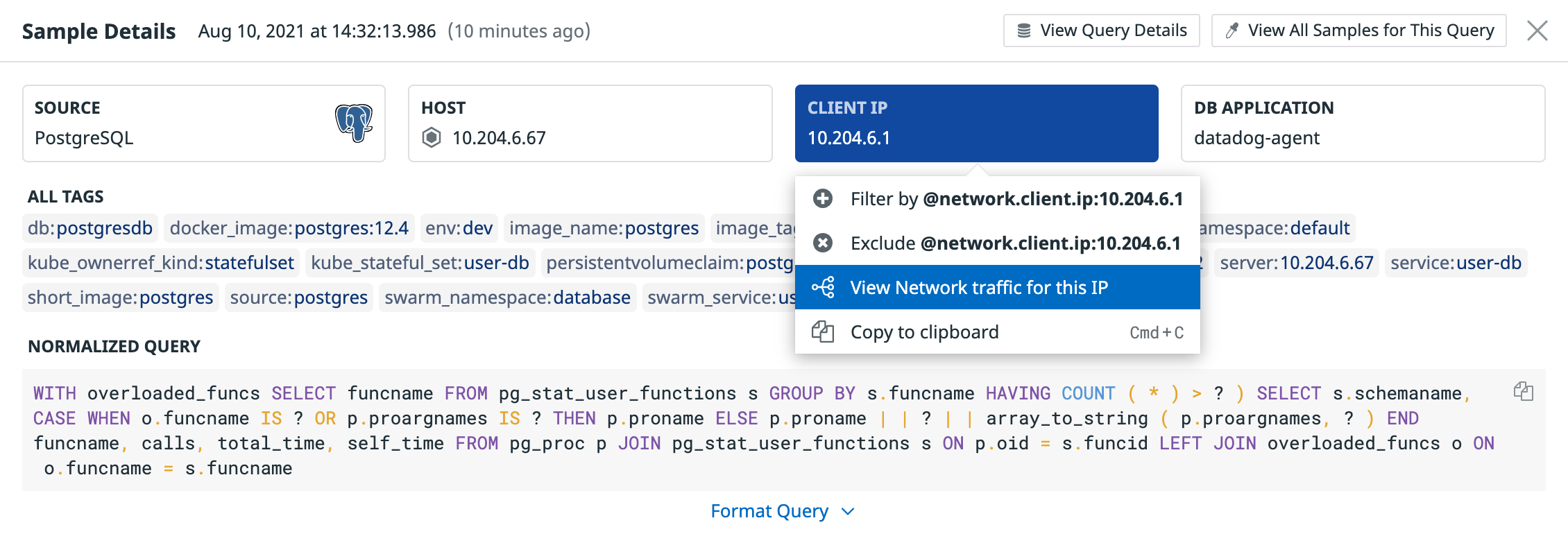
Click on a query in the table to open its Sample Details page. Use the Source, Host, and Client IP tiles at the top to filter the Sample Queries page by the values for this sample, or to navigate to other Datadog information such as the host’s dashboard or Network traffic metrics for the client IP.
For example, by opening the Network traffic page and grouping by service, you can see what service is running the query from that IP.
Graphs show the query’s performance metrics—number of executions, duration, and rows per query—over the specified time frame if it is a top query, with a line indicating the performance for the sample snapshot you’re looking at. If metrics aren’t available because it’s not a top query, the graphs are blank.
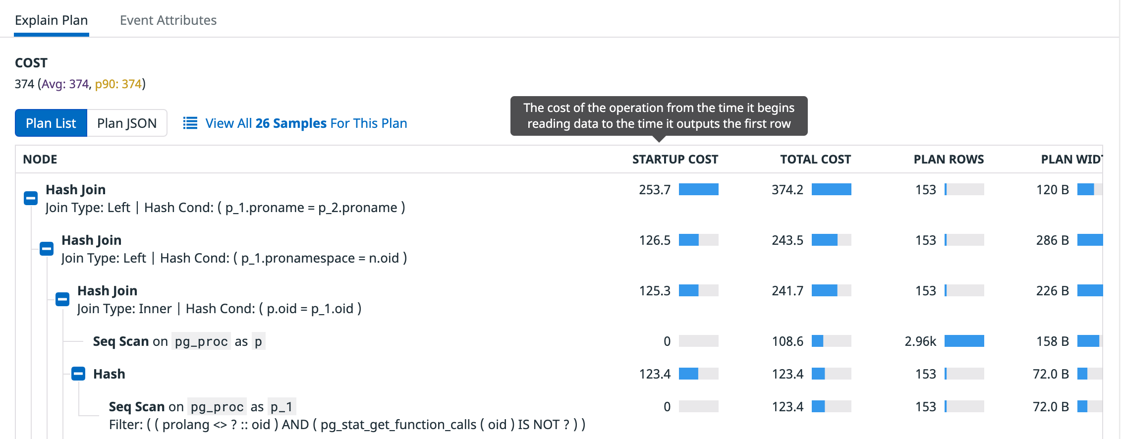
The Explain Plan section shows Duration and Cost stats for the current sample and averages and p90 for all collected snapshots across the time frame.
The explain plan also shows measures for each node (step) in the plan: startup cost, total cost, plan rows, and plan width. Hover over the column heading to see a description of each measure.
Explore other visualizations
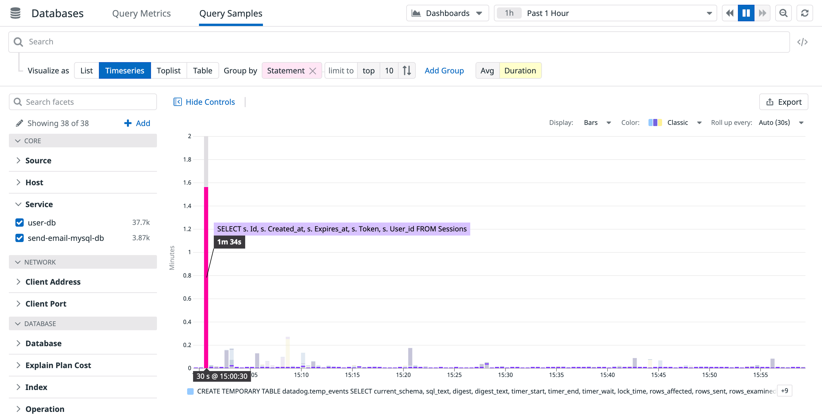
Besides the default list view, you can view query samples data as timeseries, top lists, or tables by clicking one of the Visualize as buttons. This can bring to light powerful ways of looking at the data. For example, to see the slowest queries running in a data center, select Timeseries, group by Statement and graph the average duration:
Or find an outlier such as a query that usually runs quickly, but occasionally runs slowly by graphing its p90 or p99 duration.
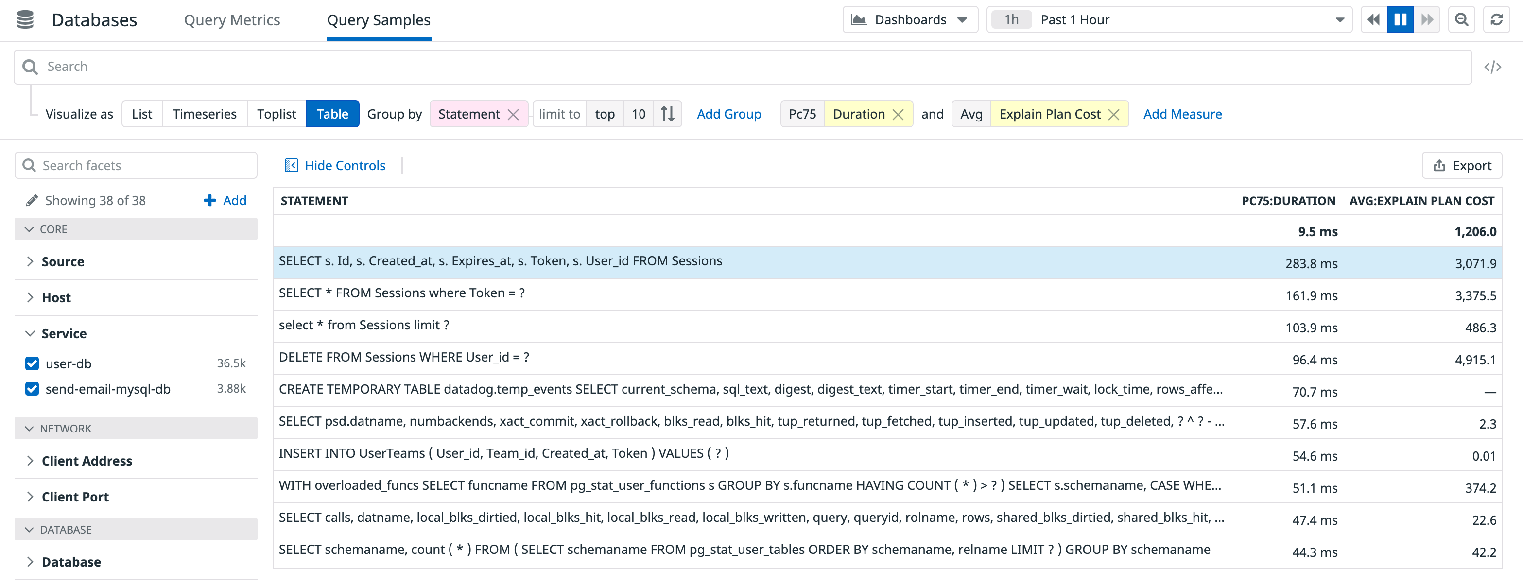
Use table visualizations to produce report-like summaries to share with others. For example, create a table of worst-performing queries (p75 Duration), and include the average plan cost values for each query:
Use the Export button to share the data with your engineering team to start a discussion about where to focus improvement efforts.
Database Monitoring dashboards
For quick access to dashboards that showcase database-related infrastructure and query metrics visualizations, click the Dashboards link at to top of the page. Use the out-of-the-box dashboards, or clone and customize them to suit your needs.
Further Reading
Additional helpful documentation, links, and articles:


