- Essentials
- Getting Started
- Agent
- API
- APM Tracing
- Containers
- Dashboards
- Database Monitoring
- Datadog
- Datadog Site
- DevSecOps
- Incident Management
- Integrations
- Logs
- Monitors
- OpenTelemetry
- Profiler
- Session Replay
- Security
- Serverless for AWS Lambda
- Software Catalog
- Software Delivery
- Synthetic Monitoring and Testing
- Tags
- Workflow Automation
- Learning Center
- Support
- Glossary
- Standard Attributes
- Guides
- Agent
- Integrations
- Developers
- Authorization
- DogStatsD
- Custom Checks
- Integrations
- Create an Agent-based Integration
- Create an API Integration
- Create a Log Pipeline
- Integration Assets Reference
- Build a Marketplace Offering
- Create a Tile
- Create an Integration Dashboard
- Create a Monitor Template
- Create a Cloud SIEM Detection Rule
- OAuth for Integrations
- Install Agent Integration Developer Tool
- Service Checks
- IDE Plugins
- Community
- Guides
- OpenTelemetry
- Administrator's Guide
- API
- Partners
- Datadog Mobile App
- DDSQL Reference
- CoScreen
- CoTerm
- Cloudcraft (Standalone)
- In The App
- Dashboards
- Notebooks
- DDSQL Editor
- Reference Tables
- Sheets
- Monitors and Alerting
- Metrics
- Watchdog
- Bits AI
- Internal Developer Portal
- Error Tracking
- Change Tracking
- Service Management
- Actions & Remediations
- Infrastructure
- Cloudcraft
- Resource Catalog
- Universal Service Monitoring
- Hosts
- Containers
- Processes
- Serverless
- Network Monitoring
- Cloud Cost
- Application Performance
- APM
- APM Terms and Concepts
- Application Instrumentation
- APM Metrics Collection
- Trace Pipeline Configuration
- Correlate Traces with Other Telemetry
- Trace Explorer
- Recommendations
- Code Origins for Spans
- Service Observability
- Endpoint Observability
- Dynamic Instrumentation
- Live Debugger
- Error Tracking
- Data Security
- Guides
- Troubleshooting
- Continuous Profiler
- Database Monitoring
- Agent Integration Overhead
- Setup Architectures
- Setting Up Postgres
- Setting Up MySQL
- Setting Up SQL Server
- Setting Up Oracle
- Setting Up Amazon DocumentDB
- Setting Up MongoDB
- Connecting DBM and Traces
- Data Collected
- Exploring Database Hosts
- Exploring Query Metrics
- Exploring Query Samples
- Exploring Database Schemas
- Exploring Recommendations
- Troubleshooting
- Guides
- Data Streams Monitoring
- Data Jobs Monitoring
- Digital Experience
- Real User Monitoring
- Synthetic Testing and Monitoring
- Continuous Testing
- Product Analytics
- Software Delivery
- CI Visibility
- CD Visibility
- Deployment Gates
- Test Optimization
- Quality Gates
- DORA Metrics
- Security
- Security Overview
- Cloud SIEM
- Code Security
- Cloud Security
- App and API Protection
- Workload Protection
- Sensitive Data Scanner
- AI Observability
- Log Management
- Observability Pipelines
- Log Management
- Administration
User Retention
Overview
Retention Analysis allows you to measure how often users are successfully returning to a page or action. By tracking user retention over time, you can gain insights into overall user satisfaction.
User retention is measured within a given cohort of users that you define. A cohort is a group of users who participate in an initial event, such as clicking a link. A user in the cohort is considered retained if they subsequently complete a return event, such as clicking the same link again or clicking a Proceed to Payment button.
Only views and actions can act as events.
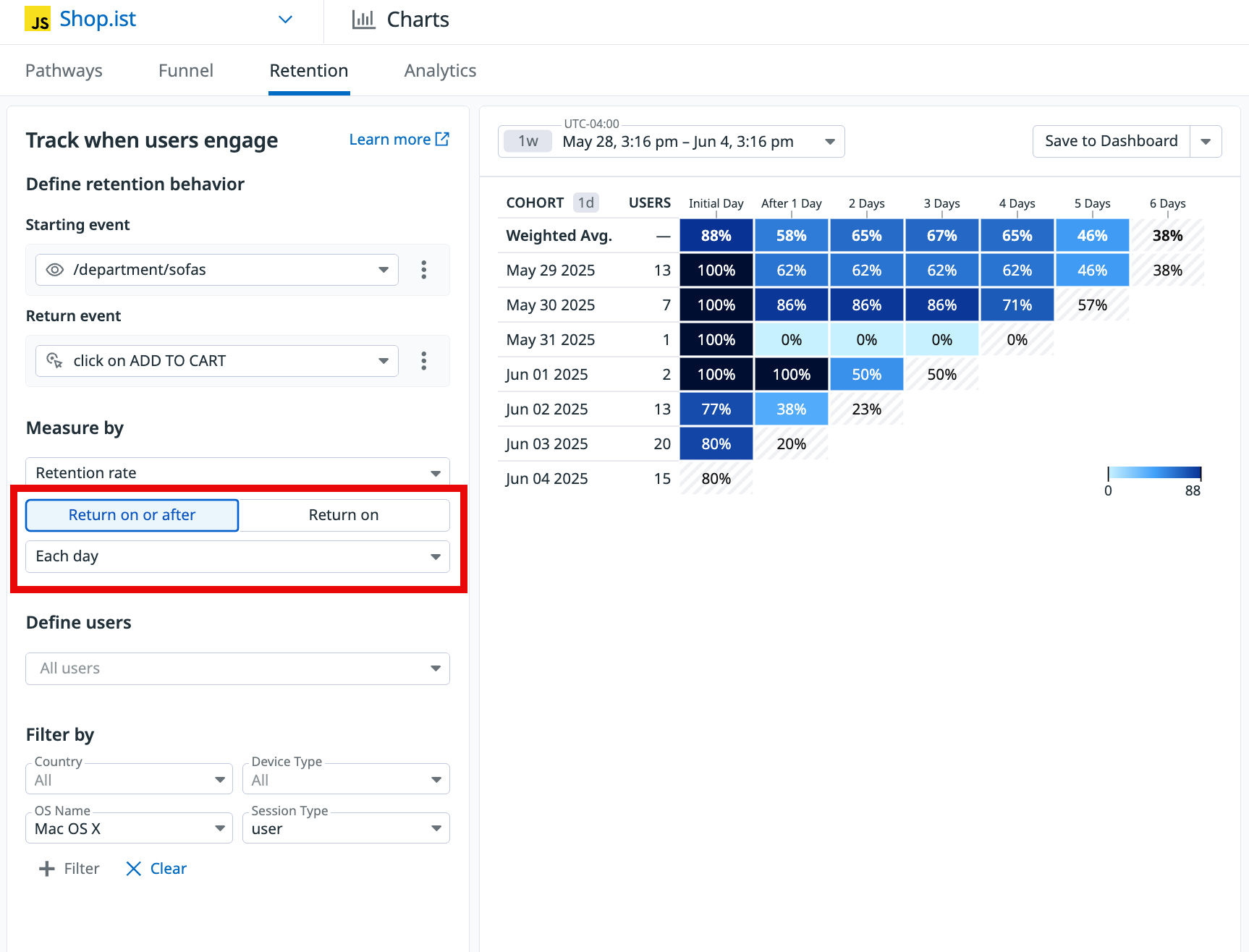
The retention graph displays the percentage of users who completed the return event each day during the past week.
Note: The retention chart displays grey when partial data is available for a given time period or cohort. This is because the time period is not finished and Datadog cannot yet accurately compute the retention rate.
You can further scope the retention measure based on when the return event occurs to identify the users who have completely churned from a product or feature.
Return on or after: the user has to complete the “Return event” on or after the period to be counted as retained.Return on: the user has to do the “Return event” on the period to be counted as retained. It’s useful to understand the likelihood of a user to come back after a given period.
Prerequisites
In order for User Retention data to populate, you must set the usr.id attribute in your SDK. See the instructions for sending unique user attributes.
Build a graph
To build a retention graph, navigate to Product Analytics > Charts, click the Retention tab, then follow the steps below.
1. Define the starting and return events
- Select the view or action to act as the starting event for defining a group of users.
- Select the view or action to act as the return event.
2. Define the the measures
- Select
Retention rateto see the data in percentages, orUnique usersto see the absolute number of users. - Scope the retention measure
Return on or afterorReturn onbased on when the return event occurs. - Choose the timeframe (day, week or month) which define the rows in your diagram, then scope to the appropriate duration for your columns. For example, in the
Measure bysection, you can selectEach dayand have the duration of this measure be for the past week.
3. Define the users
Optionally, select a specific segment to measure the retention of its users. This defaults to All users.
4. Add filters
Optionally, add any desired filter criteria, such as the user’s country, device type, or operating system.
Analyze the graph
For insights on user retention week over week, read each row of the graph horizontally from left to right.
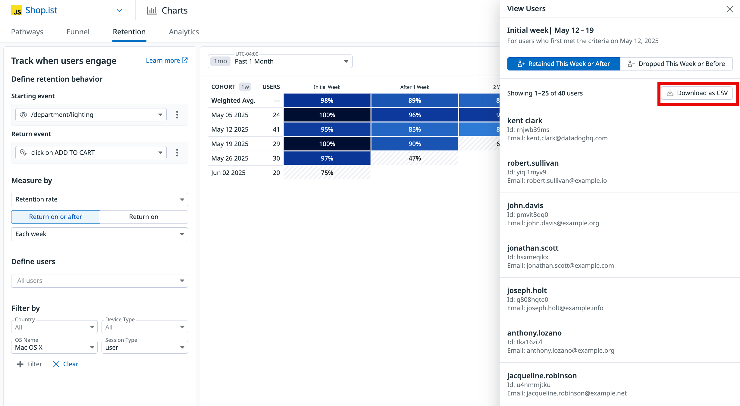
You can click on an individual diagram cell to view a list of users, and export the list as a CSV:
The graph displays slightly different information depending on whether the initial and return events match.
Matching events
If the starting and returning events match:
- Week 0 is always 100%, since it represents all of the users who completed the initial event.
- The other cells compare the viewers in a given week to Week 0, displaying the percentage of the cohort who completed the event in that week.
Reading the Dec 04 2023 row of the above graph from left to right:
- 94% of the people who completed the event in Week 0 came back and completed it again in Week 1.
- 92% of the people who completed the event in Week 0 came back and completed it again in Week 2.
Differing events
If the starting and returning events differ:
- Week 0 represents users who completed both the initial and return events.
- After Week 0, each cell displays the percentage of the Users column who completed the return event in that week.
Reading the Dec 04 2023 row of the above graph from left to right:
- 144 users completed the initial event.
- In Week 0, 94% of those 144 users completed the return event.
- In Week 1, 92% of the 144 users completed the return event.
Further reading
Additional helpful documentation, links, and articles:


