- Principales informations
- Getting Started
- Datadog
- Site Datadog
- DevSecOps
- Serverless for AWS Lambda
- Agent
- Intégrations
- Conteneurs
- Dashboards
- Monitors
- Logs
- Tracing
- Profileur
- Tags
- API
- Service Catalog
- Session Replay
- Continuous Testing
- Surveillance Synthetic
- Incident Management
- Database Monitoring
- Cloud Security Management
- Cloud SIEM
- Application Security Management
- Workflow Automation
- CI Visibility
- Test Visibility
- Intelligent Test Runner
- Code Analysis
- Learning Center
- Support
- Glossary
- Standard Attributes
- Guides
- Agent
- Intégrations
- OpenTelemetry
- Développeurs
- Authorization
- DogStatsD
- Checks custom
- Intégrations
- Create an Agent-based Integration
- Create an API Integration
- Create a Log Pipeline
- Integration Assets Reference
- Build a Marketplace Offering
- Create a Tile
- Create an Integration Dashboard
- Create a Recommended Monitor
- Create a Cloud SIEM Detection Rule
- OAuth for Integrations
- Install Agent Integration Developer Tool
- Checks de service
- IDE Plugins
- Communauté
- Guides
- API
- Application mobile
- CoScreen
- Cloudcraft
- In The App
- Dashboards
- Notebooks
- DDSQL Editor
- Alertes
- Infrastructure
- Métriques
- Watchdog
- Bits AI
- Service Catalog
- API Catalog
- Error Tracking
- Service Management
- Infrastructure
- Universal Service Monitoring
- Conteneurs
- Sans serveur
- Surveillance réseau
- Cloud Cost
- Application Performance
- APM
- Profileur en continu
- Database Monitoring
- Agent Integration Overhead
- Setup Architectures
- Configuration de Postgres
- Configuration de MySQL
- Configuration de SQL Server
- Setting Up Oracle
- Setting Up MongoDB
- Connecting DBM and Traces
- Données collectées
- Exploring Database Hosts
- Explorer les métriques de requête
- Explorer des échantillons de requêtes
- Dépannage
- Guides
- Data Streams Monitoring
- Data Jobs Monitoring
- Digital Experience
- RUM et Session Replay
- Product Analytics
- Surveillance Synthetic
- Continuous Testing
- Software Delivery
- CI Visibility
- CD Visibility
- Test Visibility
- Exécuteur de tests intelligent
- Code Analysis
- Quality Gates
- DORA Metrics
- Securité
- Security Overview
- Cloud SIEM
- Cloud Security Management
- Application Security Management
- AI Observability
- Log Management
- Pipelines d'observabilité
- Log Management
- Administration
Area Component
Cette page n'est pas encore disponible en français, sa traduction est en cours.
Si vous avez des questions ou des retours sur notre projet de traduction actuel, n'hésitez pas à nous contacter.
Si vous avez des questions ou des retours sur notre projet de traduction actuel, n'hésitez pas à nous contacter.
Overview
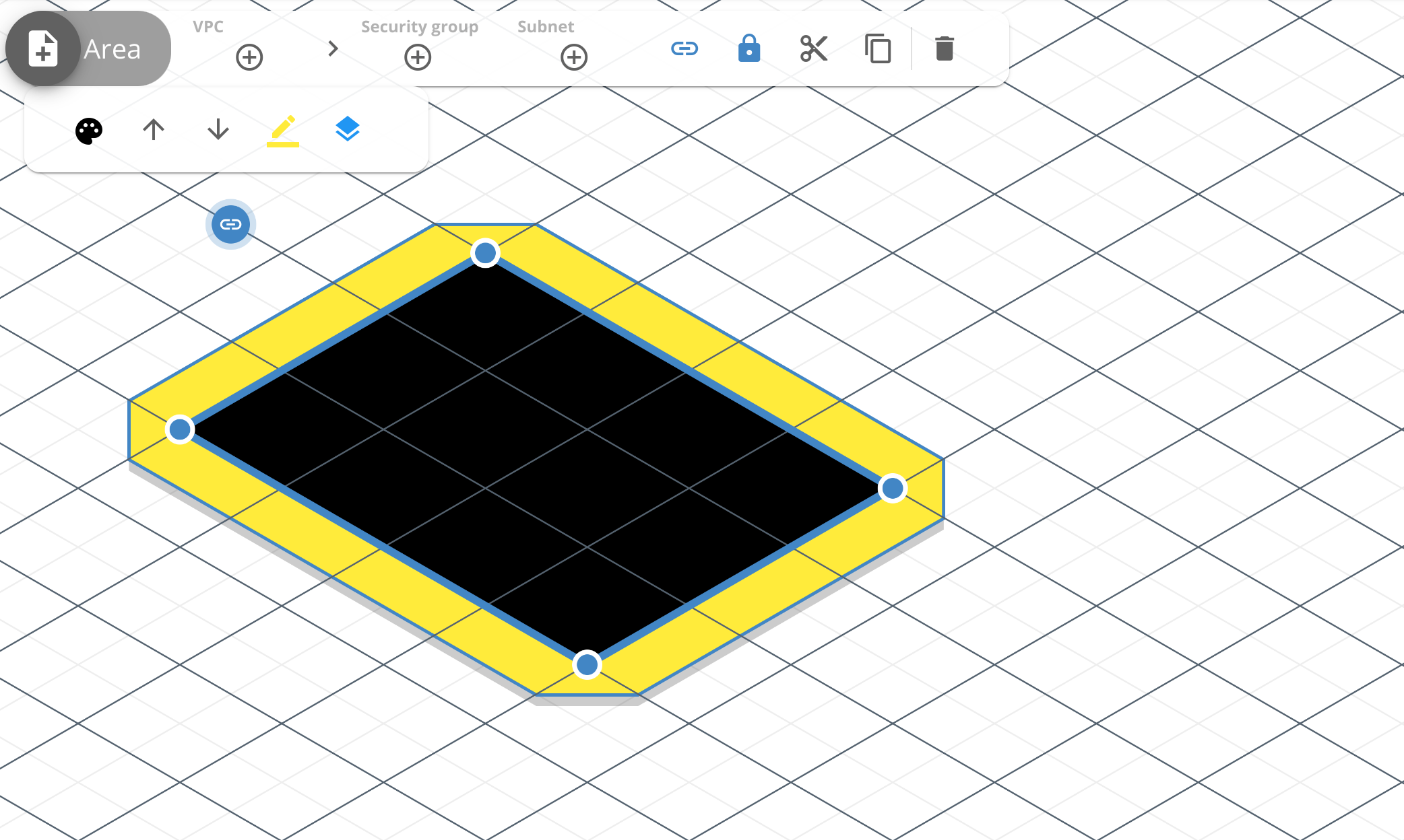
The Area component is one of the best components available to design and organize large diagrams. Along with the Text label component, it can be used to visually represent subnet and IP addresses, separate public and private cloud architectures, among others uses.
Toolbar
Use the toolbar to configure and customize the component. The following options are available:
- Fill color: Select a predefined color to fill the center of the area component, or enter the hexadecimal value for the color. Accepts the same color for both 2D and 3D view, or different colors for each.
- Raise: Raise the area component above other areas.
- Lower: Lower the area component below other areas.
- Edge color: Select a predefined color to fill the edges of the area component, or enter the hexadecimal value for the color. Accepts the same color for both 2D and 3D view, or different colors for each.
- Add shadow: Add or remove shadow from the edges to increase contrast.
API
Use the Cloudcraft API to programmatically access and render your architecture diagrams as JSON objects. The following is an example JSON object of a Area component:
{
  "type": "area",
  "id": "09659366-c3b1-479f-9b4d-37c5753e1674",
  "mapPos": [2, 9],
  "points": [
    [0, 0],
    [4, 0],
    [4, 3],
    [0, 3]
  ],
  "shadow": true,
  "color": {
    "2d": "#e6e7e8",
    "isometric": "#e6e7e8"
  },
  "borderColor": {
    "2d": "#ffffff",
    "isometric": "#ffffff"
  },
  "link": "blueprint://6f6b20d9-1332-4141-bb74-0e3af3f61801",
  "locked": true
}
- type: area: The type of component.
- id: string: A unique identifier for the component in the
uuidformat. - mapPos: [number, number]: The position of the component in the blueprint, expressed as a x,y coordinate pair.
- shadow: boolean: If true, add a shadow to the edge of the area to increase contrast. Defaults to false.
- points: [number, number]: The position of the points used to create the edges of the area.
- color: object: The fill color for the component body.
- isometric: string: Fill color for the component in 3D view. Must be an hexadecimal color.
- 2d: string: Fill color for the component in 2D view. Must be an hexadecimal color.
- borderColor: object: The color for the edge of the area.
- isometric: string: Edge color for the area in 3D view. Must be an hexadecimal color.
- 2d: string: Edge color for the area in 2D view. Must be an hexadecimal color.
- link: uri: Link component to another diagram in the
blueprint://IDformat or to external website in thehttps://LINKformat. - locked: boolean: If true, changes to the component through the application are disabled until unlocked.

