- Essentials
- Getting Started
- Datadog
- Datadog Site
- DevSecOps
- Serverless for AWS Lambda
- Agent
- Integrations
- Containers
- Dashboards
- Monitors
- Logs
- APM Tracing
- Profiler
- Tags
- API
- Service Catalog
- Session Replay
- Continuous Testing
- Synthetic Monitoring
- Incident Management
- Database Monitoring
- Cloud Security Management
- Cloud SIEM
- Application Security Management
- Workflow Automation
- CI Visibility
- Test Visibility
- Test Impact Analysis
- Code Analysis
- Learning Center
- Support
- Glossary
- Standard Attributes
- Guides
- Agent
- Integrations
- OpenTelemetry
- Developers
- Authorization
- DogStatsD
- Custom Checks
- Integrations
- Create an Agent-based Integration
- Create an API Integration
- Create a Log Pipeline
- Integration Assets Reference
- Build a Marketplace Offering
- Create a Tile
- Create an Integration Dashboard
- Create a Recommended Monitor
- Create a Cloud SIEM Detection Rule
- OAuth for Integrations
- Install Agent Integration Developer Tool
- Service Checks
- IDE Plugins
- Community
- Guides
- Administrator's Guide
- API
- Datadog Mobile App
- CoScreen
- Cloudcraft
- In The App
- Dashboards
- Notebooks
- DDSQL Editor
- Sheets
- Monitors and Alerting
- Infrastructure
- Metrics
- Watchdog
- Bits AI
- Service Catalog
- API Catalog
- Error Tracking
- Service Management
- Infrastructure
- Application Performance
- APM
- Continuous Profiler
- Database Monitoring
- Data Streams Monitoring
- Data Jobs Monitoring
- Digital Experience
- Real User Monitoring
- Product Analytics
- Synthetic Testing and Monitoring
- Continuous Testing
- Software Delivery
- CI Visibility
- CD Visibility
- Test Optimization
- Code Analysis
- Quality Gates
- DORA Metrics
- Security
- Security Overview
- Cloud SIEM
- Cloud Security Management
- Application Security Management
- AI Observability
- Log Management
- Observability Pipelines
- Log Management
- Administration
Network Map
Overview
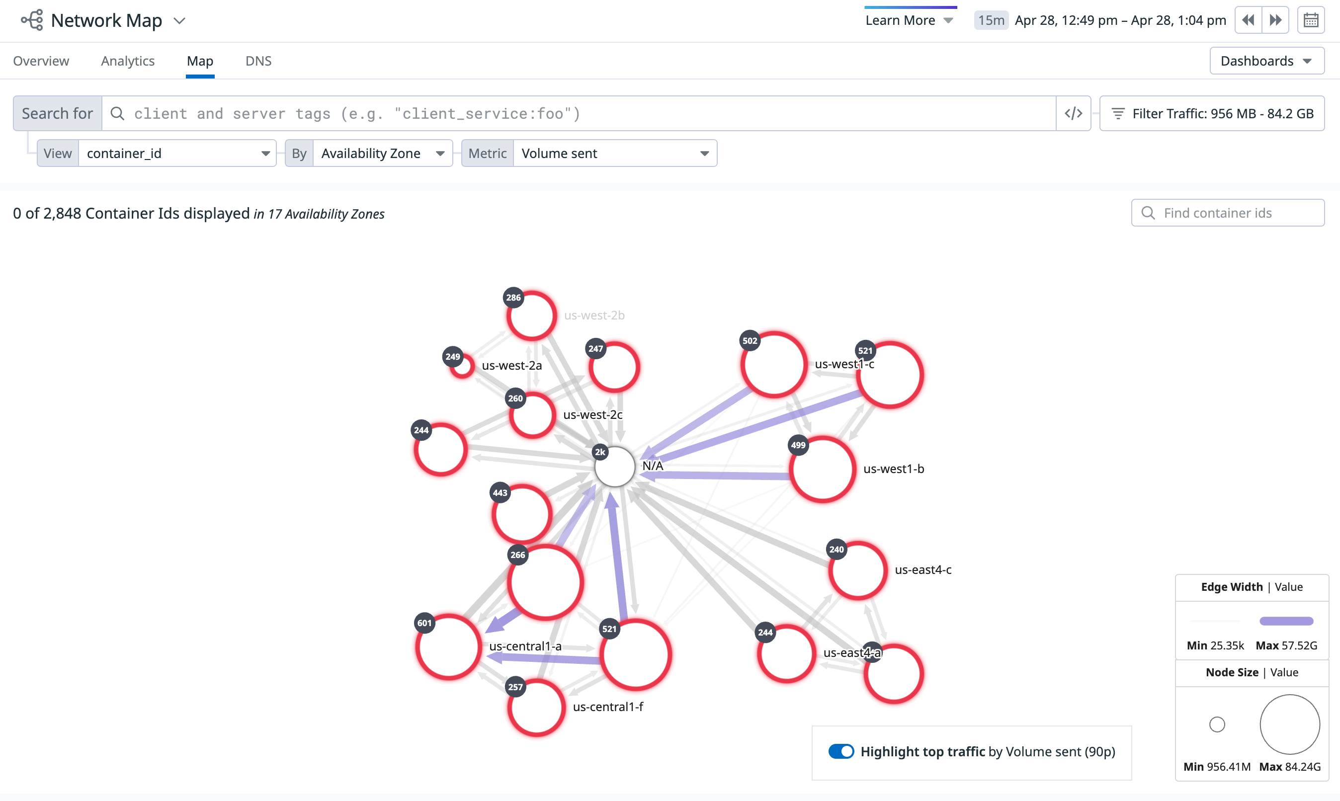
The network map provides a topology view of your network to help you visualize network partitions, dependencies, and bottlenecks. By consolidating network data into a directional map, this page can be used to cut through the noise and isolate problematic areas.
Setup
The network map visualizes data collected by the Datadog Agent automatically. Once installed, no extra steps are necessary.
Usage
Select the Map tab to configure your network map:
Choose the tag you want your Nodes to represent with the first selector at the top of the page. Available tags are the same as those offered in the network page.
- If there are too many nodes, a second tag is automatically added to the grouping. You can change the tag in the By dropdown menu. See Clustering more information.
Select the metric you want your Edges to represent:
- Throughput sent
- Throughput received
- TCP Retransmits
- TCP Latency
- TCP Jitter
- Established Connnections
- Closed Connections
Filter the connections you want to display. You can choose whether or not to:
Filter traffic to a particular environment, namespace, or any other tag(s)
Filter your tags based on a fuzzy string match.
Show unresolved traffic.
Hide network traffic outside a specified percentile range of the active network metric.
Inspection
Hovering over a node highlights it and animates the directionality of the network traffic it sends and receives:
Click on a node and select Inspect from the menu to contextualize it within the larger network:
Map clusters
For complex networks, the map’s query editor includes additional grouping fields. This enables you to render datasets that would otherwise have too many nodes to show at once on the map. Using the additional grouping fields also improves the performance of high cardinality queries.
Clustering adds an additional dimension for grouping the nodes in the map. Large maps are automatically clustered to improve load time and readability of the map. To view the nodes within a cluster, click the cluster to expand it. To collapse the cluster, click the gray area surrounding the nodes.
A red border around a cluster indicates that at least one alerting monitor carries a tag that matches the tag by which the nodes are grouped. For example, if the map is grouped by service, then the map looks for monitors with the tag service:<nodeName>. If the monitor is in an alert state, the map outlines any clusters containing <nodeName> in red.
Further Reading
Additional helpful documentation, links, and articles:


