- Essentials
- Getting Started
- Datadog
- Datadog Site
- DevSecOps
- Serverless for AWS Lambda
- Agent
- Integrations
- Containers
- Dashboards
- Monitors
- Logs
- APM Tracing
- Profiler
- Tags
- API
- Service Catalog
- Session Replay
- Continuous Testing
- Synthetic Monitoring
- Incident Management
- Database Monitoring
- Cloud Security Management
- Cloud SIEM
- Application Security Management
- Workflow Automation
- CI Visibility
- Test Visibility
- Intelligent Test Runner
- Code Analysis
- Learning Center
- Support
- Glossary
- Standard Attributes
- Guides
- Agent
- Integrations
- OpenTelemetry
- Developers
- Authorization
- DogStatsD
- Custom Checks
- Integrations
- Create an Agent-based Integration
- Create an API Integration
- Create a Log Pipeline
- Integration Assets Reference
- Build a Marketplace Offering
- Create a Tile
- Create an Integration Dashboard
- Create a Recommended Monitor
- Create a Cloud SIEM Detection Rule
- OAuth for Integrations
- Install Agent Integration Developer Tool
- Service Checks
- IDE Plugins
- Community
- Guides
- API
- Datadog Mobile App
- CoScreen
- Cloudcraft
- In The App
- Dashboards
- Notebooks
- DDSQL Editor
- Sheets
- Monitors and Alerting
- Infrastructure
- Metrics
- Watchdog
- Bits AI
- Service Catalog
- API Catalog
- Error Tracking
- Service Management
- Infrastructure
- Application Performance
- APM
- Continuous Profiler
- Database Monitoring
- Data Streams Monitoring
- Data Jobs Monitoring
- Digital Experience
- Real User Monitoring
- Product Analytics
- Synthetic Testing and Monitoring
- Continuous Testing
- Software Delivery
- CI Visibility
- CD Visibility
- Test Visibility
- Intelligent Test Runner
- Code Analysis
- Quality Gates
- DORA Metrics
- Security
- Security Overview
- Cloud SIEM
- Cloud Security Management
- Application Security Management
- AI Observability
- Log Management
- Observability Pipelines
- Log Management
- Administration
Manage Cloud Traffic Costs with NPM
Traffic is expensive, especially in the cloud. Cloud providers charge different prices for traffic, depending on whether it is flowing within an availability zone (AZ), between AZs, between particular regions, or to the open internet. Cross-regional and egress traffic is not only the most expensive, but also the most vulnerable to errors, latency, and security threats.
Network Performance Monitoring (NPM) allows you to track all of the traffic patterns described above by mapping dependencies between any tags in Datadog, including service, container, availability zone, region, datacenter, etc. This insight into your dependencies and the traffic volume they produce (which is ultimately what cloud providers charge for) can be used to monitor and optimize your traffic-related costs.
Datadog’s story
When Datadog migrated to Kubernetes, migrating stateless services was (expectedly) much faster and easier than migrating stateful services (for example, Kafka), stateless services were first. The outcome was a terabytes of new cross-AZ traffic between the stateful services (all in one AZ) and stateless services (spread across the other AZs), which led the cloud bill to increase drastically and unexpectedly. Datadog used its own NPM product to identify the root cause: a suboptimal migration strategy and consequently, inefficient and costly network communication. Sharding stateful services ultimately led to significant reductions in cloud provider traffic costs.
Steps for managing traffic costs
To find similar issues in your own environment, you can start by scoping your view to traffic between regions, availability zones,
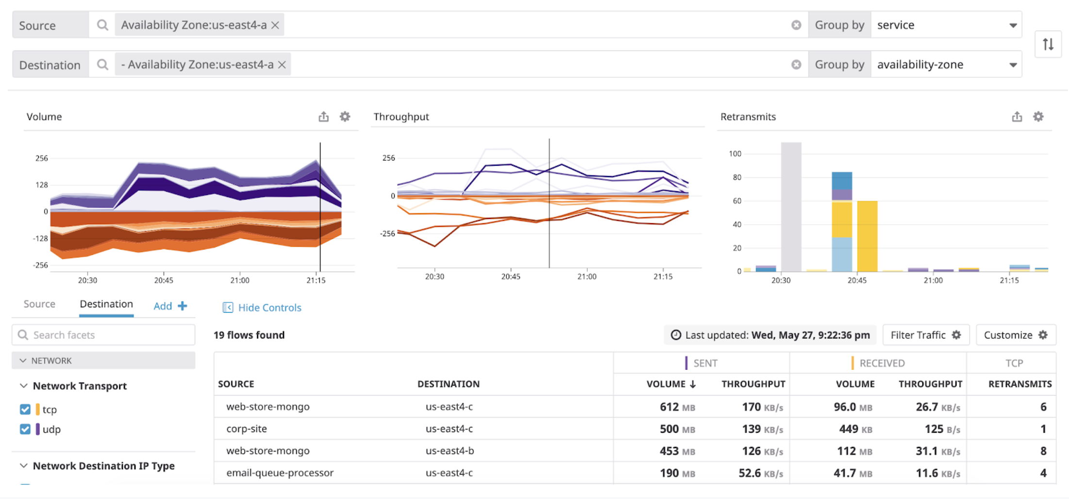
and datacenters:An increase in your traffic bill is almost always tied to an increase in one of these types of traffic. In many cases you may want to group traffic by asymmetric search terms. That is, you want to see the source of the traffic in terms of one tag, and also see the destination in terms of another tag. You can use this kind of asymmetric query to identify costly dependencies between your on-prem datacenters and cloud regions,as well as between clouds. One particularly helpful view is to group the source of the traffic by service, and the destination across availability zones.From here, isolate services that have the most traffic volume across multiple AZs. You can use filters inside the search bars to narrow down your query. For example, you can show only services that originate inside of one availability zone, and are sending traffic to any other availability zone.
The query above highlights any services that communicate fromus-east4-ato anywhere else. Since the table is already sorted by volume, the first few rows surface the chattiest services contributing to the most cross-AZ traffic. If you want to inspect the cross-infrastructure effects of one of these culprits, you can filter the Source to that particular service and view its traffic to every other availability zone.Similarly, you can use the team tag to identify engineering teams that generate the most, for instance, cross-regional traffic
or monitor your own team’s output specifically.To monitor costs from external traffic, scope your destination endpoints to public IPs using the IP Type facet.
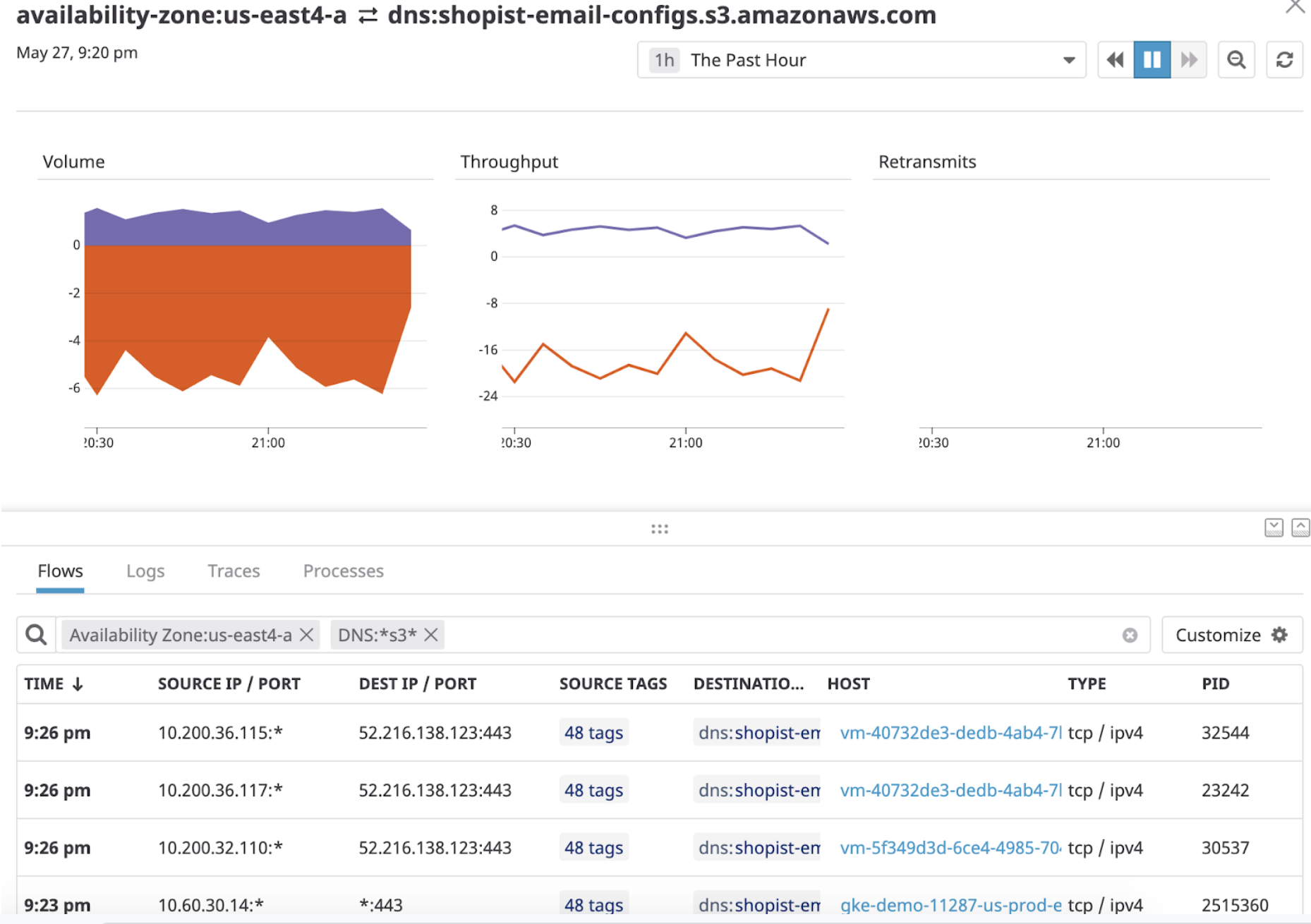
Then group your destination bydomainto break down external traffic volume by where it is going. Although you cannot install a Datadog Agent on public servers, Datadog can resolve IPs representing external and cloud endpoints to human-readable domain names.The example query above filters for traffic to Amazon S3, elastic load balancers, APIs, and external.comdomains using substring wildcard entries (for example:dns:*s3*).
Visualizing traffic costs
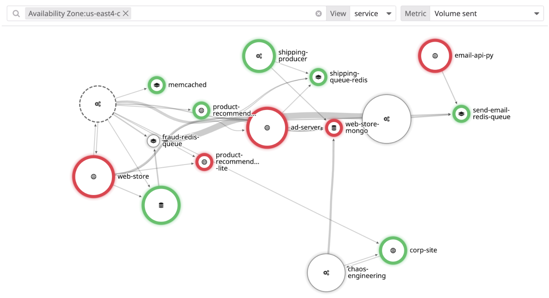
You can visualize cross-AZ or inter-AZ traffic using the Network Map to quickly pinpoint bottlenecks. At Datadog, this view is used to validate that the EU and US availability zones are not communicating, to ensure compliance with GDPR and protection of customers’ data. Cross-AZ traffic:
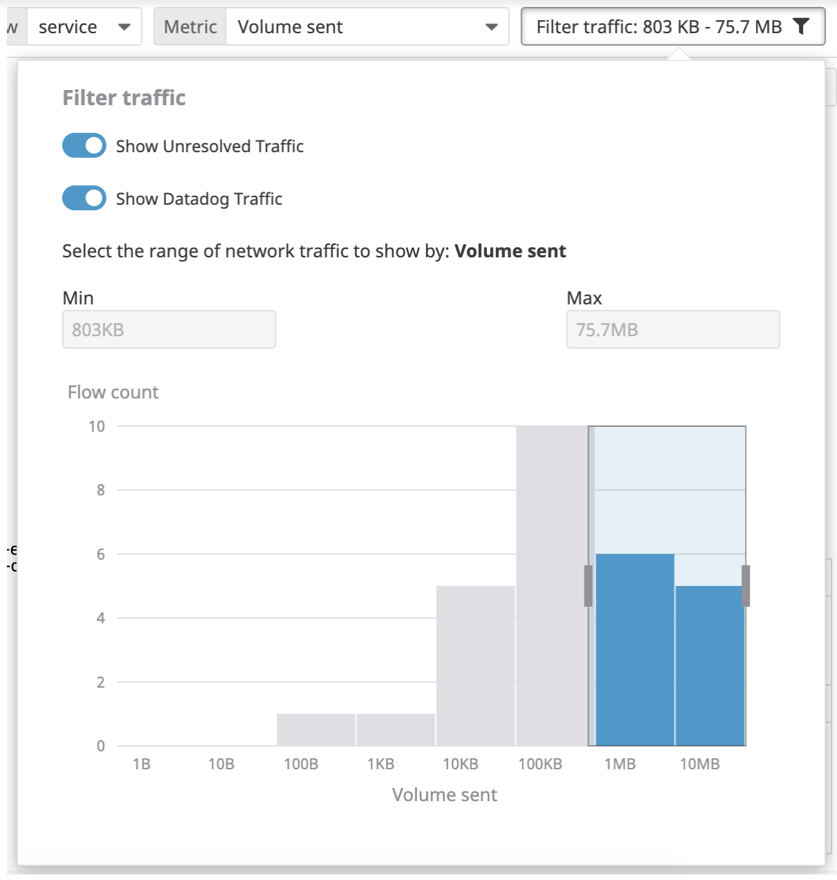
Inter-AZ service-to-service traffic:Thick edges between the map’s nodes, representing availability zones, indicates high volume of traffic flowing between them, which is what contributes to your costs.You can edit your preferences using the Filter traffic button. In larger environments, Datadog recommends scoping to just the most significant traffic sources by moving the sliders to include only the highest-volume dependencies.
Graphing traffic costs
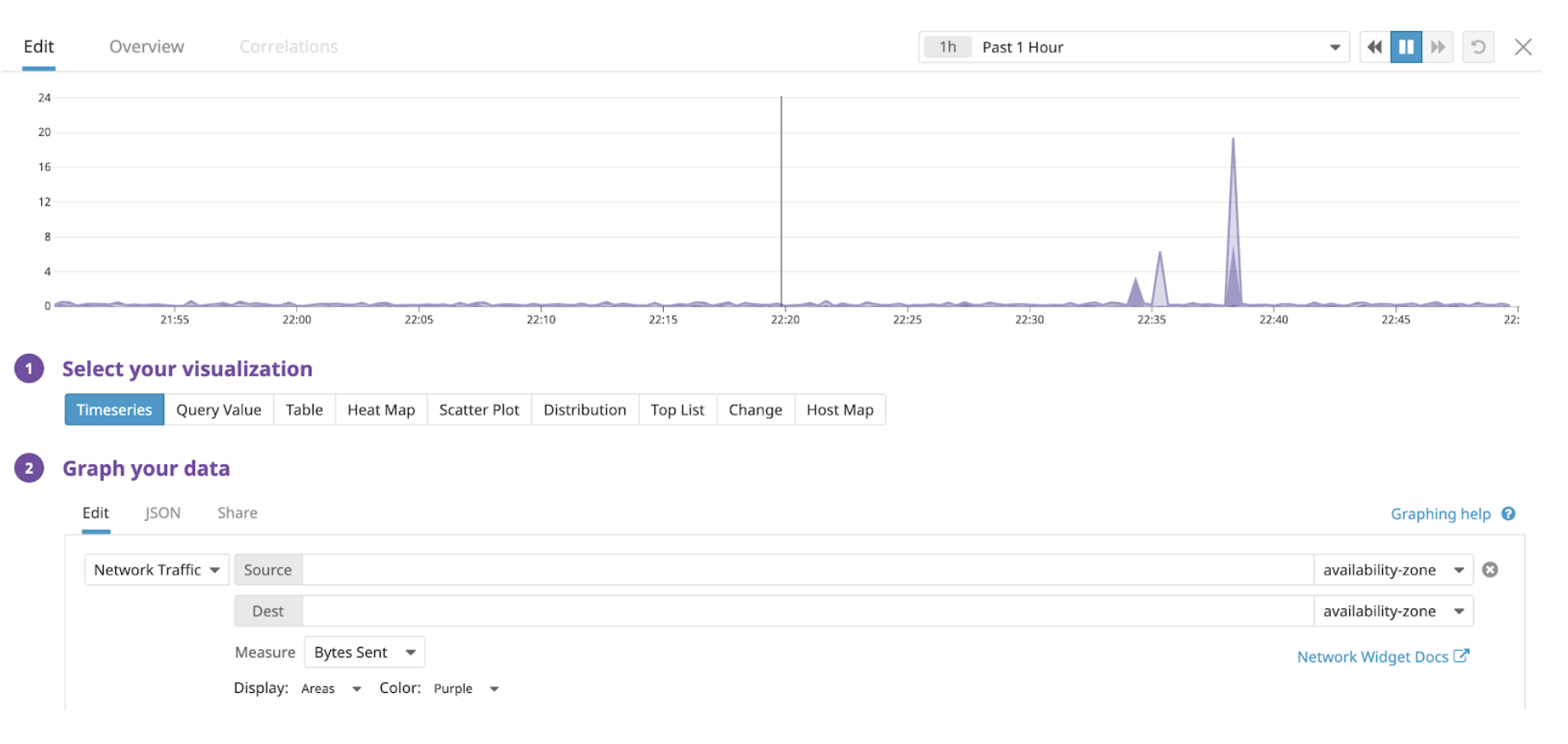
Datadog recommends tracking traffic volume metrics over time in dashboards and notebooks. You can graph traffic between any two endpoints using the same queries you would make on the Network page. To do this, create a Timeseries Widget and select the Network Traffic source from the dropdown menu.
Then share these results and any issues with your teammates using Dashboards and Notebooks.


