- Essentials
- Getting Started
- Datadog
- Datadog Site
- DevSecOps
- Serverless for AWS Lambda
- Agent
- Integrations
- Containers
- Dashboards
- Monitors
- Logs
- APM Tracing
- Profiler
- Tags
- API
- Service Catalog
- Session Replay
- Continuous Testing
- Synthetic Monitoring
- Incident Management
- Database Monitoring
- Cloud Security Management
- Cloud SIEM
- Application Security Management
- Workflow Automation
- CI Visibility
- Test Visibility
- Intelligent Test Runner
- Code Analysis
- Learning Center
- Support
- Glossary
- Standard Attributes
- Guides
- Agent
- Integrations
- OpenTelemetry
- Developers
- Authorization
- DogStatsD
- Custom Checks
- Integrations
- Create an Agent-based Integration
- Create an API Integration
- Create a Log Pipeline
- Integration Assets Reference
- Build a Marketplace Offering
- Create a Tile
- Create an Integration Dashboard
- Create a Recommended Monitor
- Create a Cloud SIEM Detection Rule
- OAuth for Integrations
- Install Agent Integration Developer Tool
- Service Checks
- IDE Plugins
- Community
- Guides
- API
- Datadog Mobile App
- CoScreen
- Cloudcraft
- In The App
- Dashboards
- Notebooks
- DDSQL Editor
- Sheets
- Monitors and Alerting
- Infrastructure
- Metrics
- Watchdog
- Bits AI
- Service Catalog
- API Catalog
- Error Tracking
- Service Management
- Infrastructure
- Application Performance
- APM
- Continuous Profiler
- Database Monitoring
- Data Streams Monitoring
- Data Jobs Monitoring
- Digital Experience
- Real User Monitoring
- Product Analytics
- Synthetic Testing and Monitoring
- Continuous Testing
- Software Delivery
- CI Visibility
- CD Visibility
- Test Visibility
- Intelligent Test Runner
- Code Analysis
- Quality Gates
- DORA Metrics
- Security
- Security Overview
- Cloud SIEM
- Cloud Security Management
- Application Security Management
- AI Observability
- Log Management
- Observability Pipelines
- Log Management
- Administration
Host and Container Maps
Overview
Infrastructure Maps (Host Maps and Container Maps) help you to visualize hosts and containers on one screen, with metrics made comprehensible through color and shape.
Use the drop-down selector in the upper left to switch between hosts and containers.
Installation
After deploying the Agent, no other configuration is necessary. For collecting Docker container information in the standard install rather than with the Docker Agent, the dd-agent user needs to have permissions to access docker.sock. Permission can be given by adding dd-agent to the docker group.
Usage
Filter
Use the Filter input box to limit an Infrastructure Map to a specific subset of an infrastructure. The filter input bar in the top left enables filtering of the Infrastructure Map by tags as well as Datadog-provided attributes.
If the filter input bar is empty, the map displays all hosts/containers that are reporting the selected metric to Datadog.
For example, if you tag your hosts by the environment they are in, you can filter by ‘production’ to remove hosts in your staging and other environments from the map. If you want to eliminate all but one host role in production, then add that role to the filter, too—the filters are ANDed together.
Note: There is a distinction between filtering for tag:value and "tag:value". Filtering for tag:value strictly matches the tag, while filtering for "tag:value" performs a search on that text.
Group
Use the Group input box to spatially arrange your hosts/containers into groups. Any host/container in a group shares the tag or tags you group by.
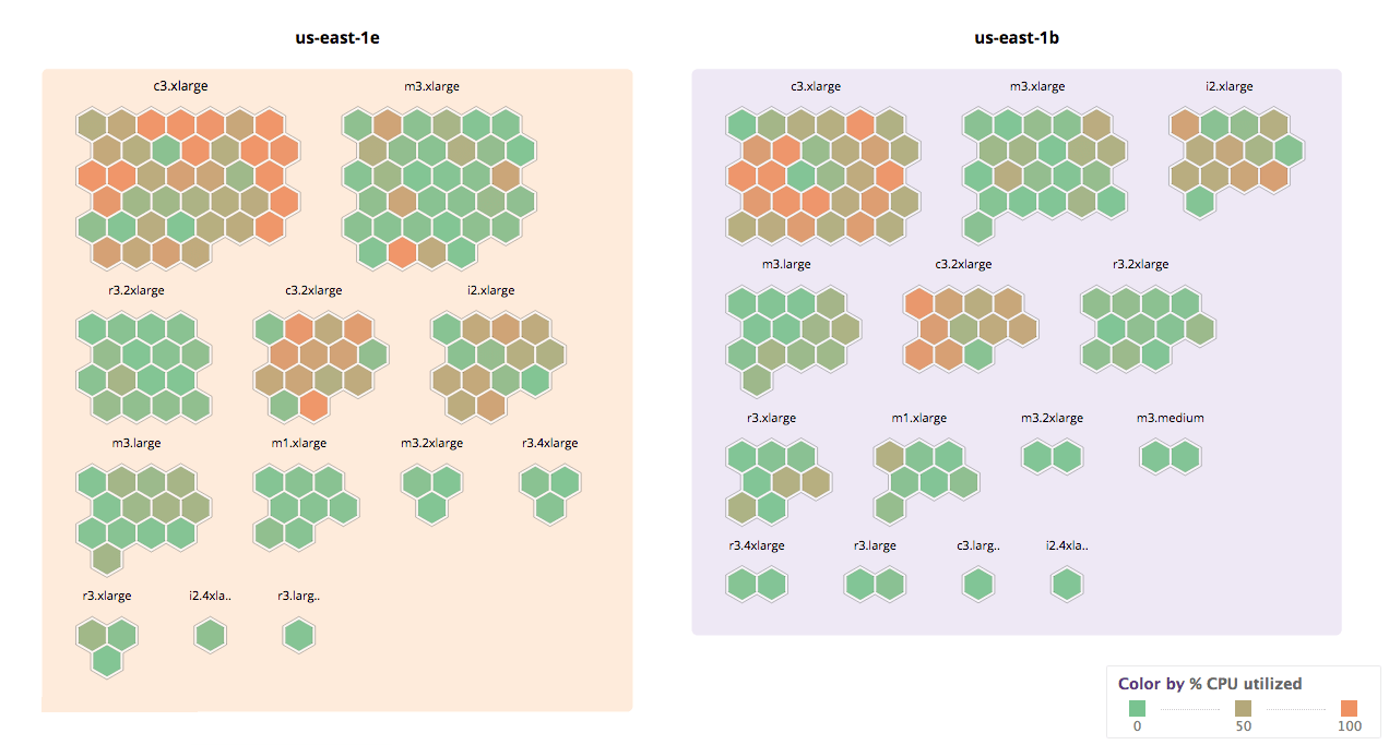
For example, you can group your hosts by AWS availability zone. If you add a second grouping tag, such as instance type, then the hosts are further subdivided into groups: first by availability zone and then by instance type, as seen below.
Fill and size
By default, the color of each host is set to represent the percentage of CPU usage on that host/container, where the color ranges from green (0% utilized) to orange (100% utilized). You can select different metrics from Fill selector.
Infrastructure Maps can also communicate an additional, optional metric with the size of the hexagon or rectangle. You can select this metric from the Size selector.
Note: The CPU Utilization metric uses the most reliable and up-to-date measurement of CPU utilization, whether it is being reported by the Datadog Agent, or directly by AWS or vSphere.
Tags
You can apply tags manually, or use integrations to automatically apply them. You can then use these tags to filter your hosts or containers.
For example, if some of your hosts are running on AWS, the following AWS-specific tags are available to you:
availability-zoneregionimageinstance-typesecurity-group- any EC2 tags you might use, such as
name
The Datadog Agent also collects host metadata and application information, some of which can be used as a filter or for grouping terms. Those fields include:
field:metadata_agent_versionfield:metadata_platformfield:metadata_processorfield:metadata_machinefield:apps
Zoom in
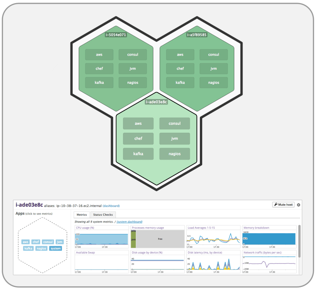
When you’ve identified a host or container that you want to investigate, click it for details. It zooms in and displays up to six integrations reporting metrics from that host. If there are more than six integrations, they are listed under the Apps header in the host’s detail pane, as shown in the screenshot below.
Click the name of an integration for a condensed dashboard of metrics for that integration. In the screenshot below, “system” has been clicked to get system metrics such as CPU usage, memory usage, disk latency, etc.
Display hosts on the Host Map that don’t have an Agent installed
By default, the Host Map only shows hosts that are reporting the selected metric, which can then be used to set a color or size for the individual hexagon within the grid.
Data freshness and meaning
Data in the Host Map is refreshed about once a minute—unless you are continuously interacting with the map. The bottom left of the screen tells you when data was last updated.
Use cases
Resource optimization
If you are an AWS user, you probably use a variety of instance types. Some instances are optimized for memory, some for compute, some are small, some are big.
If you want to reduce your AWS spend, you might start by figuring out what the expensive instances are used for. First, group by instance-type and then group by role or name. Take a look at your expensive instance types, such as c3.8xlarge. Are there any host roles whose CPU is underutilized? If so, zoom in to individual hosts and see whether all that computational power has been needed in the last several months, or whether this group of hosts is a candidate for migrating to a cheaper instance type.
Below is a subset of Datadog’s infrastructure. As you can see, c3.2xlarge instances are heavily loaded.
If you click on the c3.2xlarge group and then sub-group by role (shown below), you can find that only some of the roles are loaded, while others are nearly idling. If you downgraded these seven green nodes to a c3.xlarge, you would save almost $13K per year. ($0.21 saved per hour per host x 24 hr/day * 365 days/year * 7 hosts = $12,877.20 / year)
Availability zone placement
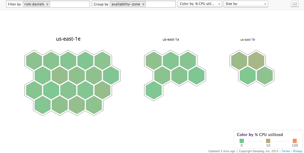
Host Maps enable you to see distributions of machines in each of your availability zones (AZ). Filter for the hosts you are interested in, group by AZ, and you can immediately see whether resources need rebalancing.
In the example seen below, there is an uneven distribution of hosts with role:daniels across availability zones. (Daniels is the name of an internal application.)
Problem investigation
Imagine you are having a problem in production. Maybe the CPUs on some of your hosts are pegged, which is causing long response times. Host Maps can help you quickly see whether there is anything different about the loaded and not-loaded hosts. You can rapidly group by dimensions you would like to investigate, and visually determine whether the problem servers belong to a certain group.
For example, you can group by AZ, region, instance type, image, or any tags that you use within your system.
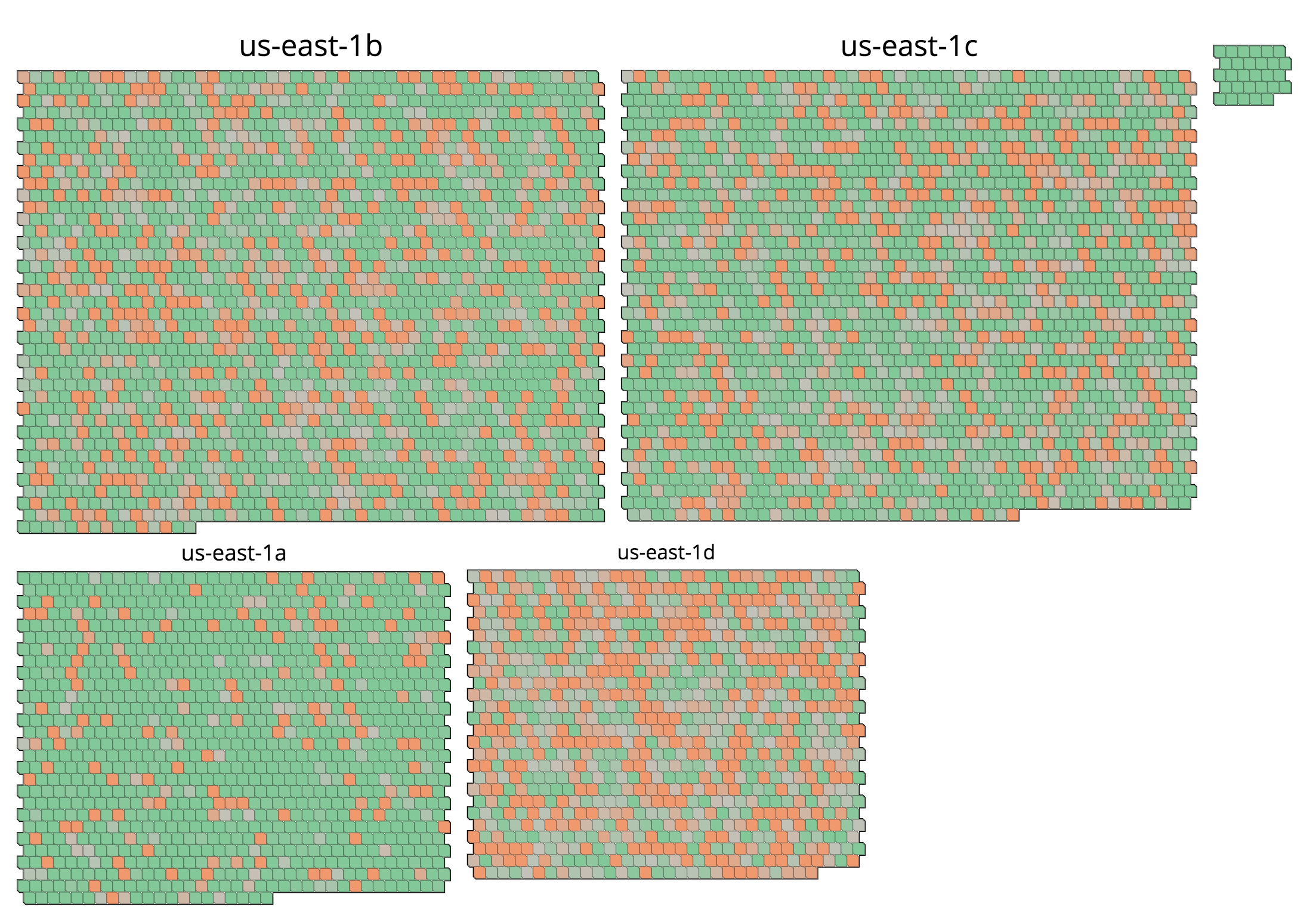
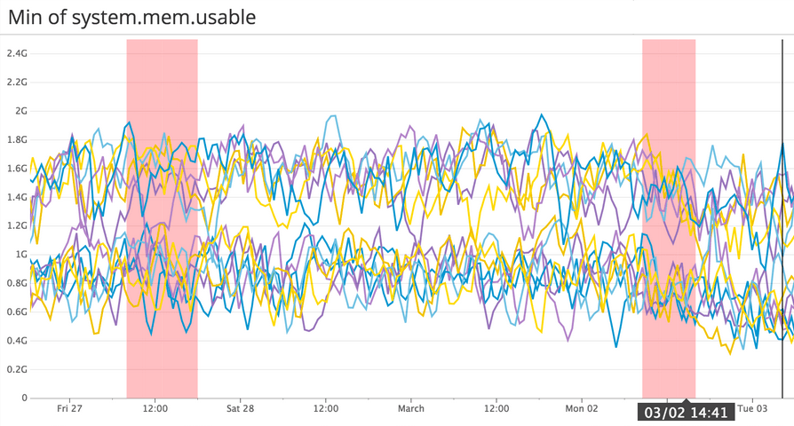
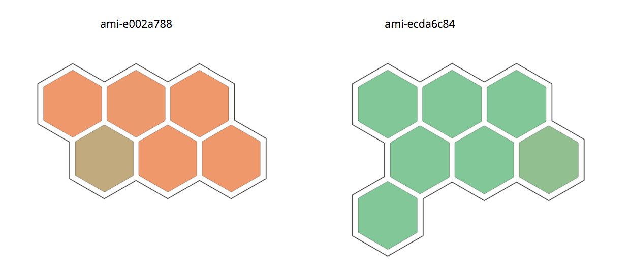
In the screenshot below, some hosts have much less usable memory than others, despite being part of the same cluster. Grouping by machine image reveals that there were two different images in use, and one of them is overloaded.
Further Reading
Additional helpful documentation, links, and articles:
