- 重要な情報
- はじめに
- Datadog
- Datadog サイト
- DevSecOps
- AWS Lambda のサーバーレス
- エージェント
- インテグレーション
- コンテナ
- ダッシュボード
- アラート設定
- ログ管理
- トレーシング
- プロファイラー
- タグ
- API
- Service Catalog
- Session Replay
- Continuous Testing
- Synthetic モニタリング
- Incident Management
- Database Monitoring
- Cloud Security Management
- Cloud SIEM
- Application Security Management
- Workflow Automation
- CI Visibility
- Test Visibility
- Intelligent Test Runner
- Code Analysis
- Learning Center
- Support
- 用語集
- Standard Attributes
- ガイド
- インテグレーション
- エージェント
- OpenTelemetry
- 開発者
- 認可
- DogStatsD
- カスタムチェック
- インテグレーション
- Create an Agent-based Integration
- Create an API Integration
- Create a Log Pipeline
- Integration Assets Reference
- Build a Marketplace Offering
- Create a Tile
- Create an Integration Dashboard
- Create a Recommended Monitor
- Create a Cloud SIEM Detection Rule
- OAuth for Integrations
- Install Agent Integration Developer Tool
- サービスのチェック
- IDE インテグレーション
- コミュニティ
- ガイド
- API
- モバイルアプリケーション
- CoScreen
- Cloudcraft
- アプリ内
- Service Management
- インフラストラクチャー
- アプリケーションパフォーマンス
- APM
- Continuous Profiler
- データベース モニタリング
- Data Streams Monitoring
- Data Jobs Monitoring
- Digital Experience
- Software Delivery
- CI Visibility (CI/CDの可視化)
- CD Visibility
- Test Visibility
- Intelligent Test Runner
- Code Analysis
- Quality Gates
- DORA Metrics
- セキュリティ
- セキュリティの概要
- Cloud SIEM
- クラウド セキュリティ マネジメント
- Application Security Management
- AI Observability
- ログ管理
- Observability Pipelines(観測データの制御)
- ログ管理
- 管理
Visualize
このページは日本語には対応しておりません。随時翻訳に取り組んでいます。翻訳に関してご質問やご意見ございましたら、お気軽にご連絡ください。
Overview
Visualizations define the outcomes of the filters and aggregates displayed in the Analytics Explorer. Select the relevant visualization type to surface the information you need under the search query.
Timeseries
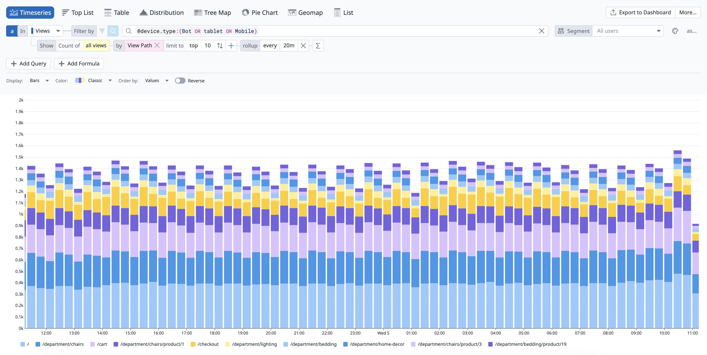
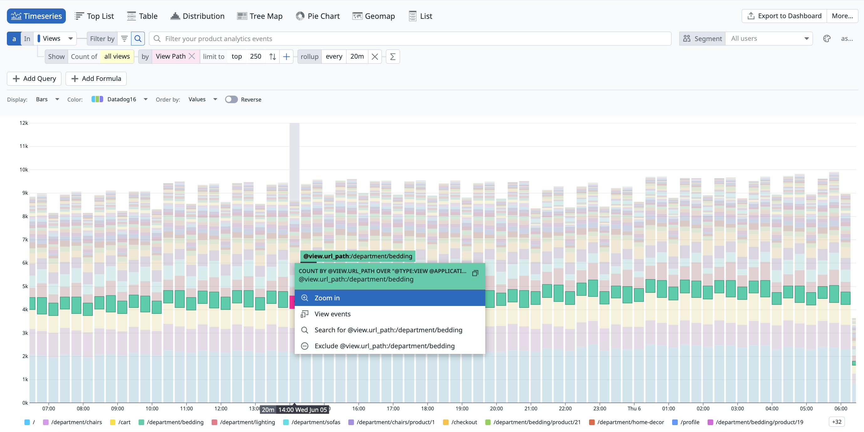
Visualize the evolution of a single measure (an attribute with a numerical value contained in your Product Analytics events), or a facet (unique count of values) over a selected time frame.
The timeseries graph depicts the evolution of the number of pageviews on an example web application over the past day for every view path.
You can choose additional display options such as:
- Display: Results are shown as bars (recommended for counts and unique counts), lines (recommended for statistical aggregations), areas, and several color sets are available.
- The roll-up interval: Determines the width of buckets in the bars.
Top list
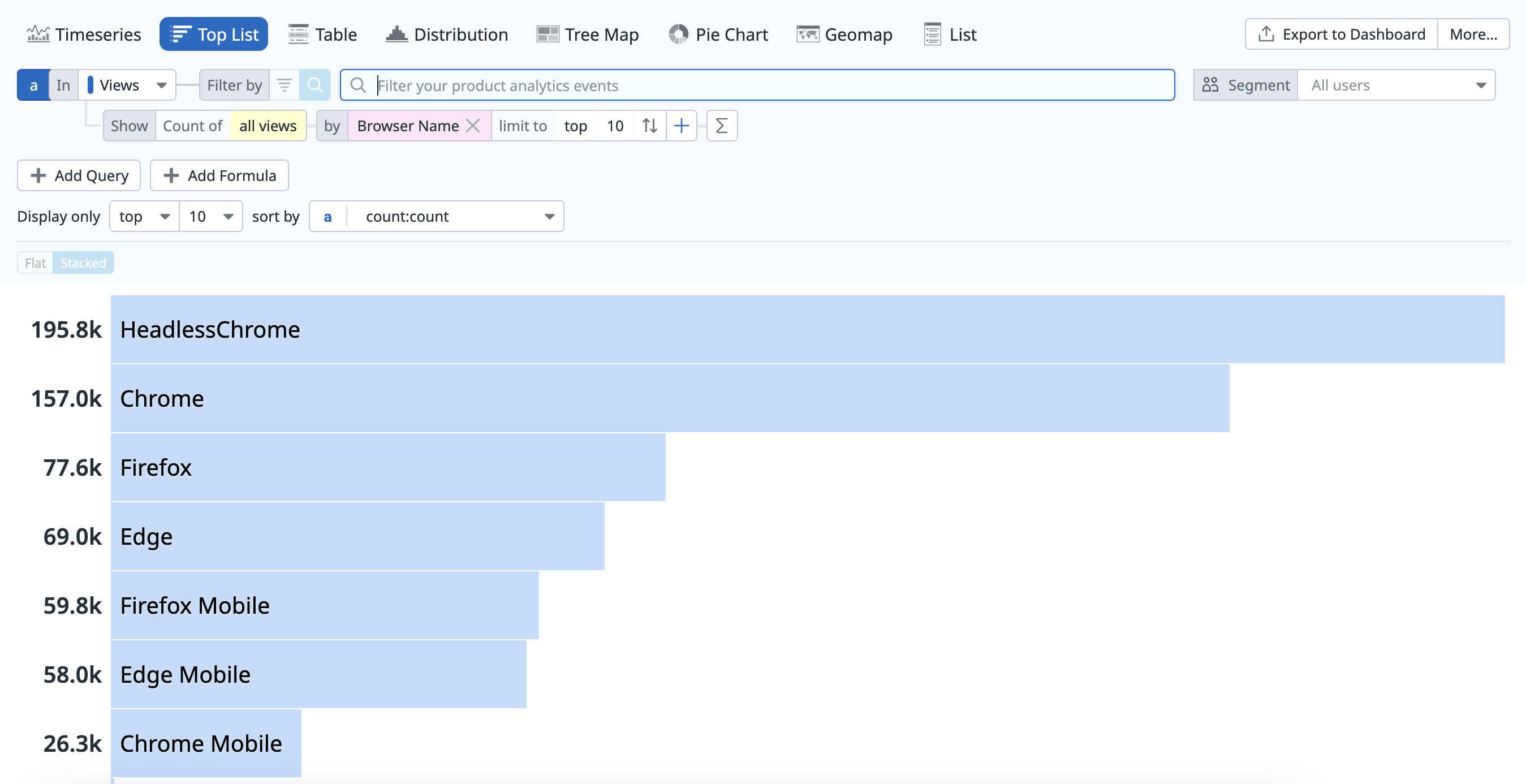
Visualize the top values from a facet based on your chosen measure.
The top list includes the top browsers used to visit the Shopist website over the last day.
Nested tables
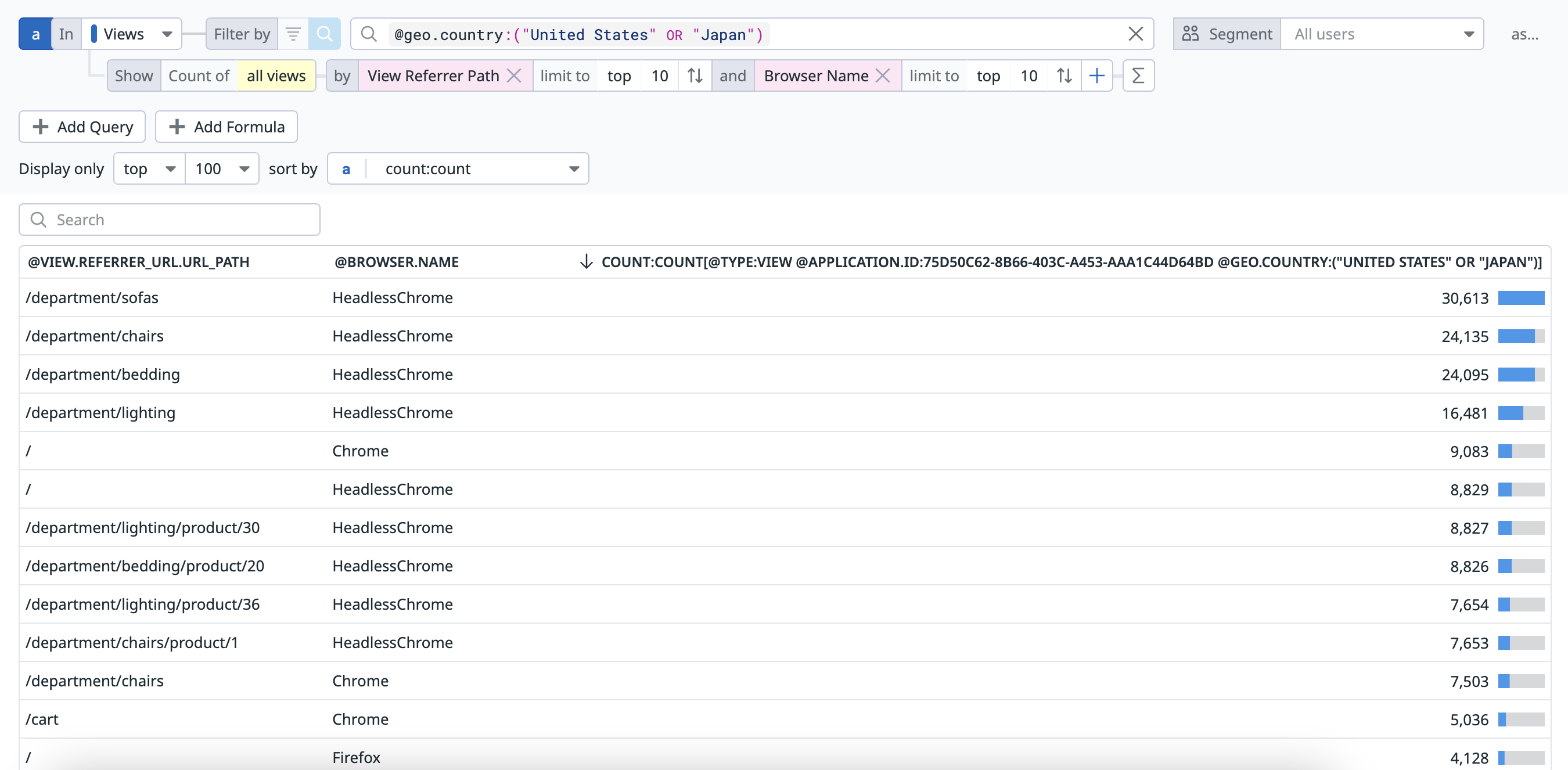
Visualize the top values from up to three facets according to your chosen measure (the first measure you choose in the list) and display the value of additional measures for elements that appear in the nested table. Update the search query or investigate the events corresponding to either dimension.
- When there are multiple measures, the top or bottom list is determined according to the first measure.
- The subtotal may differ from the actual sum of values in a group since only a subset (top or bottom) is displayed. Events with a null or empty value for this dimension are not displayed as a sub-group.
Note: A table visualization used for one single measure and one single dimension is the same as a top list, just with a different display.
The following Analytics table shows the top 5 URL paths for two countries, US and Japan, grouped by browser, over the last day:
Distributions
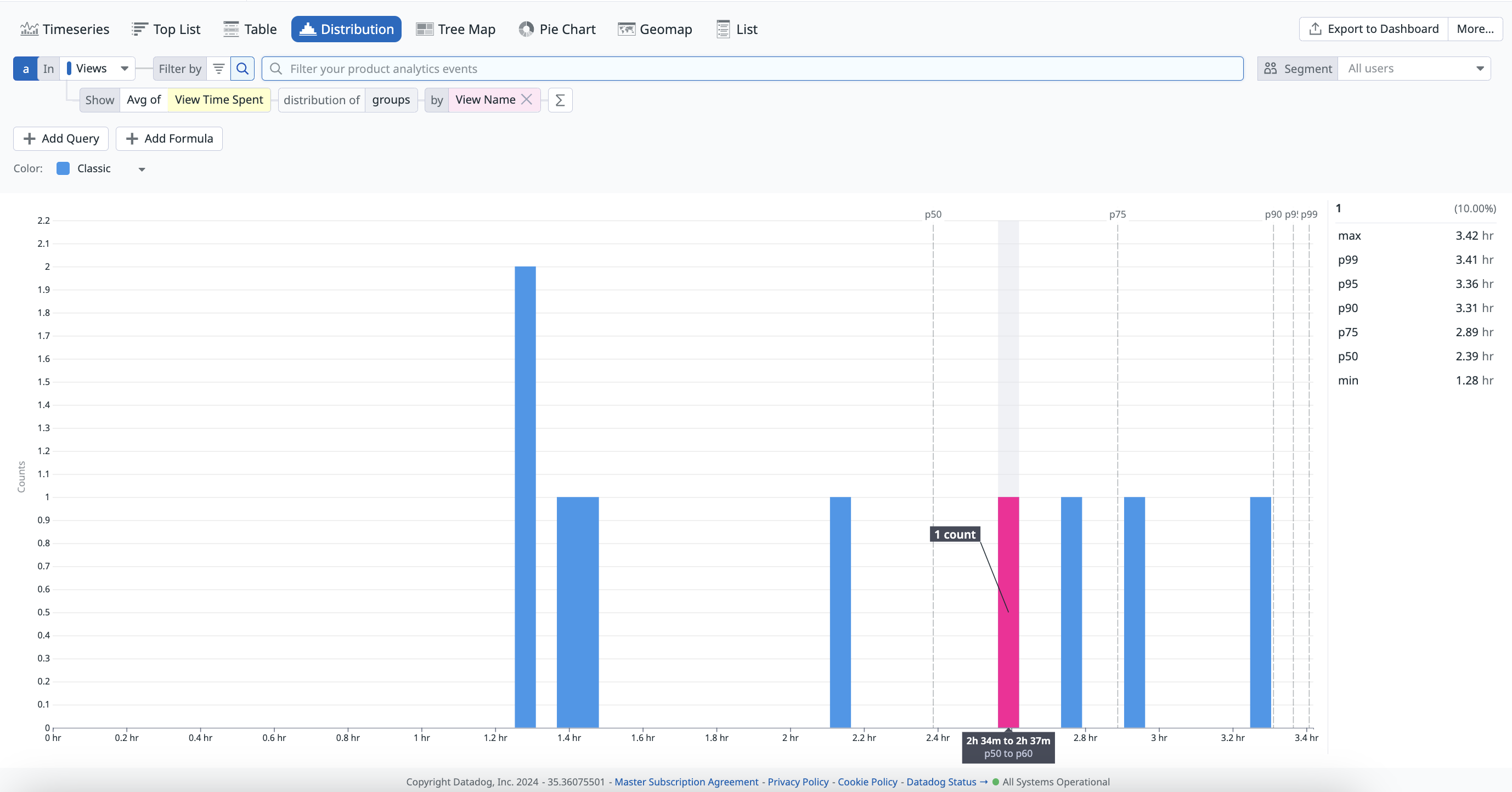
You can display the distribution of measure attributes over the selected time frame to see the values fluctuate.
The distribution graph displays the distribution of the Largest Contentful Paint that measures the user experience of the Shopist landing page.
Tree Maps
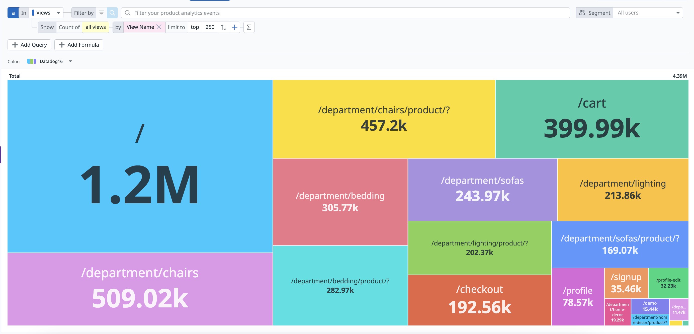
A tree map helps you organize and show data as a percentage of a whole in a visually appealing format. Tree maps display data in nested rectangles. Compare different dimensions using both size and colors of the rectangles. You can also select multiple attributes to view a hierarchy of rectangles.
The following tree map shows the percentage breakdown by View Name.
Pie charts
A pie chart helps you organize and show data as a percentage of a whole. It is useful when comparing the relationship between different dimensions such as services, users, hosts, and countries. within your log data.
The following pie chart shows the percentage breakdown by View Path.
Geomaps
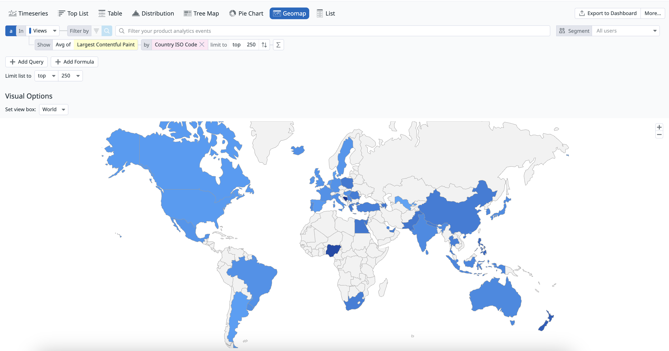
Visualize a single measure (an attribute with a numerical value contained in your Product Analytics events), or a facet (unique count of values) on the world map.
The Analytics geomap shows the 75th percentile of the Largest Contentful Paint over the past day.
Lists
Lists are paginated results of events and are ideal when individual results matter. You do not need prior knowledge of what defines a matching result to use lists.
The information you search for is displayed in columns. You can manage the following:
- The table with available interactions on the first row. You can sort, rearrange, and remove columns.
- The facet dropdown at the top of each column.
By default, events in the list visualization are organized by timestamp, with the most recent events listed first. You can sort events in any way you want, such as with facets. Surface events with the lowest or highest value for a measure first, then sort your events lexicographically for the unique value of a facet. This orders a column according to the facet.
Related events
For all visualizations besides the funnel, select a section of the graph or click on the graph to either zoom in or see a list of events that correspond to your selection.
For funnel graphs, click on the graph to see a list of converted and dropped off sessions that correspond to your queries.
For the remaining visualization options, click on the graph and click View events to see a list of events that correspond to your selection.
Further Reading
お役に立つドキュメント、リンクや記事:
