- Essentials
- Getting Started
- Datadog
- Datadog Site
- DevSecOps
- Serverless for AWS Lambda
- Agent
- Integrations
- Containers
- Dashboards
- Monitors
- Logs
- APM Tracing
- Profiler
- Tags
- API
- Service Catalog
- Session Replay
- Continuous Testing
- Synthetic Monitoring
- Incident Management
- Database Monitoring
- Cloud Security Management
- Cloud SIEM
- Application Security Management
- Workflow Automation
- CI Visibility
- Test Visibility
- Intelligent Test Runner
- Code Analysis
- Learning Center
- Support
- Glossary
- Standard Attributes
- Guides
- Agent
- Integrations
- OpenTelemetry
- Developers
- Authorization
- DogStatsD
- Custom Checks
- Integrations
- Create an Agent-based Integration
- Create an API Integration
- Create a Log Pipeline
- Integration Assets Reference
- Build a Marketplace Offering
- Create a Tile
- Create an Integration Dashboard
- Create a Recommended Monitor
- Create a Cloud SIEM Detection Rule
- OAuth for Integrations
- Install Agent Integration Developer Tool
- Service Checks
- IDE Plugins
- Community
- Guides
- API
- Datadog Mobile App
- CoScreen
- Cloudcraft
- In The App
- Dashboards
- Notebooks
- DDSQL Editor
- Sheets
- Monitors and Alerting
- Infrastructure
- Metrics
- Watchdog
- Bits AI
- Service Catalog
- API Catalog
- Error Tracking
- Service Management
- Infrastructure
- Application Performance
- APM
- Continuous Profiler
- Database Monitoring
- Data Streams Monitoring
- Data Jobs Monitoring
- Digital Experience
- Real User Monitoring
- Product Analytics
- Synthetic Testing and Monitoring
- Continuous Testing
- Software Delivery
- CI Visibility
- CD Visibility
- Test Visibility
- Intelligent Test Runner
- Code Analysis
- Quality Gates
- DORA Metrics
- Security
- Security Overview
- Cloud SIEM
- Cloud Security Management
- Application Security Management
- AI Observability
- Log Management
- Observability Pipelines
- Log Management
- Administration
Sankey Diagram
All features in Product Analytics are in limited availability. To request access, complete the form.
Request AccessOverview
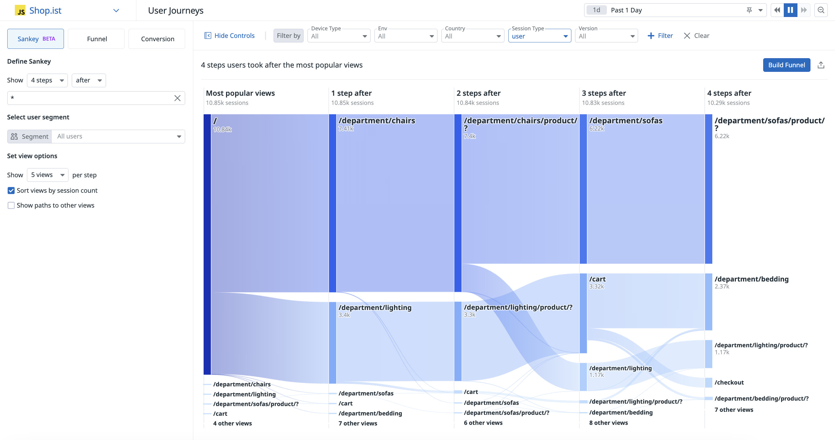
The Sankey diagram allows you to visualize all user journeys across your application to analyze the critical path.
Each node represents a view the user visited. The thickness of each node represents the count of user sessions on that page. A page with fewer visitors will have a thinner node in the diagram.
If a user visits the same page multiple times during their session, that page is only counted once.
Actions are not supported in the Sankey diagram.
Build a Sankey diagram
View the default diagram
- Navigate to Digital Experience > Product Analytics > User Journeys.
- Click Sankey if it’s not already selected. This displays the default visualization, which represents the most popular user journeys in your application.
Start or end the diagram at a given view
You can use the Define Sankey menu to customize this diagram to display:
- the steps users took after visiting a given view
- the steps users took before visiting a given view
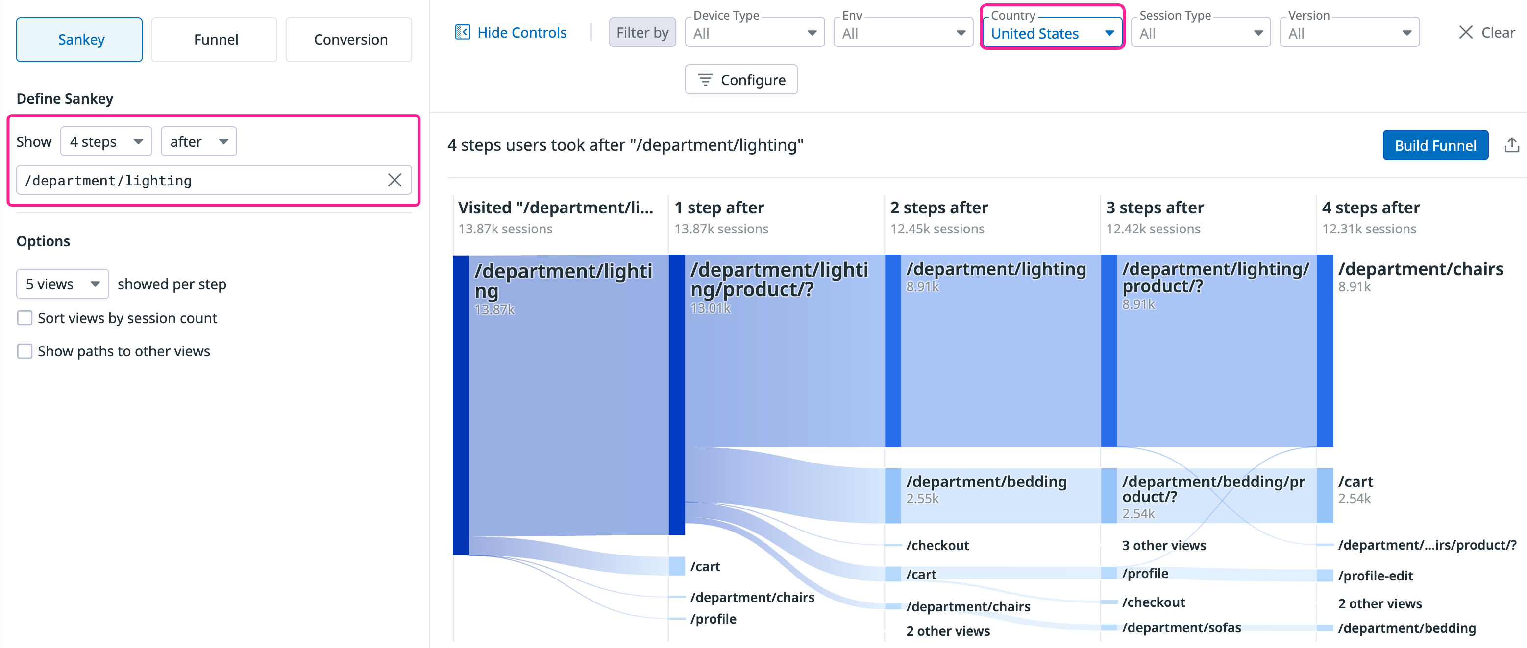
The example below displays the four steps that users in the United States take after visiting /department/lightning:
Graph all views containing a given phrase
Sankey diagrams support Datadog wildcards, allowing you to build a diagram of all views containing a given phrase.
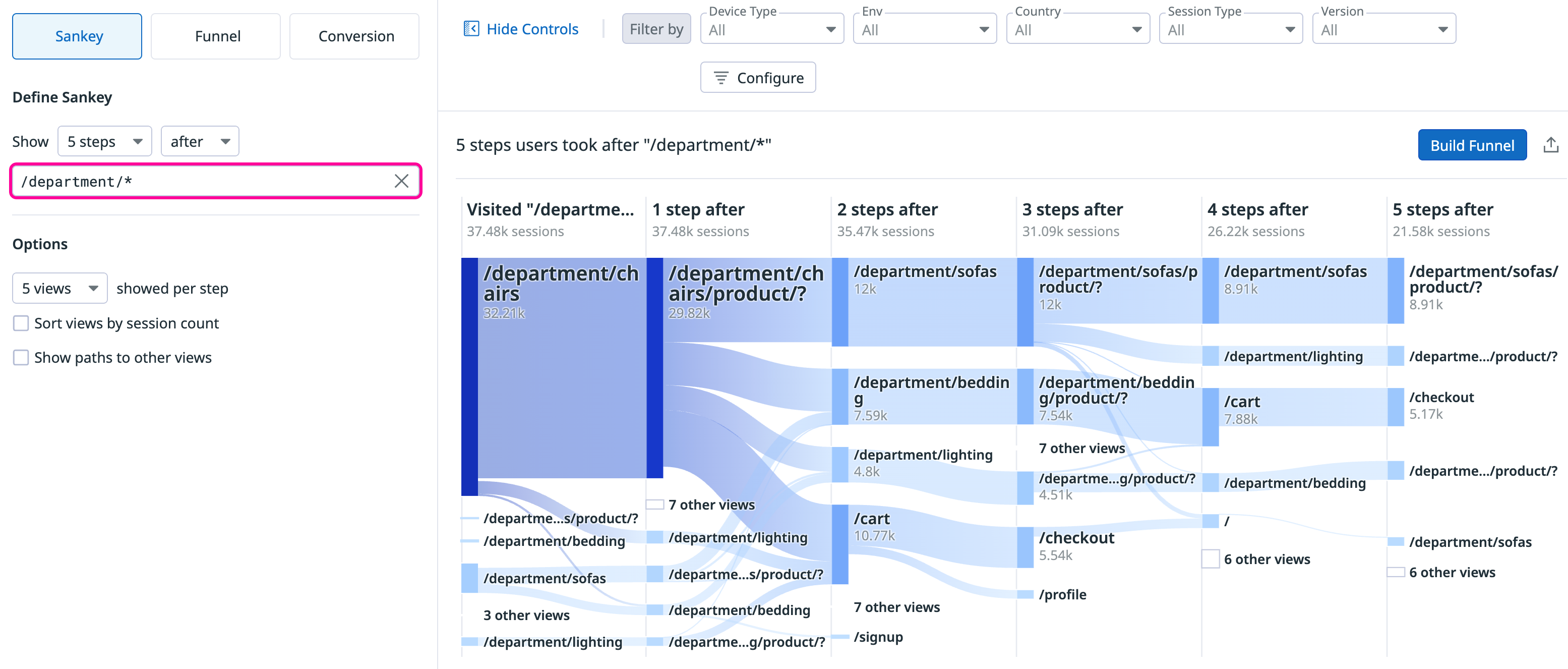
To match multiple routes, type a wildcard instead of choosing a single view name. The example below displays the five steps that users take after visiting any view matching /department/*:
Analyze a Sankey diagram
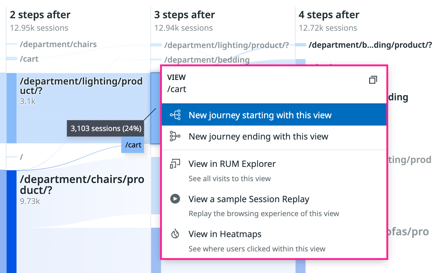
You can hover over a diagram node to view the number of sessions that included visits to that view.
Click a node for a list of analysis options, such as viewing a sample Session Replay or building a Sankey diagram that starts with that view.
Convert the diagram to a funnel
- From the Sankey diagram page, click the Build Funnel button.
- In the Sankey diagram, click the nodes of the views you want to include in the funnel.
- Click Create Funnel from Selection.
Troubleshooting
The Sankey diagram and the funnel show different view counts for the same view
The algorithms for the Sankey diagram and the funnel rely on two different computations. You may notice a difference in the count of views for the first step of both visualizations. Imagine the use case of building a funnel and a Sankey diagram that both start with the same view: /home.
- The funnel counts all views that went to
/home. - The Sankey diagram only counts views to
/homewhere another view follows. If a user goes to/homeand stays on that page or leaves the app, the Sankey diagram does not include their sessions.
In addition, funnels do not include active sessions, while Sankey diagrams do include active sessions.
Further reading
Additional helpful documentation, links, and articles:


