- Essentials
- Getting Started
- Datadog
- Datadog Site
- DevSecOps
- Serverless for AWS Lambda
- Agent
- Integrations
- Containers
- Dashboards
- Monitors
- Logs
- APM Tracing
- Profiler
- Tags
- API
- Service Catalog
- Session Replay
- Continuous Testing
- Synthetic Monitoring
- Incident Management
- Database Monitoring
- Cloud Security Management
- Cloud SIEM
- Application Security Management
- Workflow Automation
- CI Visibility
- Test Visibility
- Test Impact Analysis
- Code Analysis
- Learning Center
- Support
- Glossary
- Standard Attributes
- Guides
- Agent
- Integrations
- OpenTelemetry
- Developers
- Authorization
- DogStatsD
- Custom Checks
- Integrations
- Create an Agent-based Integration
- Create an API Integration
- Create a Log Pipeline
- Integration Assets Reference
- Build a Marketplace Offering
- Create a Tile
- Create an Integration Dashboard
- Create a Recommended Monitor
- Create a Cloud SIEM Detection Rule
- OAuth for Integrations
- Install Agent Integration Developer Tool
- Service Checks
- IDE Plugins
- Community
- Guides
- Administrator's Guide
- API
- Datadog Mobile App
- CoScreen
- Cloudcraft
- In The App
- Dashboards
- Notebooks
- DDSQL Editor
- Sheets
- Monitors and Alerting
- Infrastructure
- Metrics
- Watchdog
- Bits AI
- Service Catalog
- API Catalog
- Error Tracking
- Service Management
- Infrastructure
- Application Performance
- APM
- Continuous Profiler
- Database Monitoring
- Data Streams Monitoring
- Data Jobs Monitoring
- Digital Experience
- Real User Monitoring
- Product Analytics
- Synthetic Testing and Monitoring
- Continuous Testing
- Software Delivery
- CI Visibility
- CD Visibility
- Test Optimization
- Code Analysis
- Quality Gates
- DORA Metrics
- Security
- Security Overview
- Cloud SIEM
- Cloud Security Management
- Application Security Management
- AI Observability
- Log Management
- Observability Pipelines
- Log Management
- Administration
Visualize
Overview
Visualizations define the outcomes of the filters and aggregates displayed in the RUM Explorer. Select the relevant visualization type to surface the information you need under the search query.
Lists
Lists are paginated results of events and are ideal when individual results matter. You do not need prior knowledge of what defines a matching result to use lists.
The information you search for is displayed in columns. You can manage the following:
- The table with available interactions on the first row. You can sort, rearrange, and remove columns.
- The facet panel on the left or the RUM event side panel on the right. You can add a column for a field.
By default, RUM events in the list visualization are organized by timestamp, with the most recent events listed first. You can sort events in any way you want, such as with facets. Surface RUM events with the lowest or highest value for a measure first, then sort your events lexicographically for the unique value of a facet. This orders a column according to the facet.
While you can add attributes and tags in columns, Datadog recommends sorting the table if you have declared a facet first. To see the value of a custom attribute for a line item on the table, you can add non-faceted attributes in the columns, but they may not sort correctly.
The RUM events table configuration is stored with additional elements of your troubleshooting context in Saved Views.
List widget
The List Widget on dashboards shows individual events for a given data source, including RUM data. You can use the list widget to view any RUM events on a dashboard, like all errors on a particular page for example.
In addition to dashboards, the list widget can be used in Notebooks as well, allowing you to add RUM events as part of reports and investigations.
Timeseries
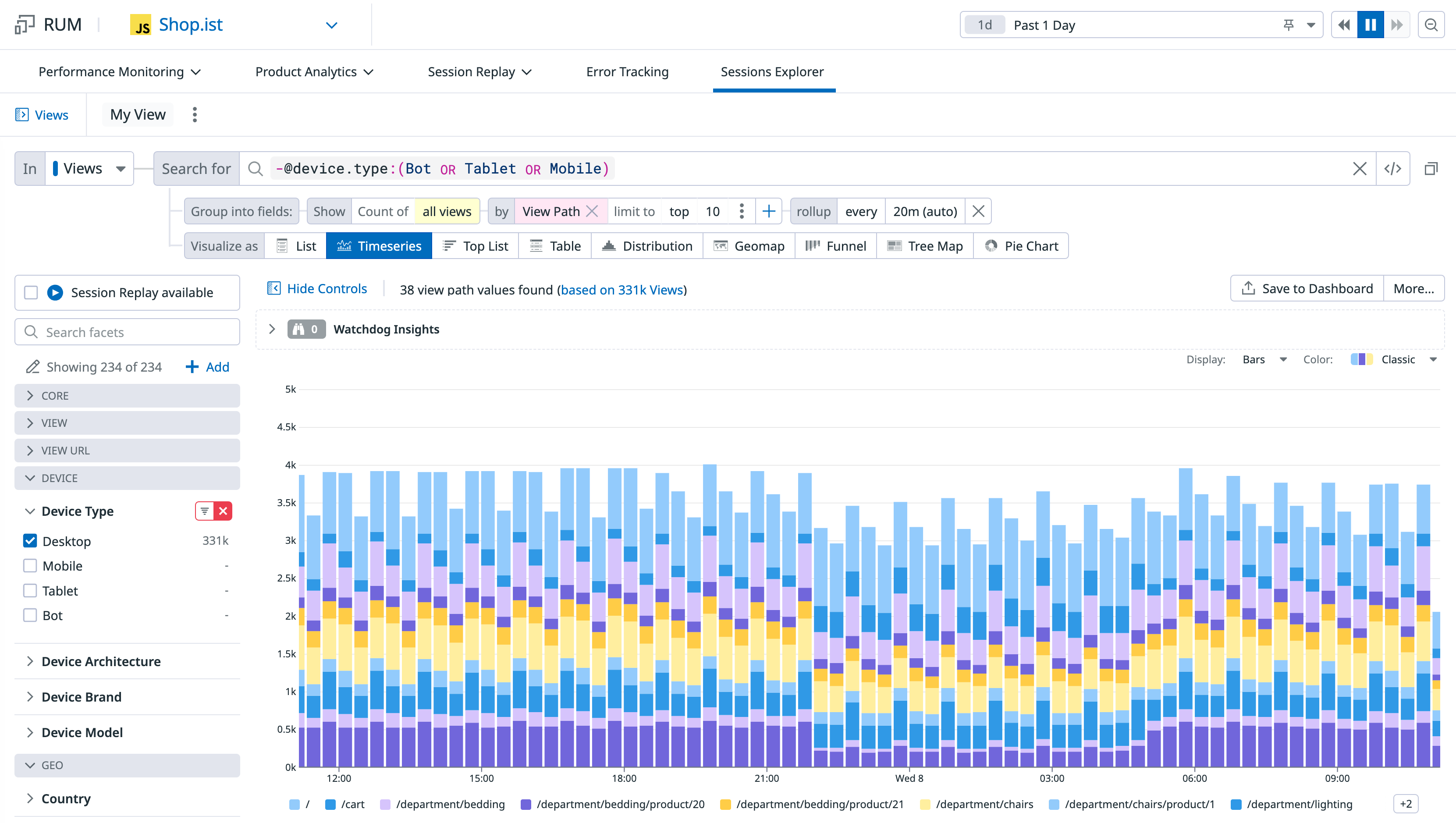
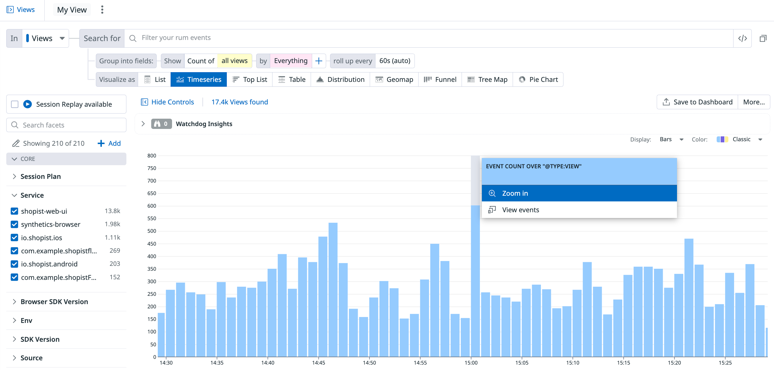
Visualize the evolution of a single measure (or a facet unique count of values) over a selected time frame, and optionally, split by an available facet.
The timeseries graph depicts the evolution of the number of pageviews on the Shopist application over the past day for every view path.
You can choose additional display options such as:
- Display: Results are shown as bars (recommended for counts and unique counts), lines (recommended for statistical aggregations), areas, and several color sets are available.
- The roll-up interval: Determines the width of buckets in the bars.
Top list
Visualize the top values from a facet based on your chosen measure.
The top list includes the top browsers used to visit the Shopist website over the last day.
Nested tables
Visualize the top values from up to three facets according to your chosen measure (the first measure you choose in the list) and display the value of additional measures for elements that appear in the nested table. Update the search query or investigate the RUM events corresponding to either dimension.
- When there are multiple measures, the top or bottom list is determined according to the first measure.
- The subtotal may differ from the actual sum of values in a group since only a subset (top or bottom) is displayed. Events with a null or empty value for this dimension are not displayed as a sub-group.
Note: A table visualization used for one single measure and one single dimension is the same as a top list, just with a different display.
The following RUM Analytics table shows the top 5 URL paths for two countries, US and Japan, grouped by browser, over the last day:
Distributions
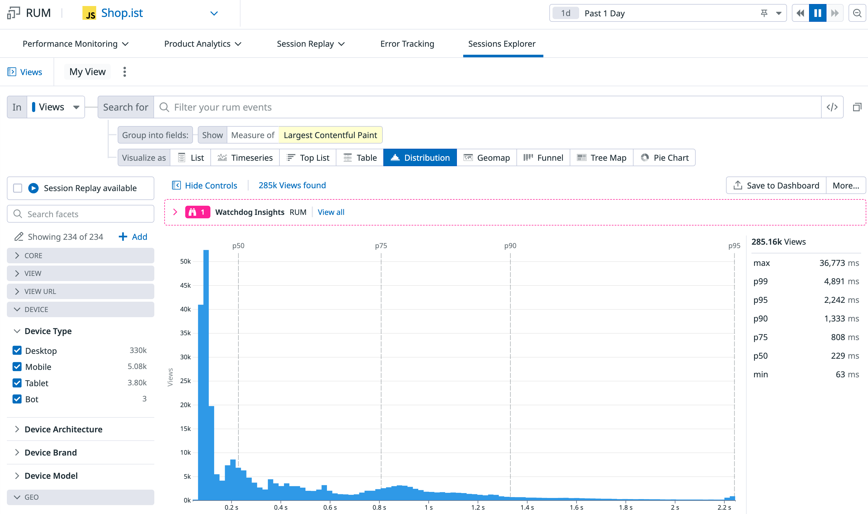
You can display the distribution of measure attributes over the selected time frame to see the values fluctuate.
The distribution graph displays the distribution of the Largest Contentful Paint that measures the user experience of the Shopist landing page.
Geomaps
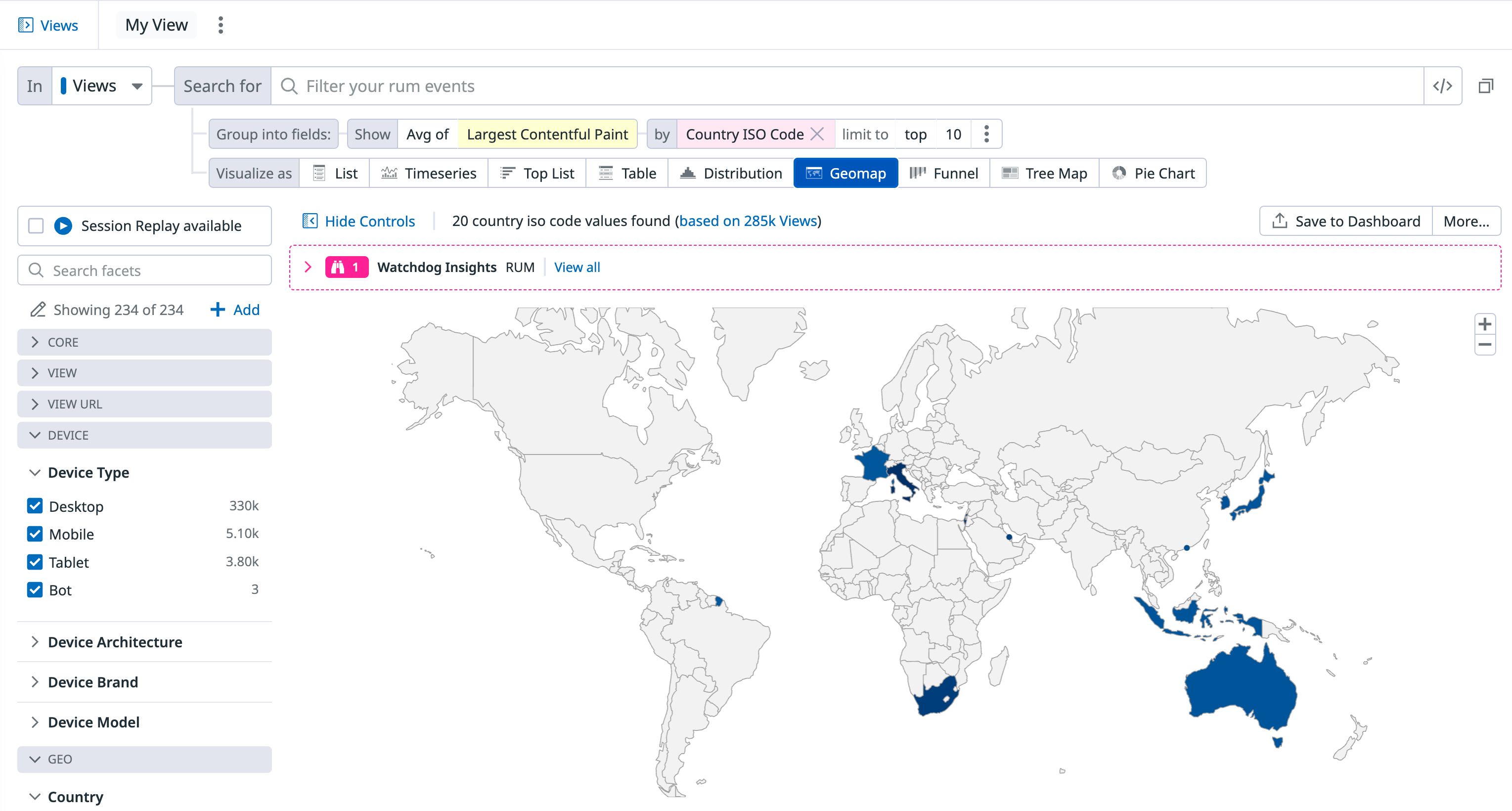
Visualize a single measure (or a facet unique count of values) on the world map.
The RUM Analytics geomap shows the 75th percentile of the Largest Contentful Paint over the past day.
Pie charts
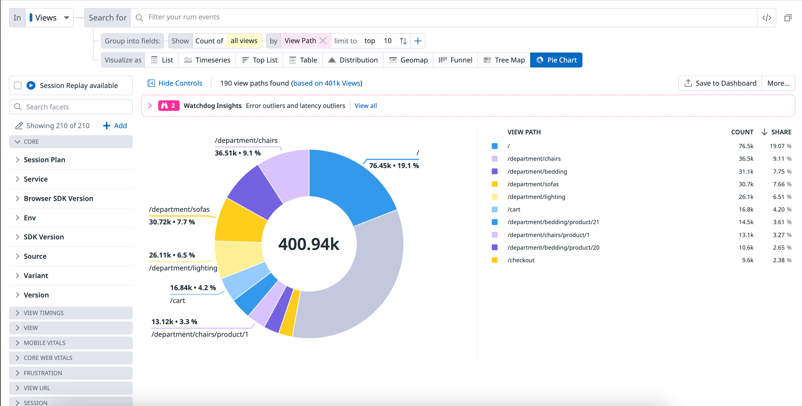
A pie chart helps you organize and show data as a percentage of a whole. It is useful when comparing the relationship between different dimensions such as services, users, hosts, countries, etc. within your log data.
The following pie chart shows the percentage breakdown by View Path.
Related events
For all visualizations, select a section of the graph or click on the graph to either zoom in or see a list of events that correspond to your selection.
For the remaining visualization options, click on the graph and click View events to see a list of events that correspond to your selection.
Further Reading
Additional helpful documentation, links, and articles:
