- Essentials
- Getting Started
- Datadog
- Datadog Site
- DevSecOps
- Serverless for AWS Lambda
- Agent
- Integrations
- Containers
- Dashboards
- Monitors
- Logs
- APM Tracing
- Profiler
- Tags
- API
- Service Catalog
- Session Replay
- Continuous Testing
- Synthetic Monitoring
- Incident Management
- Database Monitoring
- Cloud Security Management
- Cloud SIEM
- Application Security Management
- Workflow Automation
- CI Visibility
- Test Visibility
- Test Impact Analysis
- Code Analysis
- Learning Center
- Support
- Glossary
- Standard Attributes
- Guides
- Agent
- Integrations
- OpenTelemetry
- Developers
- Authorization
- DogStatsD
- Custom Checks
- Integrations
- Create an Agent-based Integration
- Create an API Integration
- Create a Log Pipeline
- Integration Assets Reference
- Build a Marketplace Offering
- Create a Tile
- Create an Integration Dashboard
- Create a Recommended Monitor
- Create a Cloud SIEM Detection Rule
- OAuth for Integrations
- Install Agent Integration Developer Tool
- Service Checks
- IDE Plugins
- Community
- Guides
- API
- Datadog Mobile App
- CoScreen
- Cloudcraft
- In The App
- Dashboards
- Notebooks
- DDSQL Editor
- Sheets
- Monitors and Alerting
- Infrastructure
- Metrics
- Watchdog
- Bits AI
- Service Catalog
- API Catalog
- Error Tracking
- Service Management
- Infrastructure
- Application Performance
- APM
- Continuous Profiler
- Database Monitoring
- Data Streams Monitoring
- Data Jobs Monitoring
- Digital Experience
- Real User Monitoring
- Product Analytics
- Synthetic Testing and Monitoring
- Continuous Testing
- Software Delivery
- CI Visibility
- CD Visibility
- Test Optimization
- Code Analysis
- Quality Gates
- DORA Metrics
- Security
- Security Overview
- Cloud SIEM
- Cloud Security Management
- Application Security Management
- AI Observability
- Log Management
- Observability Pipelines
- Log Management
- Administration
Kubernetes Resource Utilization
Datadog’s Kubernetes resource utilization view gives you insights into how your Kubernetes workloads are using your computing resources across your infrastructure. This helps you to understand resource usage and make better decisions about sizing and capacity planning, as well as reducing the amount of CPU or memory waste.
With a constantly-updated status of how well your resource requests and limits match your pods’ current usage, you can improve bin packing within your Kubernetes clusters.
Prerequisites
- Datadog Agent v7.45.0+
- Enable Orchestrator Explorer
Usage
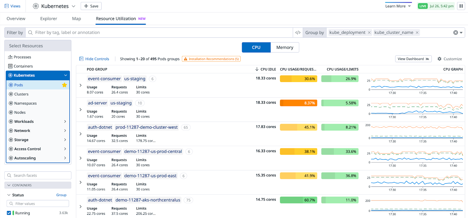
In Datadog, go to the Kubernetes Overview page and select the Resource Utilization tab.
The page opens on Pods, with a default grouping by kube_cluster_name, kube_namespace, and kube_deployment.
Optimizing the sizing for CPU and memory is typically done separately. Data in the table is split between a CPU and a Memory toggle.
Default columns
- Pod group: Represents deployments by default, but depends on what you specify in the Group by field in the upper right. This column includes the sum of usage, requests, and limits for the pods in each group.
- CPU idle: Amount of unused CPU, calculated as the sum of differences between usage and requests.
- CPU usage/requests: Sum of usage divided by sum of requests, as a percentage.
- CPU usage/limits: Sum of usage divided by sum of limits, as a percentage.
- CPU graph: A line graph displaying the evolution of usage, requests, and limits over time. Click on each row to see a longer timeframe.
- Pod group: Represents deployments by default, but depends on what you specify in the Group by field in the upper right. This column includes the sum of usage, requests, and limits for the pods in each group.
- Memory unused: Amount of unused memory, calculated as the sum of differences between usage and requests.
- Memory usage/requests: Sum of usage divided by sum of requests, as a percentage.
- Memory usage/limits: Sum of usage divided by sum of limits, as a percentage.
- Memory graph: A line graph displaying the evolution of usage, requests, and limits over time. Click on each row to see a longer timeframe.
Use the Customize button on the upper right to select other columns to view. Color coding reflects the degree of pod over/under provisioning.
Detailed view
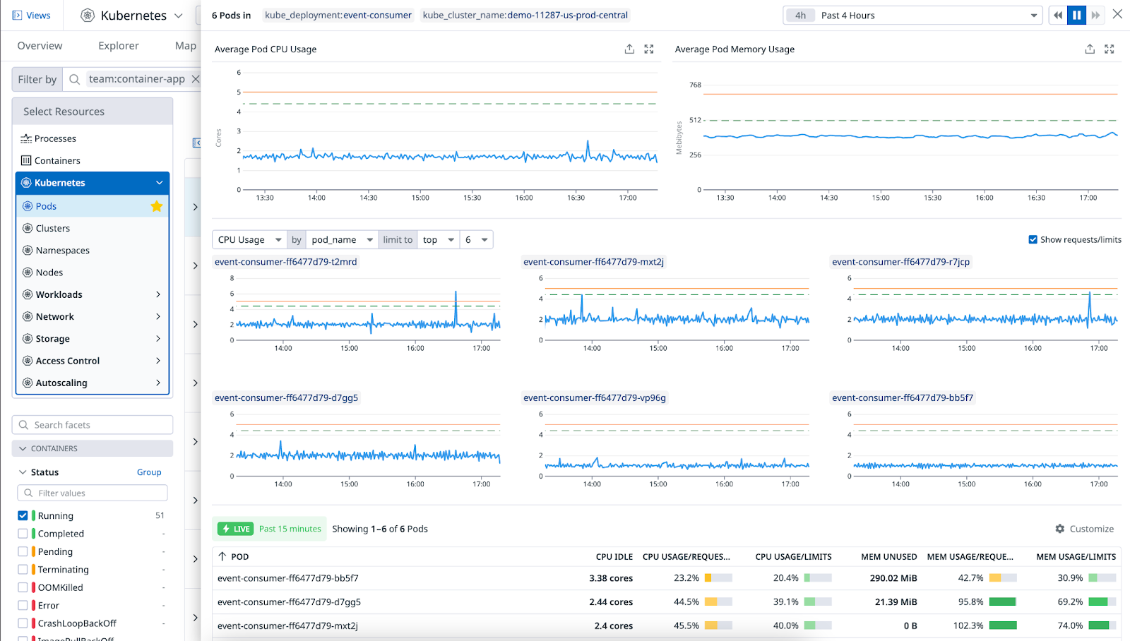
Clicking on a row opens a side panel with the combination of CPU and memory data for each group, with detailed graphs for each pod or container, and a top list of pods.
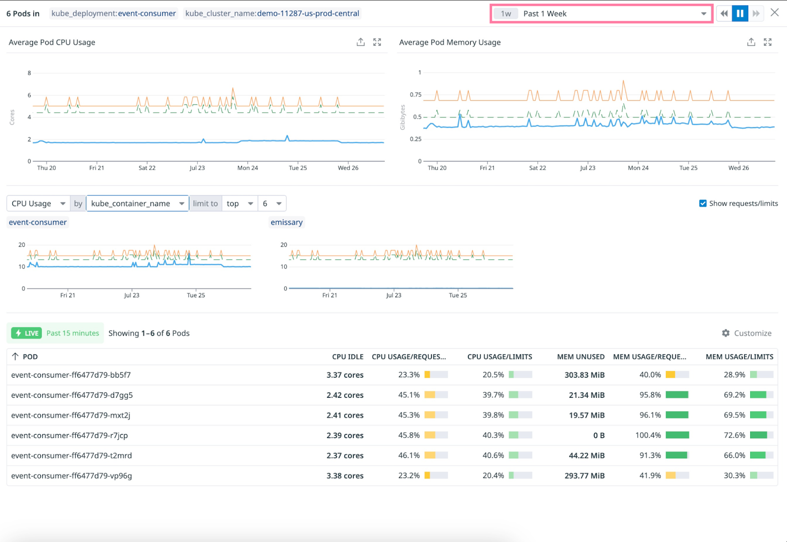
The individual pod or container graphs help you identify outliers that may impact the group in the case of load imbalance. By default, graphs are grouped by pod_name to show individual pods. You can change this to group by kube_container_name to identify which container(s) contribute the most to over/under provisioning in the case of multi-container pods.
Optimize idle resources
Idle CPU and memory are necessary to ensure that your application has room to grow without pods being immediately throttled or killed.
Too much idle CPU and memory can result in unnecessarily higher costs, but the alternative creates the risk of performance and reliability degradation if resource usage increases.
To help find this balance, adjust the graphs to look at a longer timespan, and avoid making resource sizing decisions based on the most recent usage only. These metrics are standard Kubernetes metrics, so you can query them like all Datadog metrics—for example, for the last 15 months, at full resolution if needed.
Known limitations
Metrics are not displayed for groups containing at least one pod with containers that do not set requests or limits, as Datadog cannot infer the usage percentage without them. These groups without metrics appear last, regardless of the sorting order.
The summation of resource requests and limits for a group is independent of the state of resources belonging to that group. These values may differ from the ones displayed on companion metric graphs.
Further Reading
Additional helpful documentation, links, and articles:


