- Essentials
- Getting Started
- Datadog
- Datadog Site
- DevSecOps
- Serverless for AWS Lambda
- Agent
- Integrations
- Containers
- Dashboards
- Monitors
- Logs
- APM Tracing
- Profiler
- Tags
- API
- Service Catalog
- Session Replay
- Continuous Testing
- Synthetic Monitoring
- Incident Management
- Database Monitoring
- Cloud Security Management
- Cloud SIEM
- Application Security Management
- Workflow Automation
- CI Visibility
- Test Visibility
- Test Impact Analysis
- Code Analysis
- Learning Center
- Support
- Glossary
- Standard Attributes
- Guides
- Agent
- Integrations
- OpenTelemetry
- Developers
- Authorization
- DogStatsD
- Custom Checks
- Integrations
- Create an Agent-based Integration
- Create an API Integration
- Create a Log Pipeline
- Integration Assets Reference
- Build a Marketplace Offering
- Create a Tile
- Create an Integration Dashboard
- Create a Recommended Monitor
- Create a Cloud SIEM Detection Rule
- OAuth for Integrations
- Install Agent Integration Developer Tool
- Service Checks
- IDE Plugins
- Community
- Guides
- API
- Datadog Mobile App
- CoScreen
- Cloudcraft
- In The App
- Dashboards
- Notebooks
- DDSQL Editor
- Sheets
- Monitors and Alerting
- Infrastructure
- Metrics
- Watchdog
- Bits AI
- Service Catalog
- API Catalog
- Error Tracking
- Service Management
- Infrastructure
- Application Performance
- APM
- Continuous Profiler
- Database Monitoring
- Data Streams Monitoring
- Data Jobs Monitoring
- Digital Experience
- Real User Monitoring
- Product Analytics
- Synthetic Testing and Monitoring
- Continuous Testing
- Software Delivery
- CI Visibility
- CD Visibility
- Test Optimization
- Code Analysis
- Quality Gates
- DORA Metrics
- Security
- Security Overview
- Cloud SIEM
- Cloud Security Management
- Application Security Management
- AI Observability
- Log Management
- Observability Pipelines
- Log Management
- Administration
Metrics Explorer
Overview
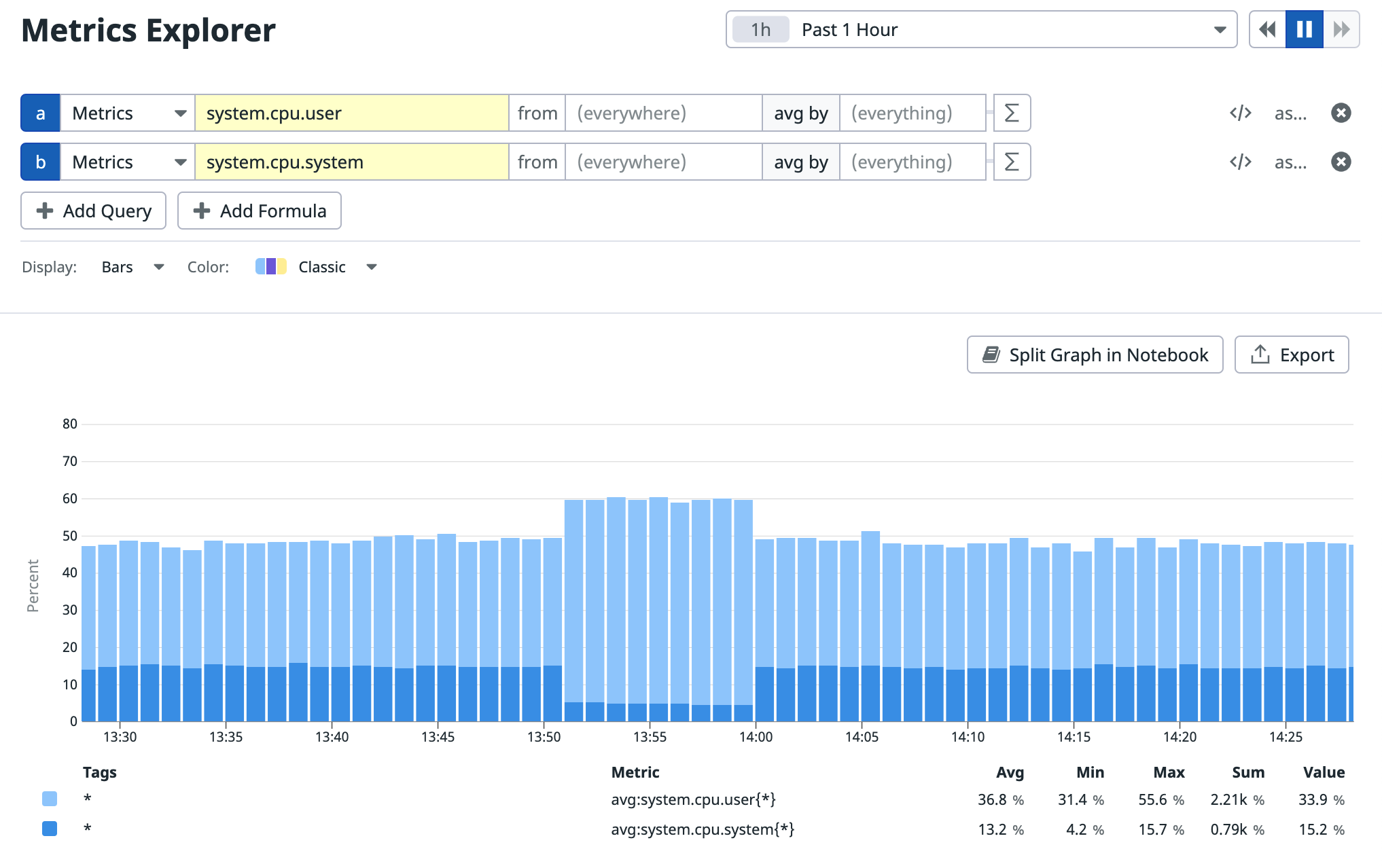
The Metrics Explorer is a basic interface for examining your metrics in Datadog. For more advanced options, create a notebook or dashboard (screenboard, or timeboard).
Graphing
Use the query editor to customize the graph displayed on the Metrics Explorer page.
You can specify the time frame in the top right corner of the page. The default is Past 1 Hour.
Metrics that are not reported in the last 24 hours do not appear in the query editor. You can add these metrics to your graphs manually by entering the metric name or full query.
Scope
Define a filtering scope with the from text box by selecting or searching for tag values. For example, you can use the from text box to filter metric values from a specific host, cluster, environment, or region.
Space aggregation
Define the space aggregation used to combine a metric’s values.
The possible options are:
- Average of reported values (default)
- Max of reported values
- Min of reported values
- Sum of reported values
Note: The options may differ based on the metric type selected.
Functions and formulas
You can optionally add functions to your query using the function button. Not all functions are available for all metric types. For more information, see the querying documentation.
Export
Export your graph to a dashboard or notebook with the buttons at the top right. You can also use Split Graph in Notebook to view the data split into individual graphs by things like region, service, or environment.
Quick Graphs
With Quick Graphs, you have more options to visualize your data, without needing to create a Dashboard or Notebook. These graphs are useful for understanding and troubleshooting issues without creating permanent dashboards or complex visualization setups.
For more information, see the Quick Graphs documentation.
Further reading
Additional helpful documentation, links, and articles:

