- Essentials
- Getting Started
- Glossary
- Standard Attributes
- Guides
- Agent
- Integrations
- Developers
- Authorization
- DogStatsD
- Custom Checks
- Integrations
- Create an Agent-based Integration
- Create an API Integration
- Create a Log Pipeline
- Integration Assets Reference
- Build a Marketplace Offering
- Create a Tile
- Create an Integration Dashboard
- Create a Monitor Template
- Create a Cloud SIEM Detection Rule
- OAuth for Integrations
- Install Agent Integration Developer Tool
- Service Checks
- IDE Plugins
- Community
- Guides
- OpenTelemetry
- Administrator's Guide
- API
- Datadog Mobile App
- CoScreen
- CoTerm
- Cloudcraft (Standalone)
- In The App
- Dashboards
- Notebooks
- DDSQL Editor
- Reference Tables
- Sheets
- Monitors and Alerting
- Metrics
- Watchdog
- Bits AI
- Software Catalog
- Error Tracking
- Change Tracking
- Service Management
- Actions & Remediations
- Infrastructure
- Cloudcraft
- Resource Catalog
- Universal Service Monitoring
- Hosts
- Containers
- Processes
- Serverless
- Network Monitoring
- Cloud Cost
- Application Performance
- APM
- Continuous Profiler
- Database Monitoring
- Agent Integration Overhead
- Setup Architectures
- Setting Up Postgres
- Setting Up MySQL
- Setting Up SQL Server
- Setting Up Oracle
- Setting Up Amazon DocumentDB
- Setting Up MongoDB
- Connecting DBM and Traces
- Data Collected
- Exploring Database Hosts
- Exploring Query Metrics
- Exploring Query Samples
- Exploring Recommendations
- Troubleshooting
- Guides
- Data Streams Monitoring
- Data Jobs Monitoring
- Digital Experience
- Real User Monitoring
- Product Analytics
- Synthetic Testing and Monitoring
- Continuous Testing
- Software Delivery
- CI Visibility
- CD Visibility
- Test Optimization
- Quality Gates
- DORA Metrics
- Security
- Security Overview
- Cloud SIEM
- Cloud Security Management
- Application Security Management
- Sensitive Data Scanner
- Code Security
- AI Observability
- Log Management
- Observability Pipelines
- Log Management
- Administration
Text label Component
Overview
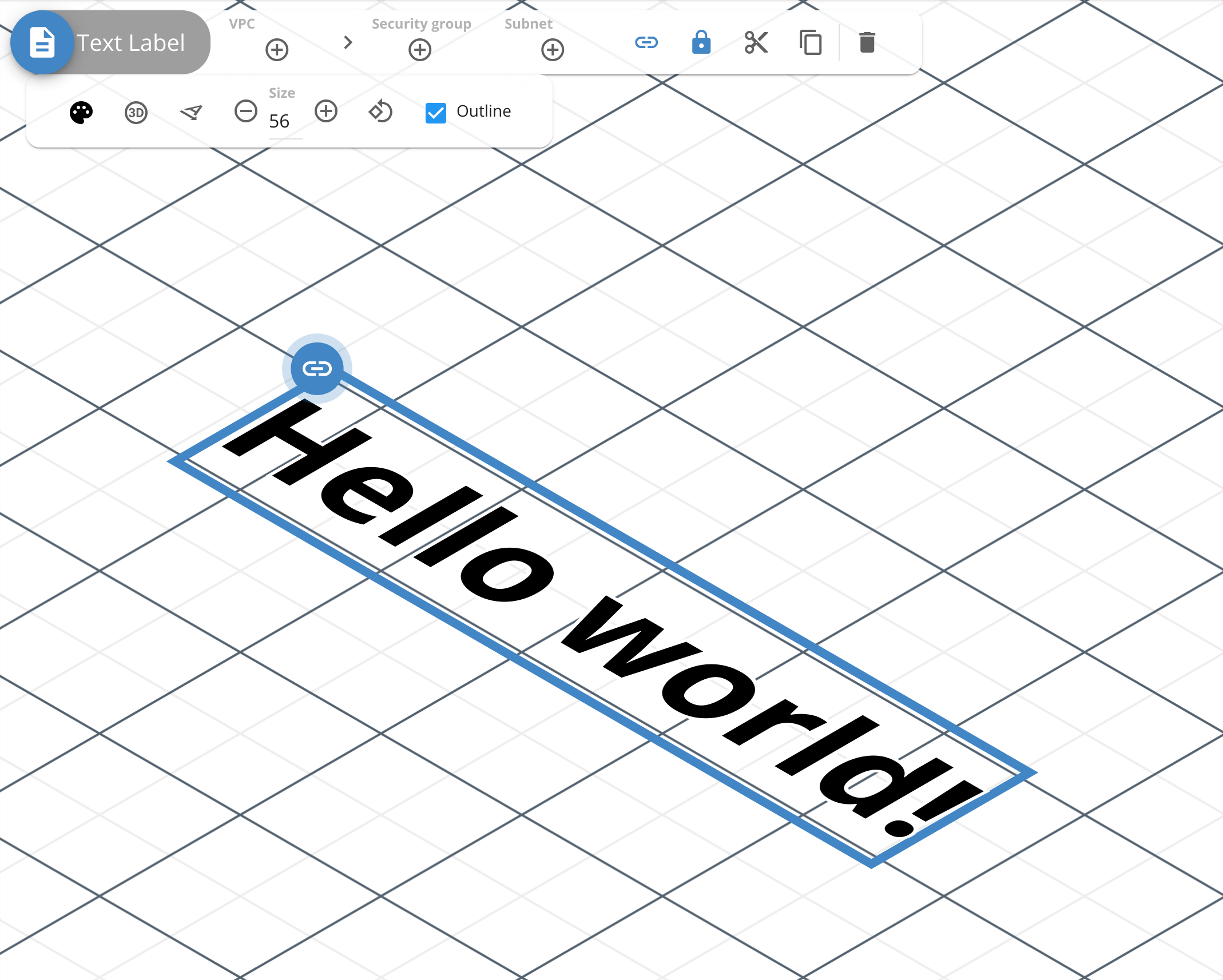
The Text label component can be used to label components, icons, and areas in a diagram, increasing readability and visual appeal.
Toolbar
Use the toolbar to configure and customize the component. The following options are available:
- Color: Select a predefined color or enter the hexadecimal value for the color. Accepts the same color for both 2D and 3D view, or different colors for each.
- Toggle 3D/2D projection: Display the label in 3D or 2D view.
- Toggle flat/standing projection: Display the label flat or standing. Not available when 2D projection is toggled.
- Size: The size of the text label. Accepts a maximum value of 112.
- Rotate item: Rotate a text label component and change its direction.
- Outline: Add an outline to the text label for increased color contrast.
API
Use the Cloudcraft API to programmatically access and render your architecture diagrams as JSON objects. The following is an example JSON object of a Text label component:
{
  "type": "isotext",
  "id": "8f2a0f5f-c373-42dd-b4df-f06f455f5f94",
  "mapPos": [3.5, 9],
  "text": "Hello world!",
  "textSize": 56,
  "isometric": true,
  "standing": false,
  "direction": "down",
  "outline": true,
  "color": {
    "2d": "#000000",
    "isometric": "#000000"
  },
  "link": "https://blog.cloudcraft.co/welcome-to-cloudcraft/",
  "locked": true
}
- type: isotext: The type of component.
- id: string: A unique identifier for the component in the
uuidformat. - mapPos: [number, number]: The position of the component in the blueprint, expressed as a x,y coordinate pair.
- text: string: The text used for the label.
- textSize: number: The size of the text label. Defaults to 25.
- isometric: boolean: If true, the label is displayed using a 3D projection, while false displays the label in a 2D projection. Defaults to true.
- standing: boolean: If true, displays the label in a standing position instead of flat. Defaults to false.
- direction: string: The rotation or direction of the label. Accepts
down, up, right, leftas value, withdownas the default. - outline: boolean: If true, adds an outline to the text to increase color contrast. Defaults to false.
- color: object: The fill color for the component.
- isometric: string: Fill color for the component in 3D view. Must be an hexadecimal color.
- 2d: string: Fill color for the component in 2D view. Must be an hexadecimal color.
- link: uri: Link component to another diagram in the
blueprint://IDformat or to external website in thehttps://LINKformat. - locked: boolean: If true, changes to the component through the application are disabled until unlocked.

