- Essentials
- Getting Started
- Agent
- API
- APM Tracing
- Containers
- Dashboards
- Database Monitoring
- Datadog
- Datadog Site
- DevSecOps
- Incident Management
- Integrations
- Logs
- Monitors
- OpenTelemetry
- Profiler
- Session Replay
- Security
- Serverless for AWS Lambda
- Software Catalog
- Software Delivery
- Synthetic Monitoring and Testing
- Tags
- Workflow Automation
- Learning Center
- Support
- Glossary
- Standard Attributes
- Guides
- Agent
- Integrations
- Developers
- Authorization
- DogStatsD
- Custom Checks
- Integrations
- Create an Agent-based Integration
- Create an API Integration
- Create a Log Pipeline
- Integration Assets Reference
- Build a Marketplace Offering
- Create a Tile
- Create an Integration Dashboard
- Create a Monitor Template
- Create a Cloud SIEM Detection Rule
- OAuth for Integrations
- Install Agent Integration Developer Tool
- Service Checks
- IDE Plugins
- Community
- Guides
- OpenTelemetry
- Administrator's Guide
- API
- Partners
- Datadog Mobile App
- DDSQL Reference
- CoScreen
- CoTerm
- Cloudcraft (Standalone)
- In The App
- Dashboards
- Notebooks
- DDSQL Editor
- Reference Tables
- Sheets
- Monitors and Alerting
- Metrics
- Watchdog
- Bits AI
- Internal Developer Portal
- Error Tracking
- Change Tracking
- Service Management
- Actions & Remediations
- Infrastructure
- Cloudcraft
- Resource Catalog
- Universal Service Monitoring
- Hosts
- Containers
- Processes
- Serverless
- Network Monitoring
- Cloud Cost
- Application Performance
- APM
- APM Terms and Concepts
- Application Instrumentation
- APM Metrics Collection
- Trace Pipeline Configuration
- Correlate Traces with Other Telemetry
- Trace Explorer
- Recommendations
- Code Origins for Spans
- Service Observability
- Endpoint Observability
- Dynamic Instrumentation
- Live Debugger
- Error Tracking
- Data Security
- Guides
- Troubleshooting
- Continuous Profiler
- Database Monitoring
- Agent Integration Overhead
- Setup Architectures
- Setting Up Postgres
- Setting Up MySQL
- Setting Up SQL Server
- Setting Up Oracle
- Setting Up Amazon DocumentDB
- Setting Up MongoDB
- Connecting DBM and Traces
- Data Collected
- Exploring Database Hosts
- Exploring Query Metrics
- Exploring Query Samples
- Exploring Database Schemas
- Exploring Recommendations
- Troubleshooting
- Guides
- Data Streams Monitoring
- Data Jobs Monitoring
- Digital Experience
- Real User Monitoring
- Synthetic Testing and Monitoring
- Continuous Testing
- Product Analytics
- Software Delivery
- CI Visibility
- CD Visibility
- Deployment Gates
- Test Optimization
- Quality Gates
- DORA Metrics
- Security
- Security Overview
- Cloud SIEM
- Code Security
- Cloud Security
- App and API Protection
- Workload Protection
- Sensitive Data Scanner
- AI Observability
- Log Management
- Observability Pipelines
- Log Management
- Administration
Product Analytics
Overview
Product Analytics helps you gain insight into user behavior and make data-driven decisions. It can help solve the following types of use cases in your application:
- Understand product adoption
- Track conversion rates and their evolution over time
- Track key user behavior patterns
- Visualize the most and least interacted with buttons on a given page
Getting started
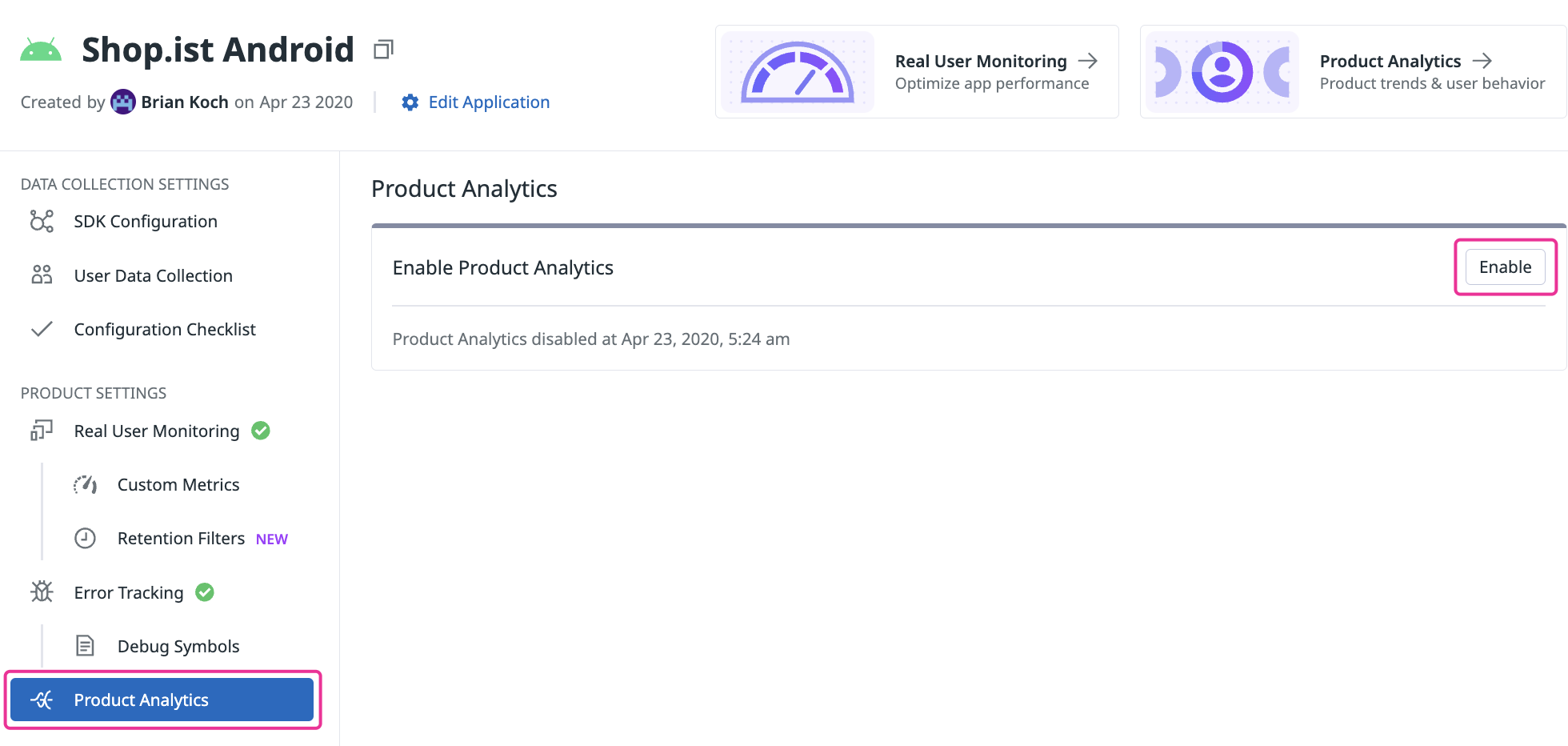
To start using Product Analytics, enable it for each application where you want to monitor user behavior:
- Select the application you want to monitor from the Application Management list.
- Under PRODUCT SETTINGS, click Product Analytics.
- Click the Enable button.
By default, Product Analytics data is retained for 15 months. Learn more about Privacy at Datadog.
Navigating the Product Analytics UI
Each Product Analytics feature provides context into your users’ journeys. This section describes the context each feature can provide for your individual use case.
Understand product adoption
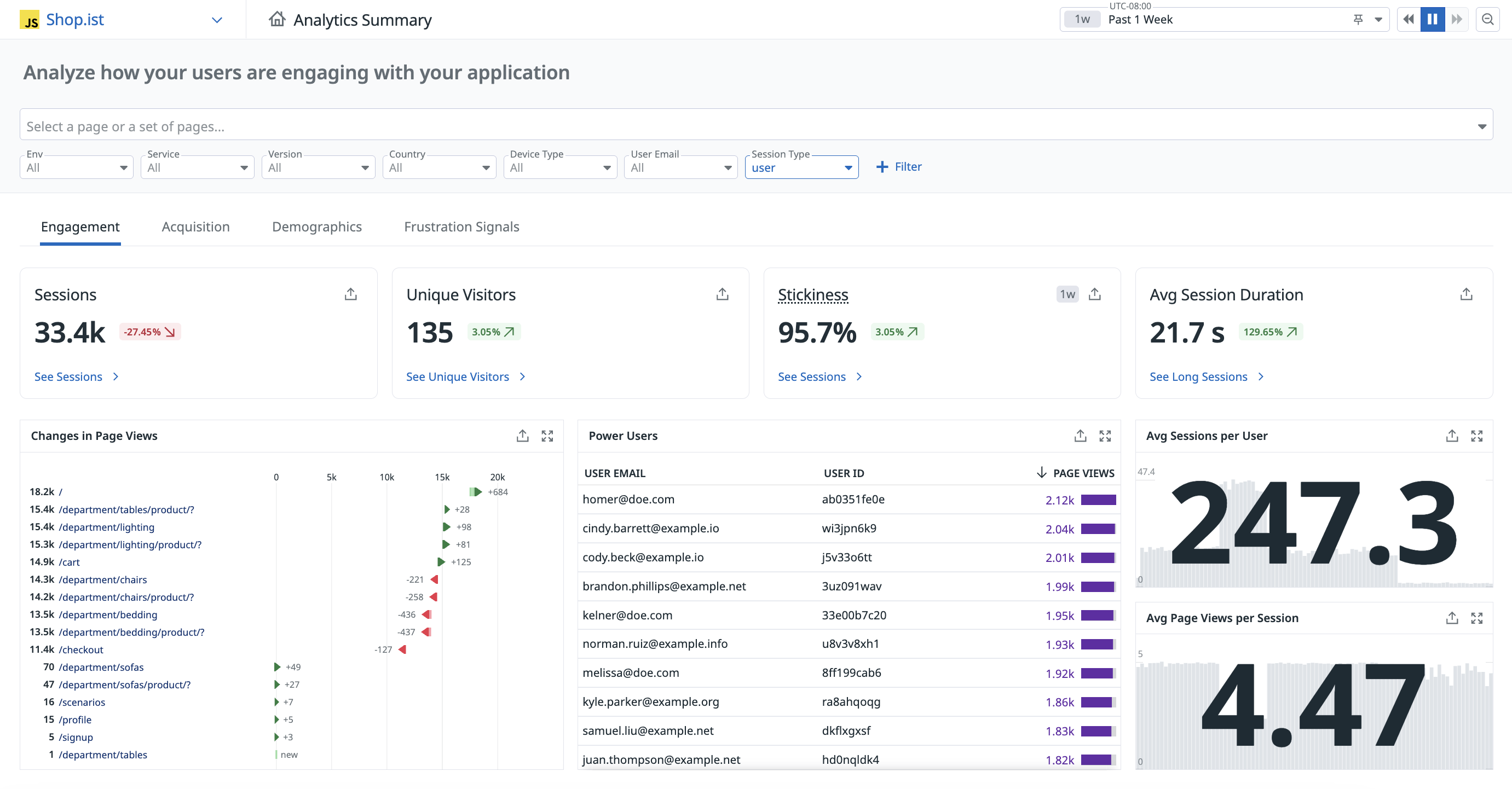
The Home page gives you a bird’s-eye view of your users’ activity and a pulse into your product’s adoption. This is where you most often land when accessing Product Analytics.
By default, this page displays the active users, page views and average time spent by user charts, but you have the ability to add additional charts or a dashboard. You can navigate to anywhere in Product Analytics from the home page.
Track conversion rates and their evolution over time
The Product Analytics charts help you visualize your users’ journey as they use your product.
Each chart type provides a different view into the user’s journey:
- Pathways
- you can visualize all user journeys across your application to analyze the critical path.
- Funnel
- track conversion rates across key workflows to identify and address any bottlenecks in end-to-end user journeys.
For example, you can see if customers drop off at a certain point due to poor website performance or measure how adding new steps to a workflow impacts drop off rate. - Retention
- measure how often users are successfully returning to a page or action to gain insights into overall user satisfaction.
- Analytics
- contains views data aggregation for understanding how your product is being used.
Track key user behavior patterns
You may want to better understand a specific group of users. This could be for the purpose of improving their user experience, or nudge them to buy the content in their cart. Regardless of the purpose, you can use the Users & Segment section to group your users based on a desired characteristic.
You can see the individual profiles of user, and create a segment, or a specified grouping, from these profiles to fit the behavior you would like to observe. For example, you can create a segment on users who have items in their carts but have not yet checked out to send an email nudging them to make a puchase.
Visualize the most and least interacted with buttons on a given page
Suppose you want to make changes to your application interface but want to first understand how users navigate in the page. Is there a specific path they take more than others? Can you make user actions and flows smoother? The following features can help you capture and replay your users’ browsing experience to inform your product change decisions.
- Session replay
- Expands your user experience monitoring by allowing you to capture and visually replay the web browsing or mobile app experience of your users.
This is beneficial for error identification, reproduction, and resolution, and provides insights into your application’s usage patterns and design pitfalls - Heatmaps
- This is a visualization of your user’s interactions overlaid on Session Replay data. Product Analytics has three different types of heatmaps: Click maps, Top elements, Scroll maps.
Use heatmaps to review complex data at a glance, gaining insights around optimizing your user experience. - Playlist
- You can create a playlist of Session Replays to organize them by any patterns you notice. Learn more about Session Replay Playlists.
Further reading
Additional helpful documentation, links, and articles:


