- Essentials
- Getting Started
- Agent
- API
- APM Tracing
- Containers
- Dashboards
- Database Monitoring
- Datadog
- Datadog Site
- DevSecOps
- Incident Management
- Integrations
- Logs
- Monitors
- OpenTelemetry
- Profiler
- Session Replay
- Security
- Serverless for AWS Lambda
- Software Catalog
- Software Delivery
- Synthetic Monitoring and Testing
- Tags
- Workflow Automation
- Learning Center
- Support
- Glossary
- Standard Attributes
- Guides
- Agent
- Integrations
- Developers
- Authorization
- DogStatsD
- Custom Checks
- Integrations
- Create an Agent-based Integration
- Create an API Integration
- Create a Log Pipeline
- Integration Assets Reference
- Build a Marketplace Offering
- Create a Tile
- Create an Integration Dashboard
- Create a Monitor Template
- Create a Cloud SIEM Detection Rule
- OAuth for Integrations
- Install Agent Integration Developer Tool
- Service Checks
- IDE Plugins
- Community
- Guides
- OpenTelemetry
- Administrator's Guide
- API
- Partners
- Datadog Mobile App
- DDSQL Reference
- CoScreen
- CoTerm
- Cloudcraft (Standalone)
- In The App
- Dashboards
- Notebooks
- DDSQL Editor
- Reference Tables
- Sheets
- Monitors and Alerting
- Metrics
- Watchdog
- Bits AI
- Internal Developer Portal
- Error Tracking
- Change Tracking
- Service Management
- Actions & Remediations
- Infrastructure
- Cloudcraft
- Resource Catalog
- Universal Service Monitoring
- Hosts
- Containers
- Processes
- Serverless
- Network Monitoring
- Cloud Cost
- Application Performance
- APM
- APM Terms and Concepts
- Application Instrumentation
- APM Metrics Collection
- Trace Pipeline Configuration
- Correlate Traces with Other Telemetry
- Trace Explorer
- Recommendations
- Code Origins for Spans
- Service Observability
- Endpoint Observability
- Dynamic Instrumentation
- Live Debugger
- Error Tracking
- Data Security
- Guides
- Troubleshooting
- Continuous Profiler
- Database Monitoring
- Agent Integration Overhead
- Setup Architectures
- Setting Up Postgres
- Setting Up MySQL
- Setting Up SQL Server
- Setting Up Oracle
- Setting Up Amazon DocumentDB
- Setting Up MongoDB
- Connecting DBM and Traces
- Data Collected
- Exploring Database Hosts
- Exploring Query Metrics
- Exploring Query Samples
- Exploring Database Schemas
- Exploring Recommendations
- Troubleshooting
- Guides
- Data Streams Monitoring
- Data Jobs Monitoring
- Data Observability
- Digital Experience
- Real User Monitoring
- Synthetic Testing and Monitoring
- Continuous Testing
- Product Analytics
- Software Delivery
- CI Visibility
- CD Visibility
- Deployment Gates
- Test Optimization
- Quality Gates
- DORA Metrics
- Security
- Security Overview
- Cloud SIEM
- Code Security
- Cloud Security
- App and API Protection
- Workload Protection
- Sensitive Data Scanner
- AI Observability
- Log Management
- Observability Pipelines
- Log Management
- Administration
Understanding rollup function and cardinality in visualizations
Overview
Visualizations in data analysis often rely on aggregation functions to summarize data over time. One common challenge arises when the rollup function and distinct or unique cardinality measures interact with each other, leading to unexpected results when visualizing data.
By aligning expectations with the nature of rollup results and employing clear queries, you can gain valuable insights from your data. This document explains how the rollup function operates, particularly in the context of cardinality, and provides best practices on how to interpret visualization results accurately.
Understanding cardinality in timeseries
Unique vs Distinct Users
When analyzing user data, it’s important to understand the difference between unique and distinct users:
- Unique Users: The total number of different people who visit your website, counted only once regardless of how many times they visit.
- Distinct Users: The number of different users who appear in each time window, which can vary based on the size of the window.
Consider a scenario where you track distinct users visiting a website. Each day for seven days, you observe 100 unique users, leading you to assume a total of 700 users. However, the actual number of distinct users over the week might be 400, as many users visit the site on multiple days. This discrepancy arises because each time frame (such as each day) independently counts unique users, inflating the total when compared to a single, longer rollup timeframe.
How Rollup Affects Averages
The rollup function also significantly impacts how averages are calculated and displayed in visualizations:
Smoothing Effect:
- Longer time periods (30-minute rollups) create smoother graphs.
- Shorter time periods (5-minute rollups) show more detailed spikes and variations.
Average Calculations:
- In shorter time periods, averages might be lower as we only catch users in that exact moment.
- In longer time periods, averages might be higher as we catch more instances of users using different devices.
- This isn’t a bug, it’s a natural result of how users interact with your service over time.
This counterintuitive result is due to cardinality, which refers to how unique elements in a dataset are counted. The cardinality for each time bucket can be complex. When analyzing unique users, consider the question: “How many unique users were there each day this week?” If a user visits on two separate days, they count as unique for each day.
Example: How rollup affects unique user counts
Visualizations display the sum of values over different intervals, which can create confusion when comparing totals across time periods. For example, a graph might show different totals for the same metric when viewed at different time scales (like 5-minute versus 30-minute intervals). This difference occurs because users can be counted multiple times in shorter time windows, but only once in longer time windows.
This walkthrough demonstrates how rollup functions and cardinality interact in practice. Consider a website that tracks user sessions on mobile and desktop.
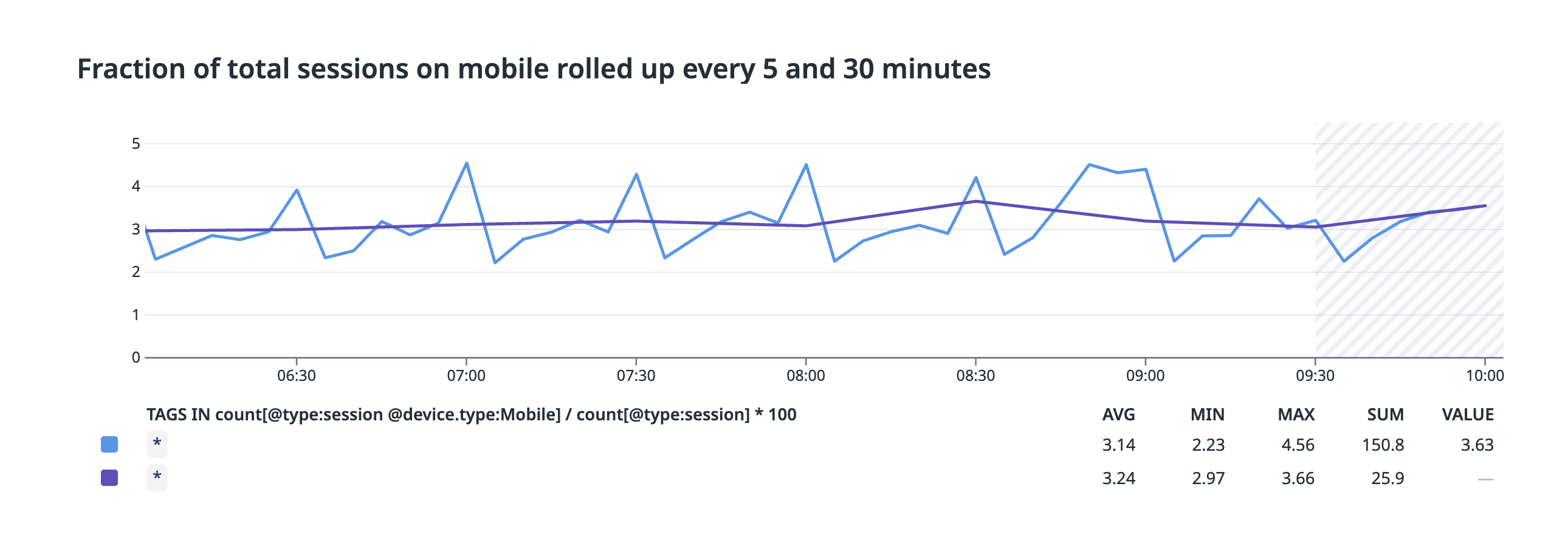
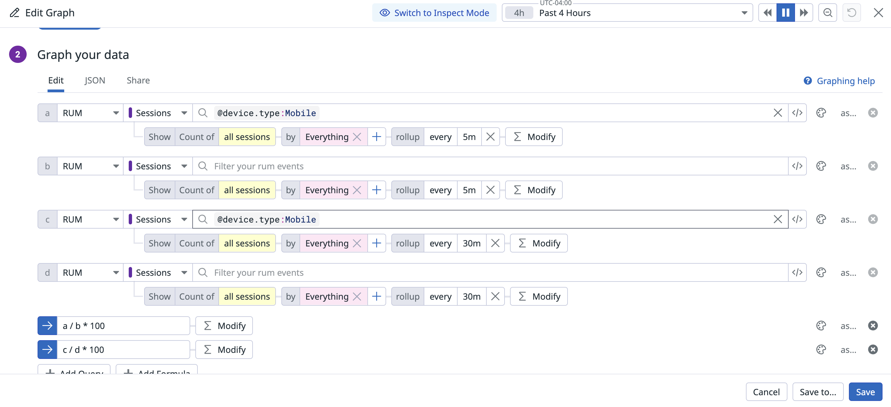
When you take an average of sessions on mobile and roll it up every 30 minutes, you get a smoothed version of the graph. This smoothing effect is a natural result of the rollup function, making the visualization easier to interpret for longer-term trends.
Configuration
Configuration
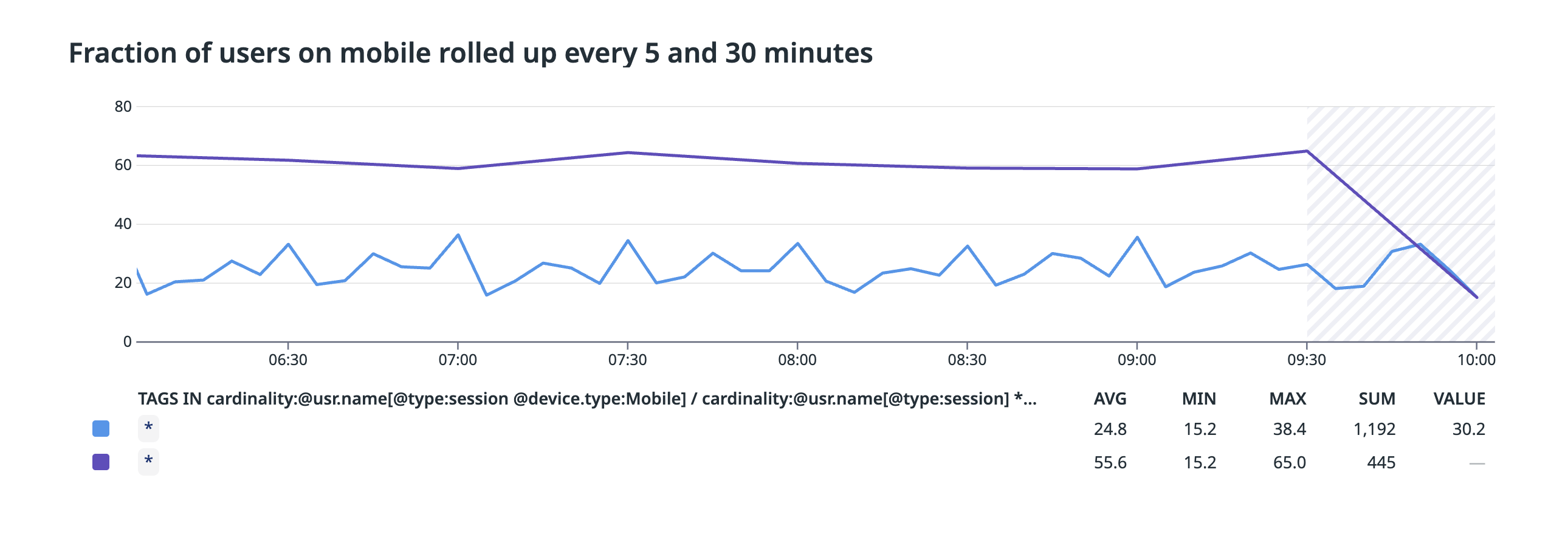
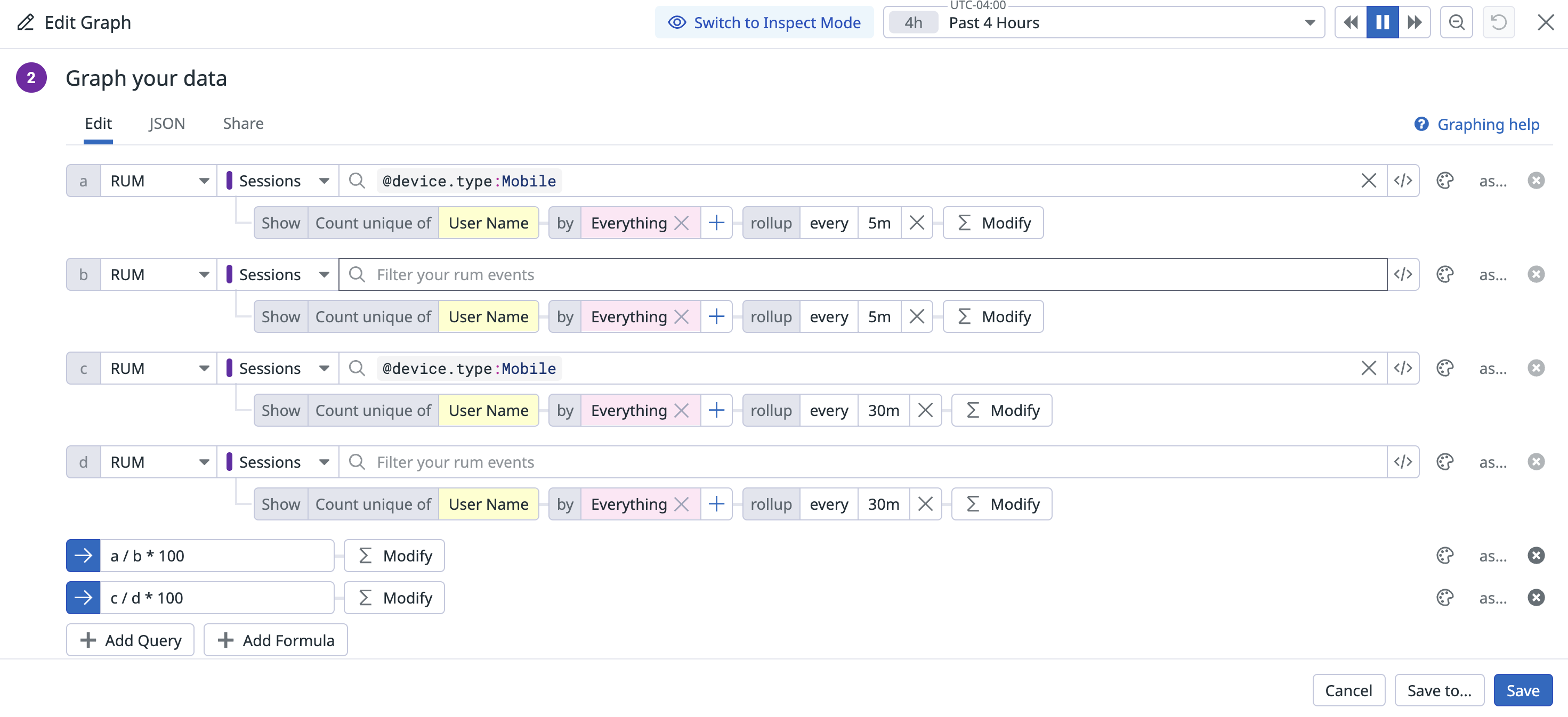
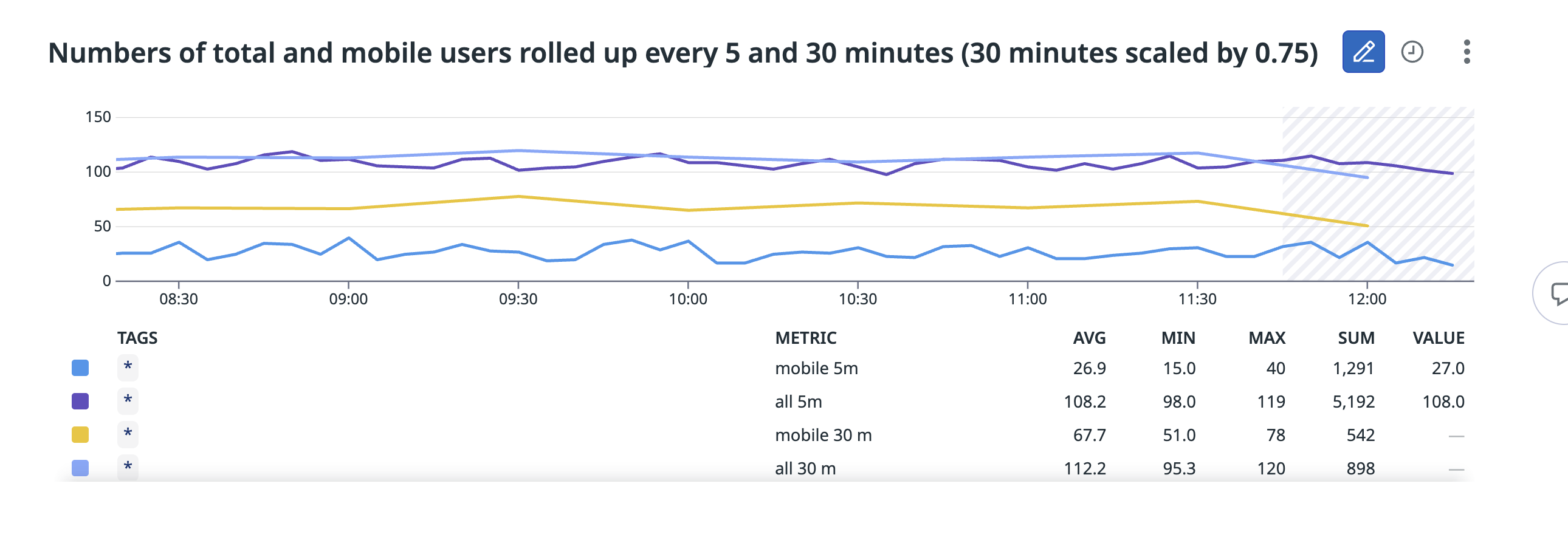
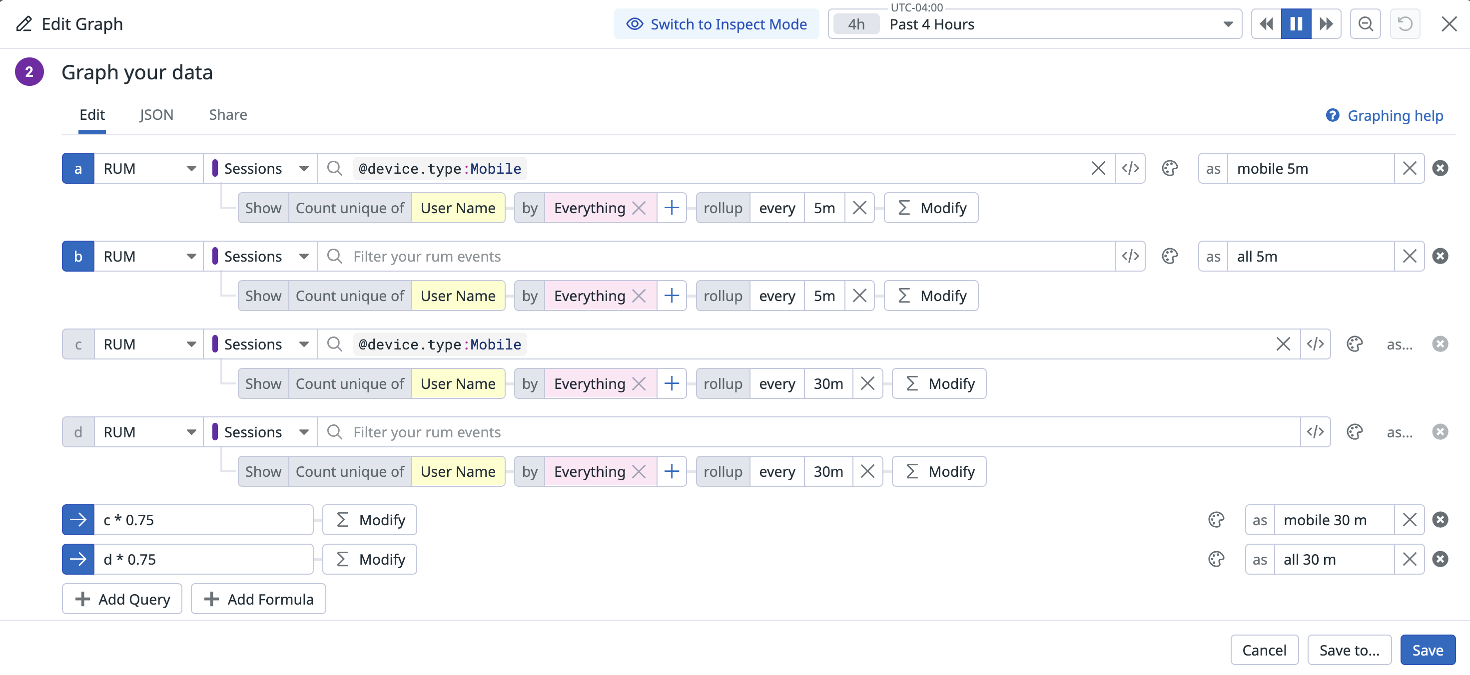
However, when you group by users, the two graphs don’t overlap: the 30-minute graph is significantly higher than the 5-minute graph. This might look like a bug at first glance, but it’s actually showing us how users interact with the service over different time periods.
Configuration
Configuration
Looking at the individual graphs, you’ll see the numbers align in the following way. The 30-minute rollups are, of course, larger than the 5-minute rollups. When you scale them down by a factor of 0.75, the total number of distinct users roughly aligns with the 5-minute rollup, while the number of mobile distinct users is significantly higher. Why?
Configuration
Configuration
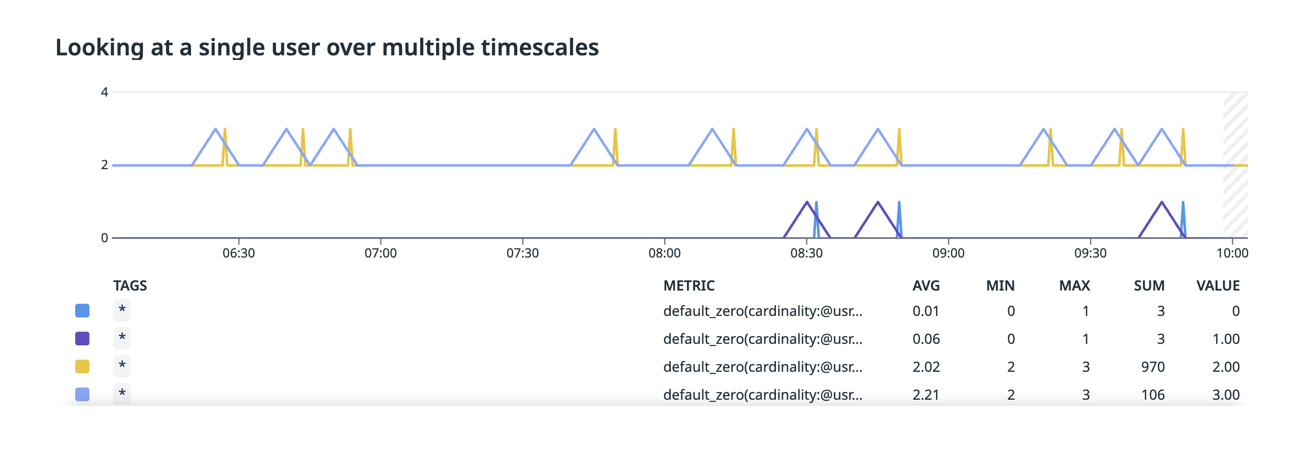
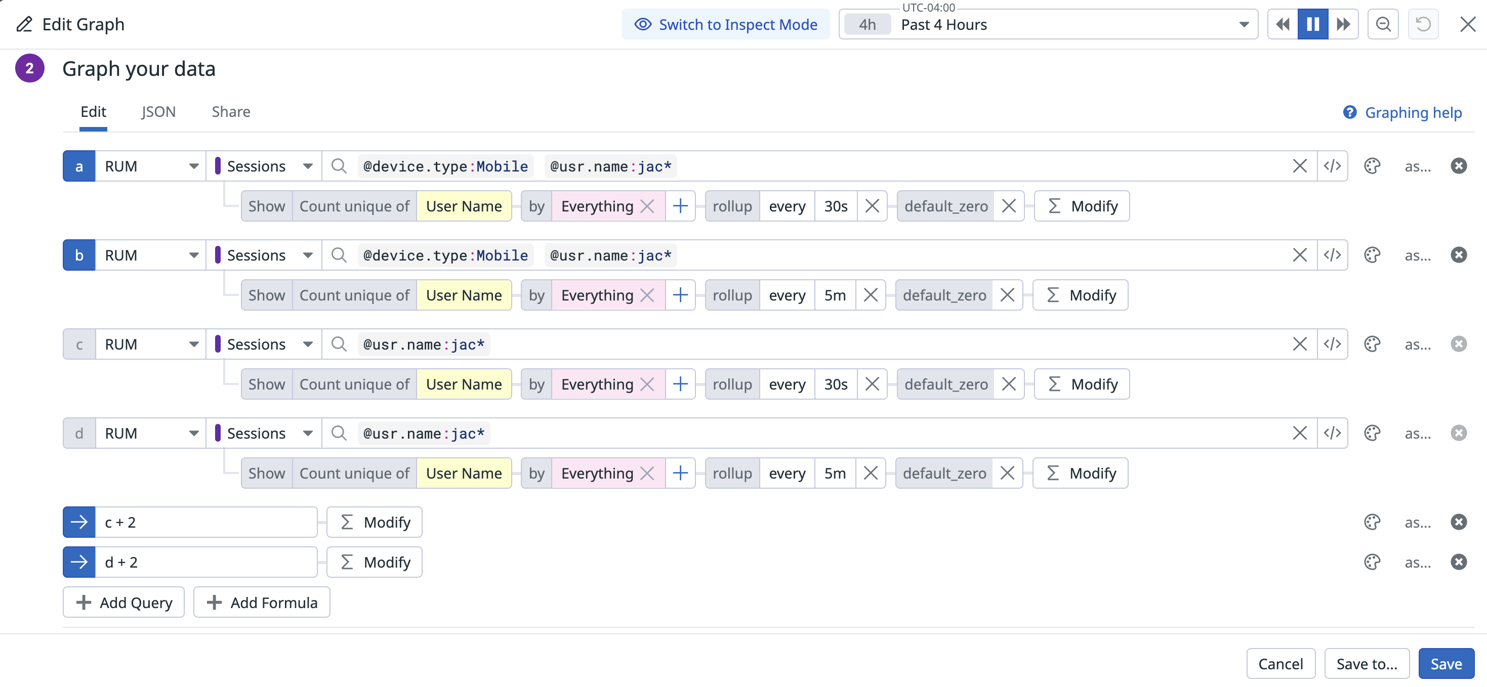
This occurs because when a user appears multiple times during a rollup window, they appear once in the denominator but multiple times in the numerator. In this case, a user may be using both mobile and desktop. The following graph shows two offset graphs for a single user. The bottom graph indicates whether the user appeared on mobile during the 30-second or 5-minute interval, while the top graph indicates whether the user appeared at all.
Since the user appeared during most minutes, but only occasionally on mobile, they appear more often on mobile in longer time frames.
Configuration
Configuration
Another way to understand this is that when a user appears multiple times in a window, each appearance represents an opportunity to appear in the numerator. In a longer time frame, each user will appear more times, creating more opportunities to (in this case) view the page on mobile.
To illustrate this concretely, imagine users who check the website on computers during the day, and only check on mobile during the morning or evening commute. If half check on the morning commute, half check on the evening commute, and half check on both (which leaves a quarter not checking at all on mobile):
A 12-hour rollup would show you 50% of users checking on mobile from midnight to noon (morning commute) and 50% checking from noon to midnight (evening commute).
A 24-hour rollup would show you 75% of users checking on mobile (either commute).
Similarly, a 1-hour rollup might show you 10-20% of users checking on mobile during the commute hours, and <1% during non-commute hours. This is much smaller than the larger timeframes, but still correct.
Further reading
Additional helpful documentation, links, and articles:
