- Essentials
- Getting Started
- Datadog
- Datadog Site
- DevSecOps
- Serverless for AWS Lambda
- Agent
- Integrations
- Containers
- Dashboards
- Monitors
- Logs
- APM Tracing
- Profiler
- Tags
- API
- Service Catalog
- Session Replay
- Continuous Testing
- Synthetic Monitoring
- Incident Management
- Database Monitoring
- Cloud Security Management
- Cloud SIEM
- Application Security Management
- Workflow Automation
- CI Visibility
- Test Visibility
- Intelligent Test Runner
- Code Analysis
- Learning Center
- Support
- Glossary
- Standard Attributes
- Guides
- Agent
- Integrations
- OpenTelemetry
- Developers
- Authorization
- DogStatsD
- Custom Checks
- Integrations
- Create an Agent-based Integration
- Create an API Integration
- Create a Log Pipeline
- Integration Assets Reference
- Build a Marketplace Offering
- Create a Tile
- Create an Integration Dashboard
- Create a Recommended Monitor
- Create a Cloud SIEM Detection Rule
- OAuth for Integrations
- Install Agent Integration Developer Tool
- Service Checks
- IDE Plugins
- Community
- Guides
- API
- Datadog Mobile App
- CoScreen
- Cloudcraft
- In The App
- Dashboards
- Notebooks
- DDSQL Editor
- Sheets
- Monitors and Alerting
- Infrastructure
- Metrics
- Watchdog
- Bits AI
- Service Catalog
- API Catalog
- Error Tracking
- Service Management
- Infrastructure
- Application Performance
- APM
- Continuous Profiler
- Database Monitoring
- Data Streams Monitoring
- Data Jobs Monitoring
- Digital Experience
- Real User Monitoring
- Product Analytics
- Synthetic Testing and Monitoring
- Continuous Testing
- Software Delivery
- CI Visibility
- CD Visibility
- Test Visibility
- Intelligent Test Runner
- Code Analysis
- Quality Gates
- DORA Metrics
- Security
- Security Overview
- Cloud SIEM
- Cloud Security Management
- Application Security Management
- AI Observability
- Log Management
- Observability Pipelines
- Log Management
- Administration
Selecting the right colors for your graphs
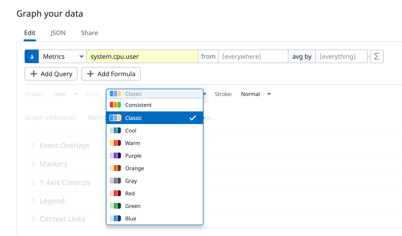
In Datadog graphs, color is the primary method by which you can distinguish between series of data. Selecting the right color for your graph ensures that your teammates can parse data in your graphs, draw insights, and troubleshoot effectively.
Types of color palettes
Categorical palettes
Categorical palettes are best used for data that needs to be differentiated, but does not follow a natural order—for example, availability zones.
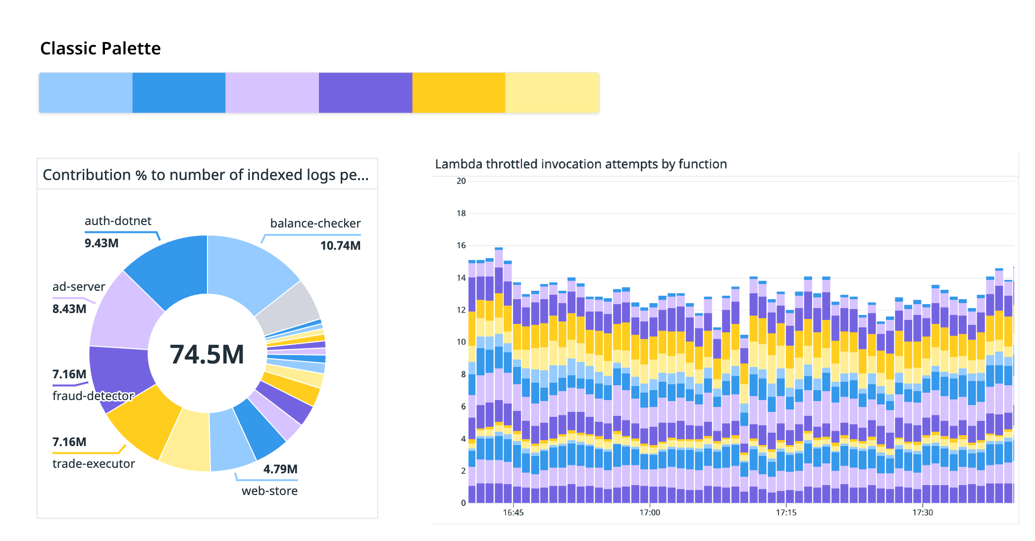
Classic
The default Classic palette uses a set of six distinct colors optimized for readability. Colors assigned to series repeat if the number of series exceeds six. Adjacent series typically have distinct colors. However, in rare conditions, adjacent series could use the same color if intermediate series have no value for partial timeframes.
The Classic color palette has visual accessibility support.
Consistent/Semantic
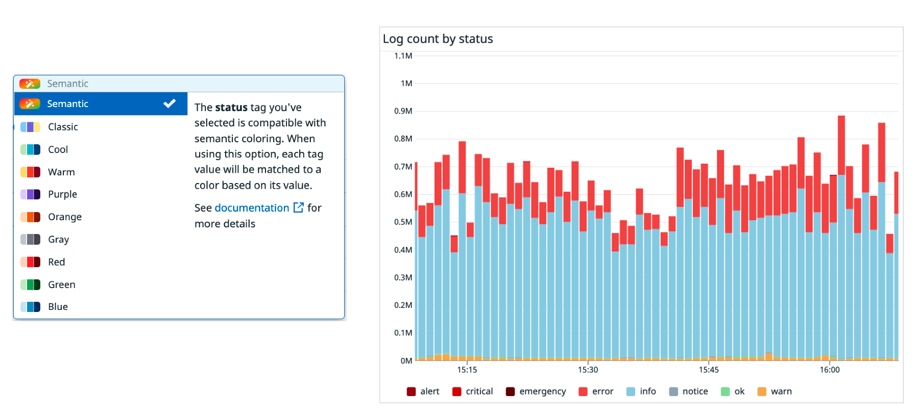
The Consistent palette allows you to assign the same color consistently to a series of data, making it easier to correlate data across charts. The Consistent palette does not guarantee that adjacent data series do not use the same color, and it does not have accessibility support.
For a small subset of compatible tags, Datadog automatically recognizes the meaning behind each series of data. In this case, the Consistent color palette appears as a Semantic color palette, which uses color to represent meaning. For instance, the color red may represent an error. See Compatible Semantic Tags for a list of supported tags.
Diverging palettes
Use a Diverging palette when you need to emphasize the difference in values within a data set. Diverging palettes are best suited to data that has a natural order and a natural midpoint. For example: the amount of change in memory utilization, from -100% to +100%, with a natural midpoint at 0%.
There are two Diverging palette options: cool (green and blue) or warm (interpolates between yellow and orange).
Sequential palettes
Use a Sequential palettes when you need to emphasize that different series in your dataset have something in common. This palette works well for data that has a natural order, such as the CPU utilization (from 0% to 100%) of a group of hosts.
Color options include purple, orange, gray, red, green, and blue.
When combined with color overrides, the Sequential palettes help you to distinguish results from multiple queries in a single chart.
Color overrides
Color overrides allow you to assign a single color of your choice to each query. This is particularly useful when distinguishing the results from multiple queries in a single chart.
Note: If your query aggregates by a tag (for instance, using ‘sum by’ or ‘avg by’), you can only select a palette override. This prevents different series from using the same color, preserving readability.
Accessibility settings
Datadog offers accessible color modes for graphs to cater to visual needs, including color vision deficiency, low visual acuity, and contrast sensitivity. Selecting an accessible color mode renders all graphs with the Classic palette in a set of accessible colors catered to a specific vision need. You can set an accessible color mode from the User Preferences page.


