- Essentials
- Getting Started
- Datadog
- Datadog Site
- DevSecOps
- Serverless for AWS Lambda
- Agent
- Integrations
- Containers
- Dashboards
- Monitors
- Logs
- APM Tracing
- Profiler
- Tags
- API
- Service Catalog
- Session Replay
- Continuous Testing
- Synthetic Monitoring
- Incident Management
- Database Monitoring
- Cloud Security Management
- Cloud SIEM
- Application Security Management
- Workflow Automation
- CI Visibility
- Test Visibility
- Intelligent Test Runner
- Code Analysis
- Learning Center
- Support
- Glossary
- Standard Attributes
- Guides
- Agent
- Integrations
- OpenTelemetry
- Developers
- Authorization
- DogStatsD
- Custom Checks
- Integrations
- Create an Agent-based Integration
- Create an API Integration
- Create a Log Pipeline
- Integration Assets Reference
- Build a Marketplace Offering
- Create a Tile
- Create an Integration Dashboard
- Create a Recommended Monitor
- Create a Cloud SIEM Detection Rule
- OAuth for Integrations
- Install Agent Integration Developer Tool
- Service Checks
- IDE Plugins
- Community
- Guides
- API
- Datadog Mobile App
- CoScreen
- Cloudcraft
- In The App
- Dashboards
- Notebooks
- DDSQL Editor
- Sheets
- Monitors and Alerting
- Infrastructure
- Metrics
- Watchdog
- Bits AI
- Service Catalog
- API Catalog
- Error Tracking
- Service Management
- Infrastructure
- Application Performance
- APM
- Continuous Profiler
- Database Monitoring
- Data Streams Monitoring
- Data Jobs Monitoring
- Digital Experience
- Real User Monitoring
- Product Analytics
- Synthetic Testing and Monitoring
- Continuous Testing
- Software Delivery
- CI Visibility
- CD Visibility
- Test Visibility
- Intelligent Test Runner
- Code Analysis
- Quality Gates
- DORA Metrics
- Security
- Security Overview
- Cloud SIEM
- Cloud Security Management
- Application Security Management
- AI Observability
- Log Management
- Observability Pipelines
- Log Management
- Administration
Span Visualizations
Overview
Visualizations define how the queried span data is displayed. Select relevant visualizations to surface valuable information, such as a list for individual events, or as timeseries or top lists for aggregates.
List view
The list view displays a list of spans that match the selected context, defined by the search bar query filter and a time range.
In the table, choose which information of interest to display as columns. Manage the columns by either:
- interacting with the table header row to sort, rearrange, or remove columns.
- selecting a facet from the facet panel on the left, or from the trace side panel after clicking on a specific span, to add a column for a field. You can also add columns from with the Options button.
The default sort for spans in the list visualization is by timestamp, with the most recent spans on top. To surface spans with lowest or highest value for a measure first, or to sort your spans lexicographically for the value of a tag, specify that column as the by column.
The configuration of the columns is stored alongside other elements of your troubleshooting context in saved views.
The Latency Breakdown of the trace might be missing for some spans if the trace is malformed or incomplete. For instance, the error and the rare samplers capture pieces of traces, without the guarantee of capturing the complete trace. In this case, the data is omitted to avoid displaying inconsistent or misleading latency information that would only make sense when the trace is complete.
When the query is filtered on error spans, select the Group into Issues option to visualize a list of Error Tracking issues instead of individual error spans. Click on any issue in the issue list to open the issue panel and access additional information about this group of errors.
From the issue details, click See all errors to view individual error spans grouped under this issue.
Note:Switch back to the Errors grouping to view individual errors, including non fingerprinted errors, i.e. errors without associated issue.
Timeseries
Use timeseries to visualize the evolution of a measure (or a count of unique tag values) over a selected time frame, and optionally split the data by up to three tags (grouping).
Note: The Live Explorer (15 minutes) allows grouping by only one dimension.
Aggregated views use additional query options, to define the measured tag dimension, the dimensions to group the query by, and the aggregation period. For example:
Choose to view the
Durationmeasure.Select the aggregation function for the
Durationmeasure. Selecting a measure lets you choose the aggregation function whereas selecting a qualitative attribute displays the unique count.Group the query by a dimension, for example,
Resource.Choose to display a number of either top or bottom values according to the selected tag.
Choose the rollup period, for example,
10min.
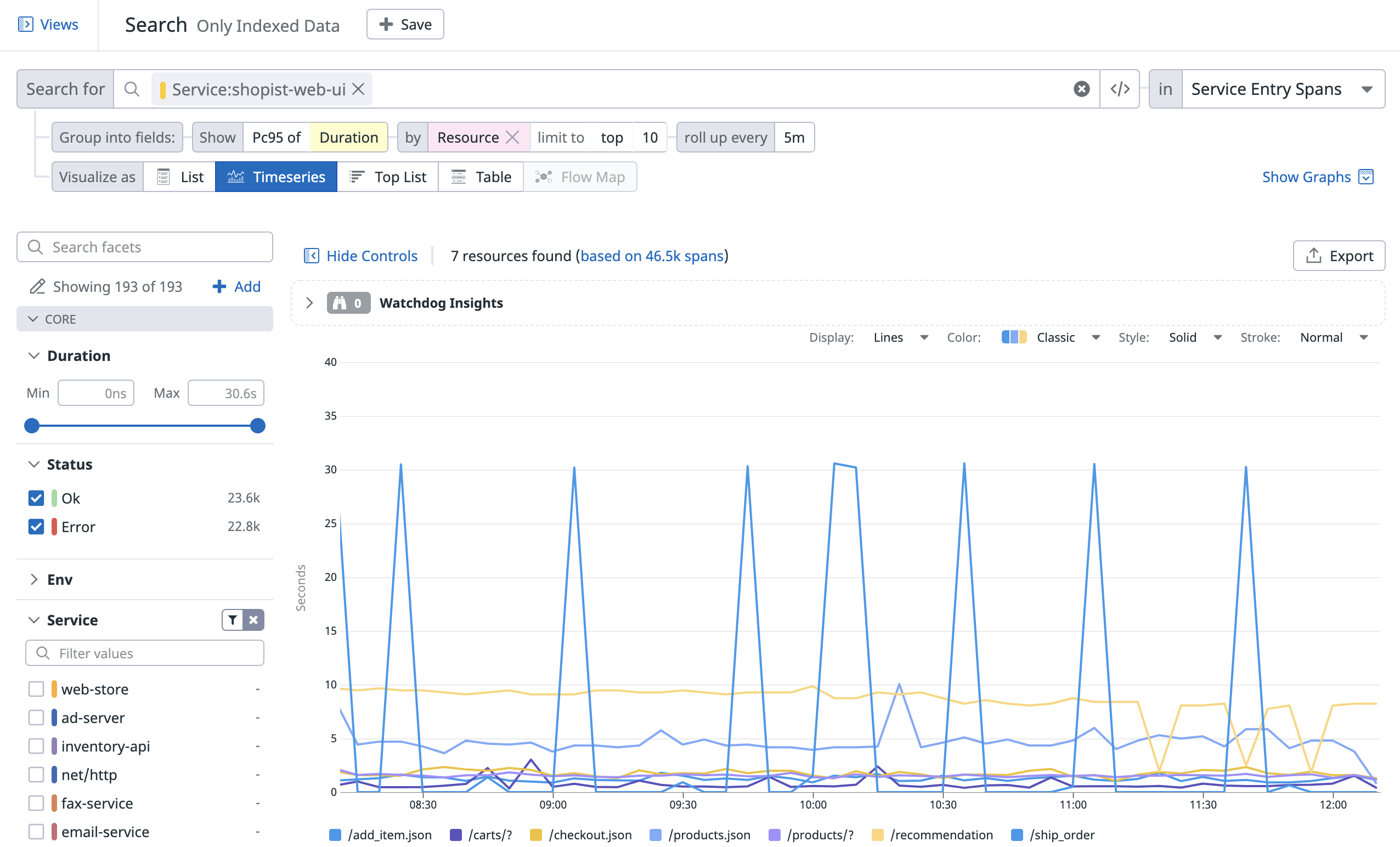
The following Trace Explorer timeseries view shows the evolution of the top ten resource names of the service shopist-web-ui according to the 95th percentile of Duration over the past four hours:
Choose additional display options for timeseries: the roll-up interval, whether you display results as bars (recommended for counts and unique counts), lines (recommended for statistical aggregations) or areas, and the colorset.
Top list
Use a top list to visualize a span count, a count of unique tag values, or a measure split by one tag dimension.
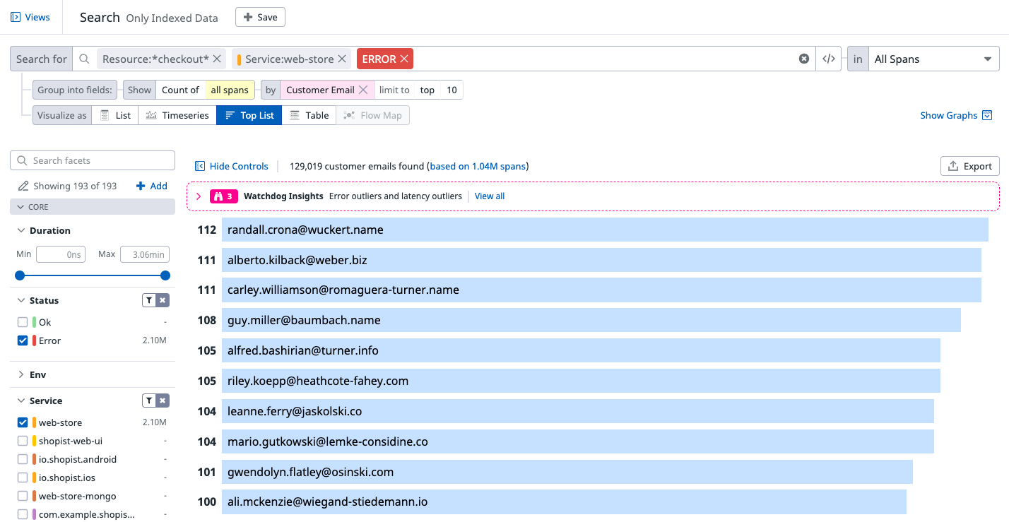
For example, the following top list shows the top ten website customers that experienced an error at checkout over the past day, based on the span count.
Table
Use a table to visualize the top values from up to three dimension combinations according to a chosen measure or span count.
Note: A table visualization grouped by a single dimension is the same as a Top List, just with a different display.
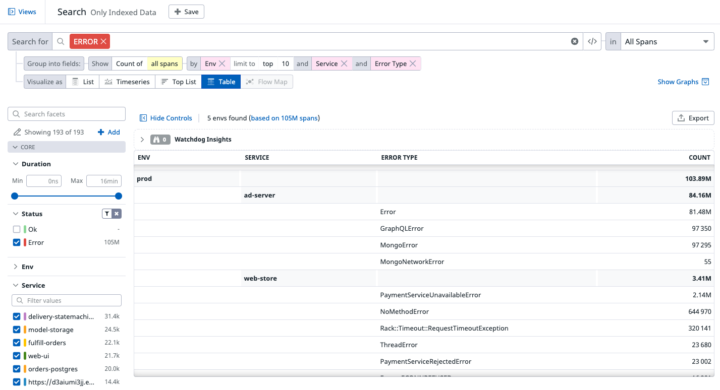
The following table shows the error spans count by Env, Service, and Error type.
Further Reading
Additional helpful documentation, links, and articles:


