- Principales informations
- Getting Started
- Datadog
- Site Datadog
- DevSecOps
- Serverless for AWS Lambda
- Agent
- Intégrations
- Conteneurs
- Dashboards
- Monitors
- Logs
- Tracing
- Profileur
- Tags
- API
- Service Catalog
- Session Replay
- Continuous Testing
- Surveillance Synthetic
- Incident Management
- Database Monitoring
- Cloud Security Management
- Cloud SIEM
- Application Security Management
- Workflow Automation
- CI Visibility
- Test Visibility
- Intelligent Test Runner
- Code Analysis
- Learning Center
- Support
- Glossary
- Standard Attributes
- Guides
- Agent
- Intégrations
- OpenTelemetry
- Développeurs
- Authorization
- DogStatsD
- Checks custom
- Intégrations
- Create an Agent-based Integration
- Create an API Integration
- Create a Log Pipeline
- Integration Assets Reference
- Build a Marketplace Offering
- Create a Tile
- Create an Integration Dashboard
- Create a Recommended Monitor
- Create a Cloud SIEM Detection Rule
- OAuth for Integrations
- Install Agent Integration Developer Tool
- Checks de service
- IDE Plugins
- Communauté
- Guides
- Administrator's Guide
- API
- Application mobile
- CoScreen
- Cloudcraft
- In The App
- Dashboards
- Notebooks
- DDSQL Editor
- Alertes
- Infrastructure
- Métriques
- Watchdog
- Bits AI
- Service Catalog
- API Catalog
- Error Tracking
- Service Management
- Infrastructure
- Universal Service Monitoring
- Conteneurs
- Sans serveur
- Surveillance réseau
- Cloud Cost
- Application Performance
- APM
- Profileur en continu
- Database Monitoring
- Agent Integration Overhead
- Setup Architectures
- Configuration de Postgres
- Configuration de MySQL
- Configuration de SQL Server
- Setting Up Oracle
- Setting Up MongoDB
- Connecting DBM and Traces
- Données collectées
- Exploring Database Hosts
- Explorer les métriques de requête
- Explorer des échantillons de requêtes
- Dépannage
- Guides
- Data Streams Monitoring
- Data Jobs Monitoring
- Digital Experience
- RUM et Session Replay
- Product Analytics
- Surveillance Synthetic
- Continuous Testing
- Software Delivery
- CI Visibility
- CD Visibility
- Test Visibility
- Exécuteur de tests intelligent
- Code Analysis
- Quality Gates
- DORA Metrics
- Securité
- Security Overview
- Cloud SIEM
- Cloud Security Management
- Application Security Management
- AI Observability
- Log Management
- Pipelines d'observabilité
- Log Management
- Administration
Wildcard Widget Examples
Cette page n'est pas encore disponible en français, sa traduction est en cours.
Si vous avez des questions ou des retours sur notre projet de traduction actuel, n'hésitez pas à nous contacter.
Si vous avez des questions ou des retours sur notre projet de traduction actuel, n'hésitez pas à nous contacter.
Overview
The Wildcard widget provides a powerful way to create custom visualizations in Datadog dashboards using Vega-Lite, a declarative language for creating interactive graphics. This flexibility allows you to build visualizations that go beyond the standard widget offerings, enabling you to represent your data in ways that best suit your specific monitoring and analysis needs.
These examples are designed to showcase the flexibility and power of the Wildcard widget, allowing you to create custom visualizations beyond what’s available in standard widgets. Each example includes a description of key features, a visual preview, and the complete Vega-Lite configuration code that you can copy and adapt for your own dashboards.
Geomap with data transform
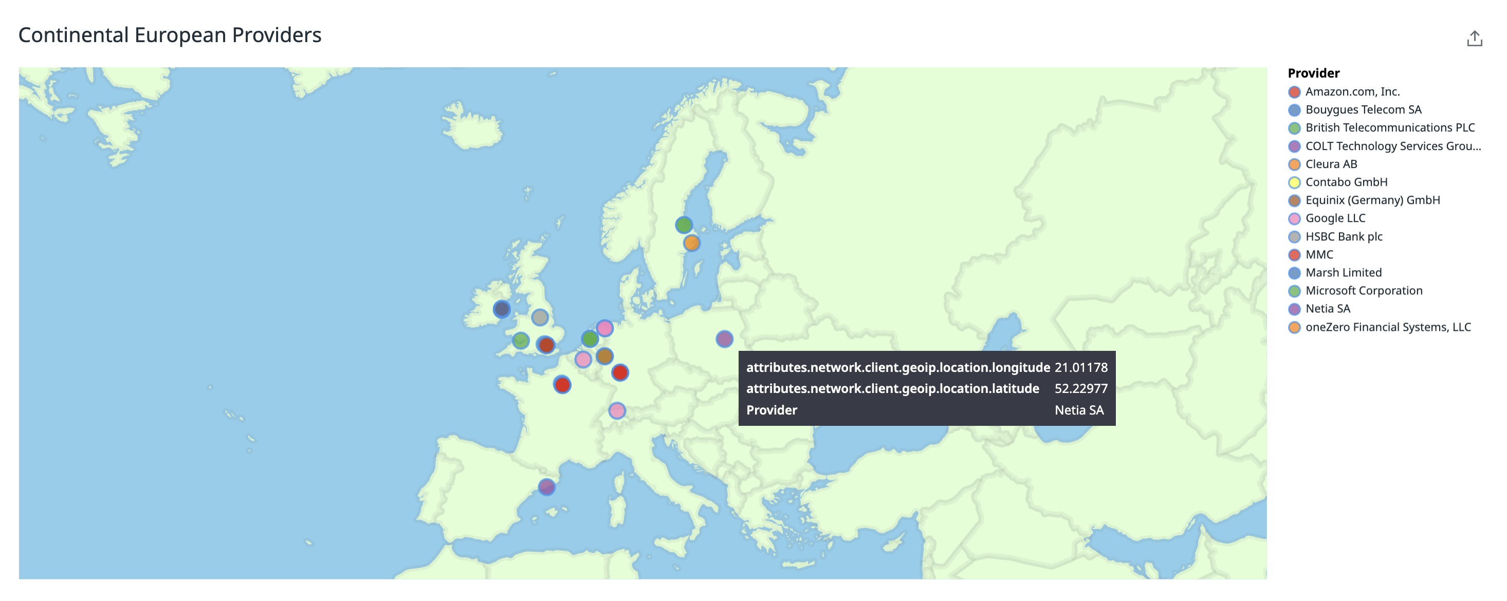
The Wildcard widget enables the creation of customized geomaps with advanced data transformation capabilities. This example demonstrates a continental European map that visualizes internet service providers based on log data. The map includes interactive tooltips that display additional provider information when hovering over data points.
Key features:
- Custom Albers projection focused on Europe
- Color-coded provider locations
- Interactive tooltips with provider details
- Data sourced directly from log queries
Vega-Lite Configuration
Vega-Lite Configuration
{
 "$schema": "https://vega.github.io/schema/vega-lite/v5.json",
 "projection": {
   "type": "albers",
   "rotate": [
     -12,
     -15,
     0
   ],
   "scale": 700
 },
 "layer": [
   {
     "data": {
       "sphere": true
     },
     "mark": {
       "type": "geoshape",
       "fill": "skyblue"
     }
   },
   {
     "data": {
       "url": "https://cdn.jsdelivr.net/npm/world-atlas@2/countries-50m.json",
       "format": {
         "type": "topojson",
         "feature": "countries"
       }
     },
     "mark": {
       "type": "geoshape",
       "fill": "#e0ffd4",
       "stroke": "gray",
       "strokeWidth": 5,
       "strokeOpacity": 0.1,
       "strokeJoin": "round",
       "strokeCap": "round"
     }
   },
   {
     "data": {
       "name": "table1"
     },
     "encoding": {
       "latitude": {
         "field": "attributes.network.client.geoip.location.latitude",
         "type": "quantitative"
       },
       "longitude": {
         "field": "attributes.network.client.geoip.location.longitude",
         "type": "quantitative"
       },
       "color": {
         "field": "attributes.network.client.geoip.as.name",
         "type": "ordinal",
         "title": "Provider",
         "scale": {
           "scheme": "set1"
         }
       }
     },
     "mark": {
       "type": "point",
       "filled": true,
       "opacity": 0.75,
       "size": 200,
       "tooltip": true
     }
   }
 ]
}
Joining data with Reference Tables
You can enhance your visualizations by joining Wildcard data queries with Reference Tables to add custom mappings. This example demonstrates log volumes by service, with color coding based on team ownership information from a reference table.
Key features:
- Combine operational data with business context
- Create meaningful groupings based on your organization’s structure
- Simplify complex relationships with custom mappings
- Enable team-based filtering and analysis
Vega-Lite configuration
Vega-Lite configuration
{
 "$schema": "https://vega.github.io/schema/vega-lite/v5.json",
 "description": "Log volume by team ownership.",
 "data": {
   "name": "table1"
 },
 "mark": "bar",
 "encoding": {
   "x": {
     "field": "service",
     "type": "nominal",
     "title": "Service"
   },
   "y": {
     "field": "query1",
     "type": "quantitative",
     "title": "Log Count",
     "scale": {
       "type": "sqrt"
     }
   },
   "color": {
     "field": "team_name",
     "type": "nominal",
     "title": "Team",
     "scale": {
       "range": [
         "#1f77b4",
         "#ff7f0e",
         "#2ca02c",
         "#d62728",
         "#9467bd",
         "#8c564b",
         "#e377c2",
         "#7f7f7f",
         "#bcbd22",
         "#17becf",
         "#393b79",
         "#637939"
       ]
     }
   },
   "tooltip": [
     {
       "field": "team_name",
       "type": "nominal",
       "title": "Team"
     },
     {
       "field": "query1",
       "type": "quantitative",
       "title": "Log Count"
     }
   ]
 }
}
Multi-metric pie chart with Context Menu
The Wildcard widget can create pie charts where each slice represents a different metric or formula using the “fold” transform operator. This approach is particularly useful for visualizing data from integrations like Fastly, where separate metrics are reported for each status code instead of a single metric tagged with different status values.
This example demonstrates how to create a multi-metric pie chart with interactive context menu functionality, allowing users to drill down into specific data points.
Key features:
- Combine multiple metrics into a single visualization
- Use the “fold” transform to convert separate queries into pie slices
- Apply custom color schemes to differentiate between data categories
- Enable interactive tooltips for detailed information on hover
- Implement context menu functionality for drill-down analysis
Vega-Lite Configuration
Vega-Lite Configuration
{
 "description": "A simple pie chart with multiple scalar queries",
 "encoding": {
   "color": {
     "field": "http\\.status_code",
     "scale": {
       "scheme": "dogcat"
     },
     "type": "nominal"
   },
   "theta": {
     "field": "value",
     "type": "quantitative"
   },
   "tooltip": [
     {
       "field": "http.status_code",
       "type": "nominal"
     },
     {
       "field": "value",
       "type": "quantitative"
     }
   ]
 },
 "transform": [
   {
     "fold": [
       "400",
       "403",
       "404"
     ],
     "as": [
       "http.status_code",
       "value"
     ]
   }
 ],
 "mark": "arc",
 "params": [
   {
     "name": "datadogPointSelection",
     "select": "point"
   }
 ],
 "$schema": "https://vega.github.io/schema/vega-lite/v5.json",
 "data": {
   "name": "table1"
 }
}
Multi-layer histogram
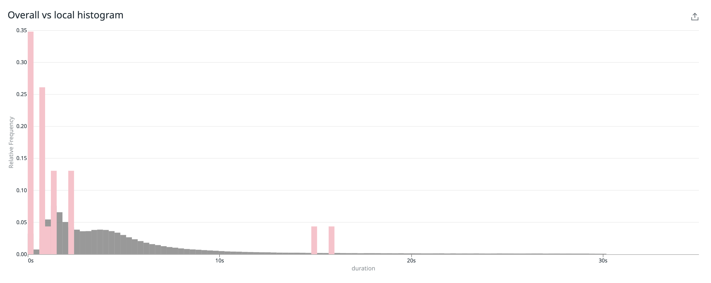
This example demonstrates how to create a multi-layer histogram that compares error durations against overall trace durations. This visualization is particularly useful for identifying performance bottlenecks by showing how error durations distribute compared to normal operations. By overlaying these distributions, you can identify patterns where errors take significantly longer to process, helping you prioritize which issues to address first based on their performance impact.
Key features:
- Uses the
joinaggregatetransform to calculate relative frequencies - Implements custom tooltips with formatted values
- Configures unit formatting for time measurements (nanoseconds)
- Overlays multiple data series for visual comparison
Vega-Lite Configuration
Vega-Lite Configuration
{
 "$schema": "https://vega.github.io/schema/vega-lite/v5.json",
 "config": {
   "customFormatTypes": true
 },
 "encoding": {
   "x": {
     "field": "min",
     "type": "quantitative",
     "axis": {
       "formatType": "hoverFormatter",
       "format": {
         "units": [
           "nanosecond",
           null
         ]
       }
     },
     "title": "duration"
   },
   "x2": {
     "field": "max"
   },
   "y": {
     "field": "relative_frequency",
     "type": "quantitative",
     "title": "Relative Frequency"
   },
   "tooltip": [
     {
       "field": "count"
     },
     {
       "field": "min",
       "formatType": "hoverFormatter",
       "format": {
         "units": [
           "nanosecond",
           null
         ]
       }
     },
     {
       "field": "max",
       "formatType": "hoverFormatter",
       "format": {
         "units": [
           "nanosecond",
           null
         ]
       }
     },
     {
       "field": "relative_frequency",
       "format": "0.3f"
     }
   ]
 },
 "layer": [
   {
     "data": {
       "name": "table2"
     },
     "transform": [
       {
         "joinaggregate": [
           {
             "op": "sum",
             "field": "count",
             "as": "total_count"
           }
         ]
       },
       {
         "calculate": "datum.count / datum.total_count",
         "as": "relative_frequency"
       }
     ],
     "mark": {
       "type": "rect",
       "color": "gray",
       "opacity": 0.8
     }
   },
   {
     "data": {
       "name": "table1"
     },
     "transform": [
       {
         "joinaggregate": [
           {
             "op": "sum",
             "field": "count",
             "as": "total_count"
           }
         ]
       },
       {
         "calculate": "datum.count / datum.total_count",
         "as": "relative_frequency"
       }
     ],
     "mark": {
       "type": "rect",
       "color": "pink",
       "tooltip": {
         "content": "data"
       }
     }
   }
 ]
}
Text color scatterplot
Create a customized scatterplot that uses text marks instead of points, with automatic coloring from the Datadog palette. This improves readability by displaying the actual text labels directly on the chart while maintaining the positional data relationships of a traditional scatterplot.
Key features:
- Text elements as data points for enhanced readability
- Automatic color assignment using the Datadog color scheme
- Customizable axes for different metrics (p50/p95 in this example)
- Visual encoding that combines position and color for multi-dimensional analysis
- Compact representation of categorical data in a quantitative space
Vega-Lite Configuration
Vega-Lite Configuration
{
 "$schema": "https://vega.github.io/schema/vega-lite/v5.json",
 "data": {
   "name": "table1"
 },
 "encoding": {
   "x": {
     "field": "query1",
     "type": "quantitative",
     "axis": {
       "title": "p50"
     }
   },
   "y": {
     "field": "query2",
     "type": "quantitative",
     "axis": {
       "title": "p95"
     }
   },
   "text": {
     "field": "viz"
   },
   "color": {
     "field": "viz",
     "type": "nominal",
     "scale": {
       "scheme": "dogcat"
     }
   }
 },
 "mark": {
   "type": "text"
 }
}
Categorical Heatmap with Time Filtering
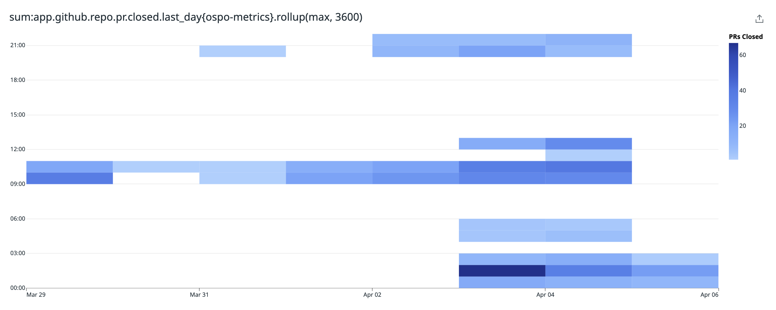
This example demonstrates how to create a categorical heatmap that displays data across time and categories with advanced filtering capabilities. Heatmaps help reveal patterns and outliers in multidimensional data, making them ideal for tracking metrics across time and categories.
Key features:
- Filter data to exclude zero or negative values
- Use time unit formatting to group temporal data
- Interactive tooltips that display detailed information on hover
- Context menu functionality for drill-down analysis
- Color gradient to represent data intensity
Vega-Lite Configuration
Vega-Lite Configuration
{
  "$schema": "https://vega.github.io/schema/vega-lite/v5.json",
  "data": {
    "name": "table1"
  },
  "encoding": {
    "x": {
      "title": null,
      "field": "_time",
      "type": "temporal",
      "timeUnit": "utcmonthdate"
    },
    "y": {
      "title": null,
      "field": "_time",
      "type": "temporal",
      "timeUnit": "utchours"
    },
    "color": {
      "field": "result1",
      "type": "quantitative",
      "title": "PRs Closed",
      "scale": {
        "scheme": "blues"
      }
    }
  },
  "mark": {
    "type": "rect",
    "tooltip": {
      "content": "data"
    }
  },
  "transform": [
    {
      "filter": "datum.result1 > 0"
    }
  ]
}
Lollipop Chart
This example demonstrates how to create a lollipop chart to clearly rank items and emphasize their relative values. Lollipop charts are useful for comparing values across categories while reducing visual clutter. By combining the precision of point markers with the visual guidance of lines, they make it easier to scan and compare data than traditional bar charts—particularly when working with many categories or when exact value comparisons are important.
Key features:
- Enhanced visual ranking compared to traditional toplists
- Combines bar and point marks for improved readability
- Automatic sorting to highlight top/bottom performers
- Custom formatting of axis labels for cleaner presentation
- Visually distinguishes between the rank and the metric value
Vega-Lite Configuration
Vega-Lite Configuration
{
 "$schema": "https://vega.github.io/schema/vega-lite/v5.json",
 "data": {
   "name": "table1"
 },
 "description": "A lollipop / dot plot",
 "layer": [
   {
     "encoding": {
       "x": {
         "field": "query1",
         "title": "cpu usage",
         "type": "quantitative"
       },
       "y": {
         "sort": "-x",
         "field": "team",
         "type": "nominal"
       }
     },
     "mark": {
       "type": "rule",
       "color": "#3598eccc"
     }
   },
   {
     "encoding": {
       "x": {
         "field": "query1",
         "title": "cpu usage",
         "type": "quantitative"
       },
       "y": {
         "sort": "-x",
         "field": "team",
         "type": "nominal",
         "axis": {
           "labelExpr": "upper(substring(replace(datum.label, /[-_]/g, ' '), 0, 1)) + lower(substring(replace(datum.label, /[-_]/g, ' '), 1))",
           "labelPadding": 10
         }
       }
     },
     "mark": {
       "type": "point",
       "filled": true,
       "color": "#3598ec",
       "size": 100
     }
   }
 ]
}
Custom Status Text Widget
Create a responsive text widget that changes color based on conditional logic applied to your metrics.
This example demonstrates how to create a status widget that displays Firefox usage statistics while conditionally changing color based on a comparison with Safari usage data. The text turns green when Firefox usage is at least 10 times higher than Safari usage, and red otherwise.
Key features:
- Conditional text coloring based on threshold comparisons
- Custom text formatting that combines multiple metrics in one display
- Responsive font sizing that adjusts to widget dimensions
- Combined display of both absolute values and percentages
- Data transformation to create derived metrics for decision logic
Vega-Lite Configuration
Vega-Lite Configuration
{
 "$schema": "https://vega.github.io/schema/vega-lite/v5.json",
 "description": "Customize a text display using a transform and conditional coloring",
 "data": {
   "name": "table1"
 },
 "transform": [
   {
     "calculate": "'Firefox: ' + datum.num_firefox + ' of ' + format(datum.num_total, '.3s') + ' (' + format(datum['fraction'], '.0%') + ')'",
     "as": "display_text"
   },
   {
     "calculate": "datum.num_firefox >= 10 * datum.num_safari",
     "as": "is_firefox_ahead"
   }
 ],
 "mark": {
   "type": "text",
   "align": "center",
   "baseline": "middle",
   "fontSize": {
     "expr": "width / 18"
   }
 },
 "encoding": {
   "text": {
     "field": "display_text",
     "type": "nominal"
   },
   "color": {
     "condition": {
       "test": "datum.is_firefox_ahead",
       "value": "rgb(45,195,100)"
     },
     "value": "red"
   }
 }
}
Further reading
Documentation, liens et articles supplémentaires utiles:


