- Essentials
- Getting Started
- Datadog
- Datadog Site
- DevSecOps
- Serverless for AWS Lambda
- Agent
- Integrations
- Containers
- Dashboards
- Monitors
- Logs
- APM Tracing
- Profiler
- Tags
- API
- Service Catalog
- Session Replay
- Continuous Testing
- Synthetic Monitoring
- Incident Management
- Database Monitoring
- Cloud Security Management
- Cloud SIEM
- Application Security Management
- Workflow Automation
- CI Visibility
- Test Visibility
- Test Impact Analysis
- Code Analysis
- Learning Center
- Support
- Glossary
- Standard Attributes
- Guides
- Agent
- Integrations
- OpenTelemetry
- Developers
- Authorization
- DogStatsD
- Custom Checks
- Integrations
- Create an Agent-based Integration
- Create an API Integration
- Create a Log Pipeline
- Integration Assets Reference
- Build a Marketplace Offering
- Create a Tile
- Create an Integration Dashboard
- Create a Recommended Monitor
- Create a Cloud SIEM Detection Rule
- OAuth for Integrations
- Install Agent Integration Developer Tool
- Service Checks
- IDE Plugins
- Community
- Guides
- API
- Datadog Mobile App
- CoScreen
- Cloudcraft
- In The App
- Dashboards
- Notebooks
- DDSQL Editor
- Sheets
- Monitors and Alerting
- Infrastructure
- Metrics
- Watchdog
- Bits AI
- Service Catalog
- API Catalog
- Error Tracking
- Service Management
- Infrastructure
- Application Performance
- APM
- Continuous Profiler
- Database Monitoring
- Data Streams Monitoring
- Data Jobs Monitoring
- Digital Experience
- Real User Monitoring
- Product Analytics
- Synthetic Testing and Monitoring
- Continuous Testing
- Software Delivery
- CI Visibility
- CD Visibility
- Test Optimization
- Code Analysis
- Quality Gates
- DORA Metrics
- Security
- Security Overview
- Cloud SIEM
- Cloud Security Management
- Application Security Management
- AI Observability
- Log Management
- Observability Pipelines
- Log Management
- Administration
Querying
Overview
Whether you are using metrics, logs, traces, monitors, dashboards, notebooks, etc., all graphs in Datadog have the same basic functionality. This page describes querying with the graphic editor. Advanced users can create and edit graphs with JSON. To learn more, see Graphing with JSON.
You can query using the graph editor on the Dashboards or Notebooks pages, or you can use Quick Graphs available on any page. Open Quick Graphs by pressing G on any page. To learn more, see the Quick Graphs Guide.
Graphing editor
On widgets, open the graphing editor by clicking on the pencil icon in the upper right corner. The graphing editor has the following tabs:
- Share: Embed the graph on any external web page.
- JSON: A more flexible editor, which requires knowledge of the graph definition language.
- Edit: The default UI tab for graphing options.
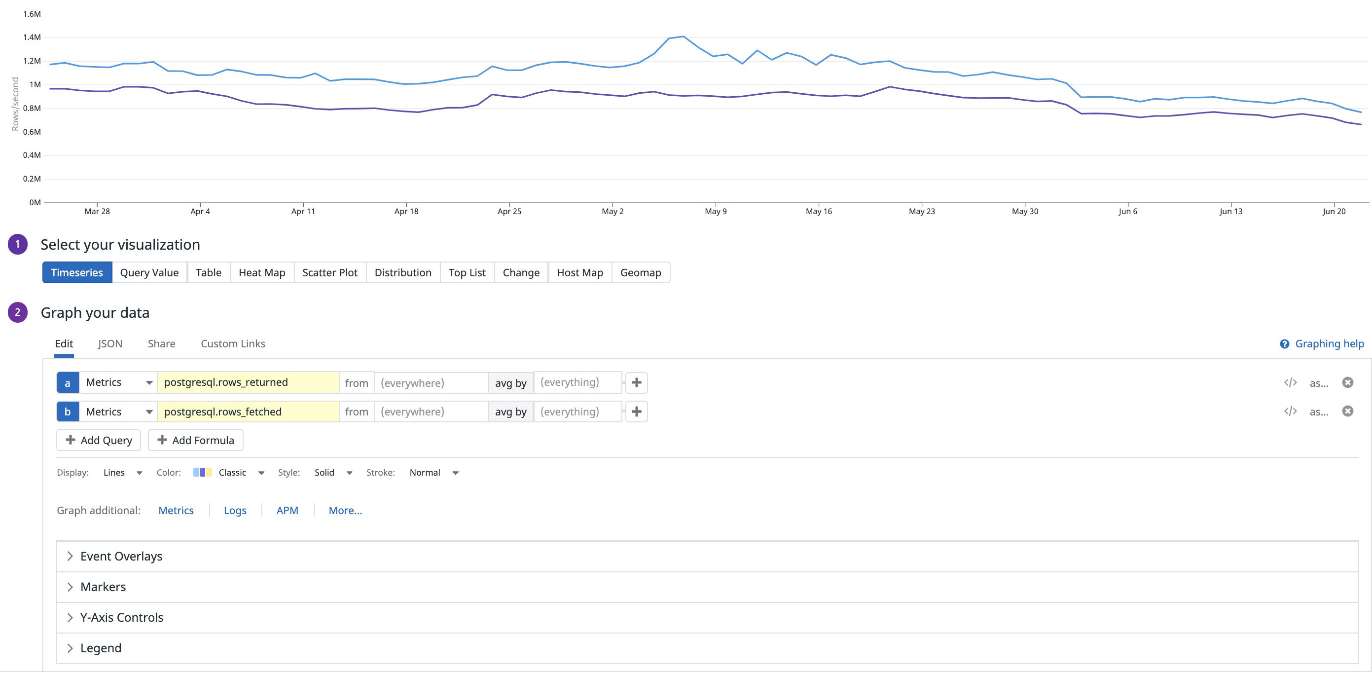
When you first open the graphing editor, you are on the Edit tab. Here, you can use the UI to choose most settings. Here is an example:
Configuring a graph
To configure your graph on dashboards, follow this process:
- Select the visualization
- Define the metric
- Filter your metric
- Configure the time aggregation
- Configure the space aggregation
- Apply function
- Title the graph
Select your visualization
Select your visualization from the available widgets.
Define the metric
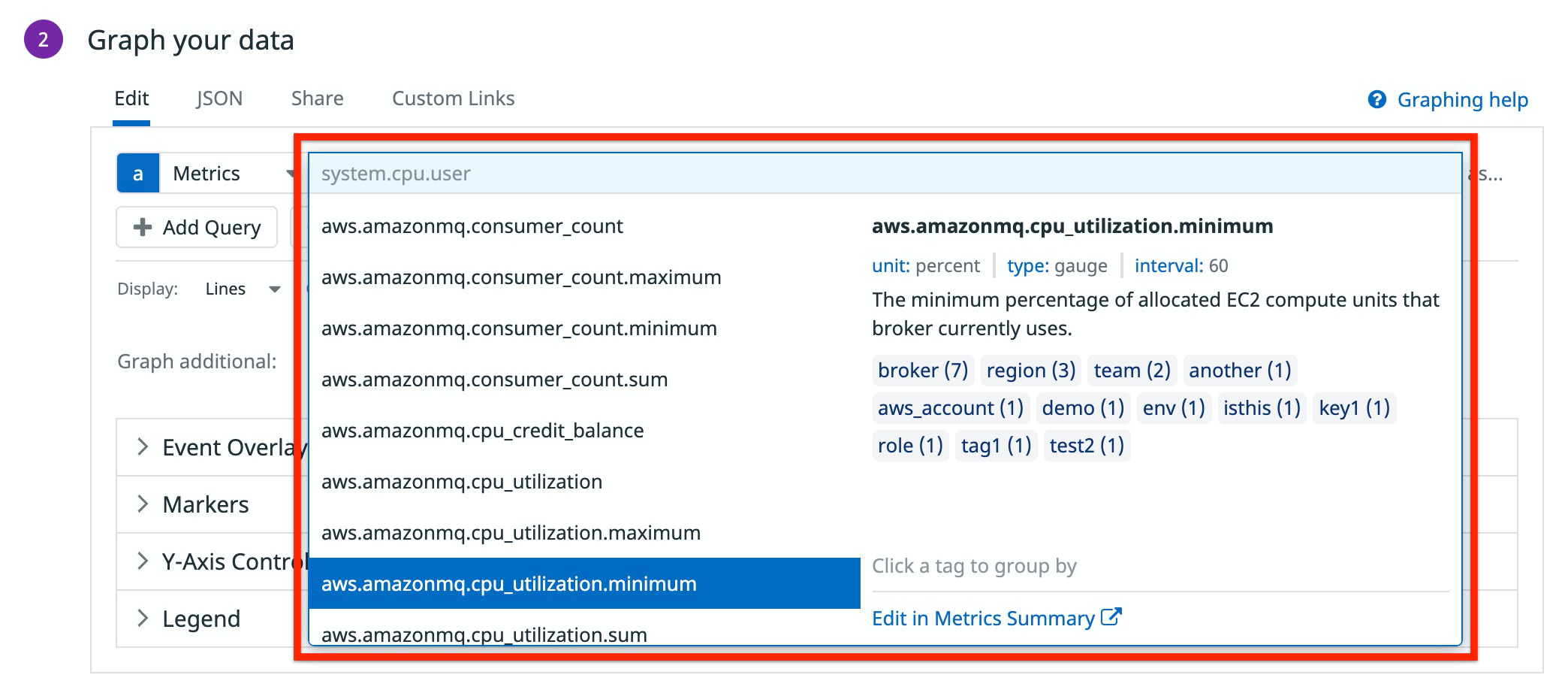
Choose the metric to graph by searching or selecting it from the dropdown next to Metric. If you don’t know which metric to use, the metric dropdown provides additional information, including the unit, type, interval, description, tags, and number of tag values.
Explore your metrics further with the Metrics Explorer, a Notebook, or see a list of metrics on the Metrics Summary page.
Filter
Your chosen metric can be filtered by host or tag using the from dropdown to the right of the metric. The default filter is (everywhere).
- Use advanced filtering within the
fromdropdown to evaluate boolean filtered or wildcard filtered queries. - Filter queries dynamically, using Template Variables. Add the
$with the tag key and the graph automatically applies the tag you choose in the template variable dropdown. For more information, see the Template Variable documentation.
To learn more about tags, see the Tagging documentation.
Aggregate and rollup
Aggregation method
Aggregation method is next to the filter dropdown. This defaults to avg by but you can change the method to max by, min by, or sum by. In most cases, the metric has many values for each time interval, coming from many hosts or instances. The aggregation method chosen determines how the metrics are aggregated into a single line.
Configure the time aggregation
Regardless of the options chosen above, there is always some aggregation of data due to the physical size constraints of the window holding the graph. If a metric is updated every second, and you are looking at 4 hours of data, you need 14,400 points to display everything. Each graph displayed has about 300 points shown at any given time. Therefore, each point displayed on the screen represents 48 data points.
In practice, metrics are collected by the Agent every 15-20 seconds. So one day’s worth of data is 4,320 data points. If you display a day’s worth of data on single graph, Datadog automatically rolls up the data. For more details on time aggregation, see the Metrics Introduction. See the Rollup documentation to learn more about the rollup intervals and how Datadog automatically rolls up data points.
To manually rollup the data, use the rollup function. Click the sigma icon to add a function and select rollup from the dropdown menu. Then choose how you want to aggregate the data and the interval in seconds.
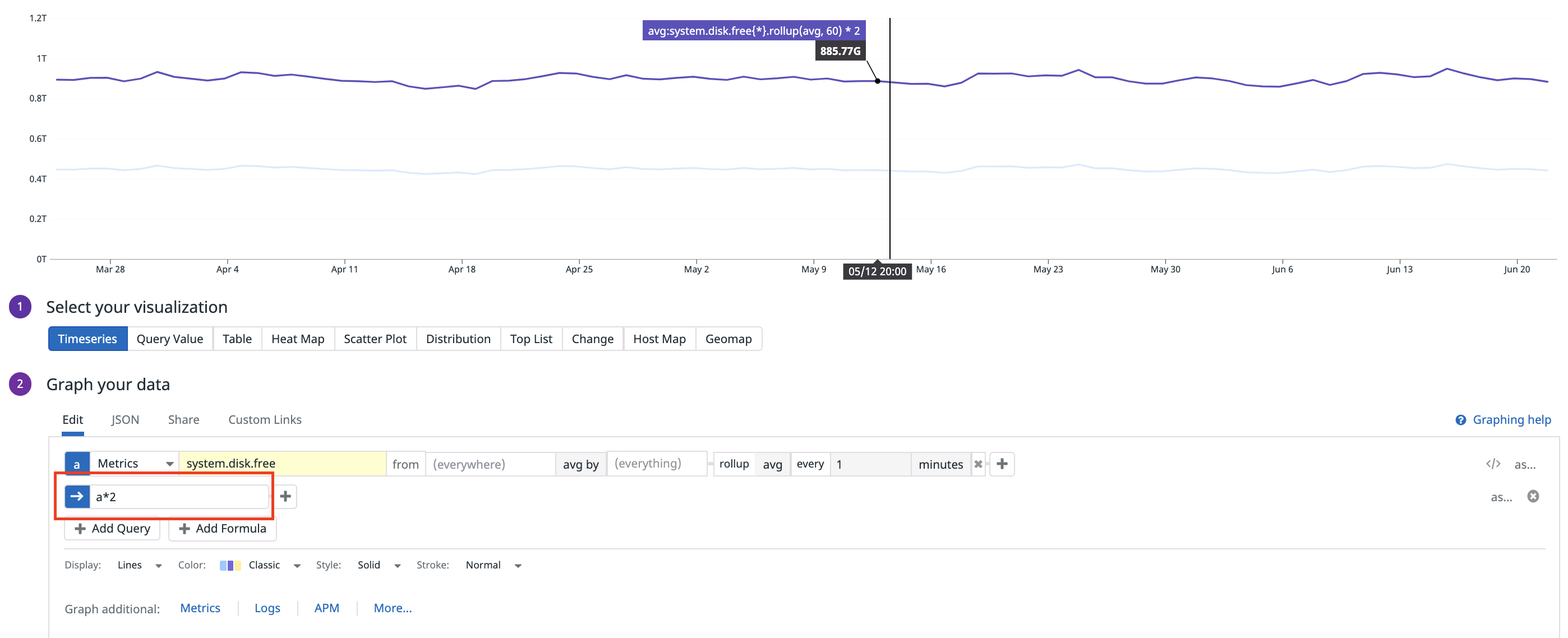
This query creates a single line that represents the total available disk space, on average, across all machines rolled up in one minute buckets:
When switching to the JSON view, the query looks like this:
"query": "avg:system.disk.free{*}.rollup(avg, 60)"
The full JSON looks like this:
{
    "viz": "timeseries",
    "requests": [
        {
            "formulas": [
                {
                    "formula": "query1"
                }
            ],
            "queries": [
                {
                    "data_source": "metrics",
                    "name": "query1",
                    "query": "avg:system.disk.free{*}.rollup(avg, 60)"
                }
            ],
            "response_format": "timeseries",
            "type": "line",
            "style": {
                "palette": "dog_classic",
                "type": "solid",
                "width": "normal"
            }
        }
    ],
    "yaxis": {
        "scale": "linear",
        "min": "auto",
        "max": "auto",
        "include_zero": true,
        "label": ""
    },
    "markers": []
}
For more about using the JSON view, see Graphing with JSON.
Configure the space aggregation
Next to the aggregation method dropdown, choose what constitutes a line or grouping on a graph. For example, if you choose host, there is a line for every host. Each line is made up of the selected metric on a particular host aggregated using the chosen method.
Additionally, you can click the tags in the metric dropdown used for defining the metric to group and aggregate your data.
Nested Queries
Datadog’s nested queries feature allows you to add additional layers of time and/or space aggregation on the results of existing metric queries. This advanced query capability also allows you to compute percentiles and standard deviations on aggregated query results of count/rate/gauge type metrics and access higher resolution queries over historical time frames.
For more information, see the Nested Queries documentation.
Advanced graphing
Depending on your analysis needs, you may choose to apply other mathematical functions to the query. Examples include rates and derivatives, smoothing, and others. See the list of available functions.
Datadog also supports the ability to graph your metrics, logs, traces, and other data sources with various arithmetic operations. Use: +, -, /, *, min, and max to modify the values displayed on your graphs. This syntax allows for both integer values and arithmetic using multiple metrics.
To graph metrics separately, use the comma (,). For example, a, b, c.
Note: Queries using commas are only supported in visualizations, they do not work on monitors. Use boolean operators or arithmetic operations to combine multiple metrics in a monitor.
Metric arithmetic using an integer
Modify the displayed value of a metric on a graph by performing an arithmetic operation. For example, to visualize the double of a specific metric, click the Advanced… link in the graph editor. Then enter your arithmetic in the Formula box, in this case: a * 2:
Arithmetic between two metrics
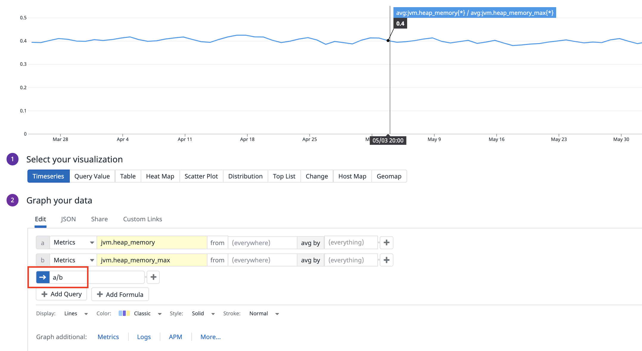
Visualize the percentage of a metric by dividing one metric over another, for example:
jvm.heap_memory / jvm.heap_memory_max
Use the Advanced… option in the graph editor and select Add Query. Each query is assigned a letter in alphabetical order: the first metric is represented by a, the second metric is represented by b, etc.
Then in the Formula box, enter the arithmetic (a / b for this example). To display only the formula on your graph, click on the check marks next to the metrics a and b.
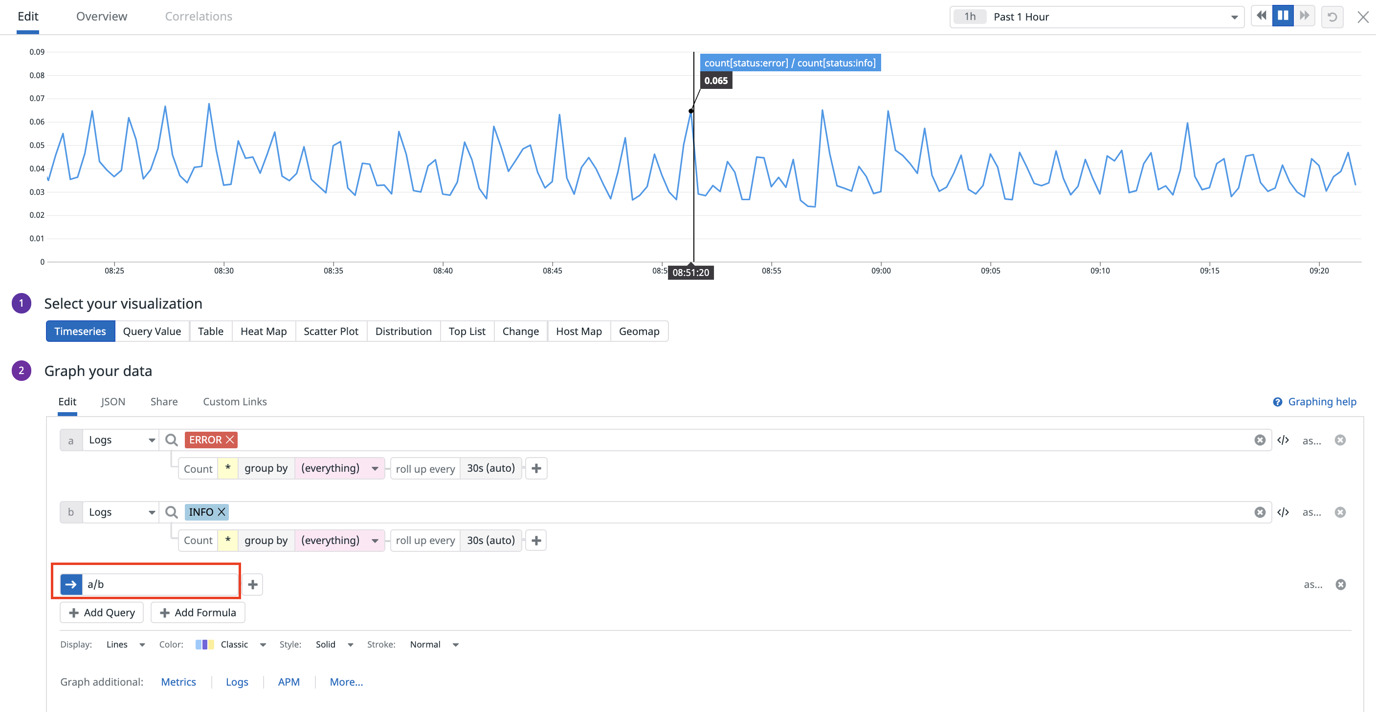
Here is another example showing how you can graph the ratio between error logs and info logs.
status:error / status:info
Note: Formulas are not lettered. Arithmetic cannot be done between formulas.
Minimum or Maximum between two queries
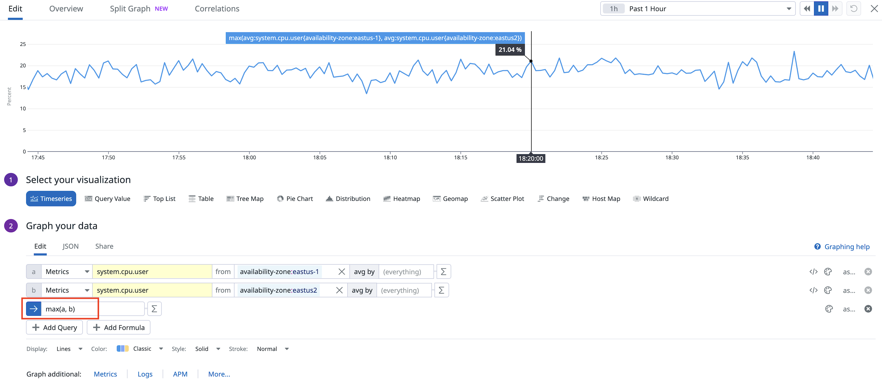
Here is an example using the max operator to find the maximum CPU usage between two availability zones.
max(system.cpu.user{availability-zone:eastus-1}, system.cpu.user{availability-zone:eastus-2})
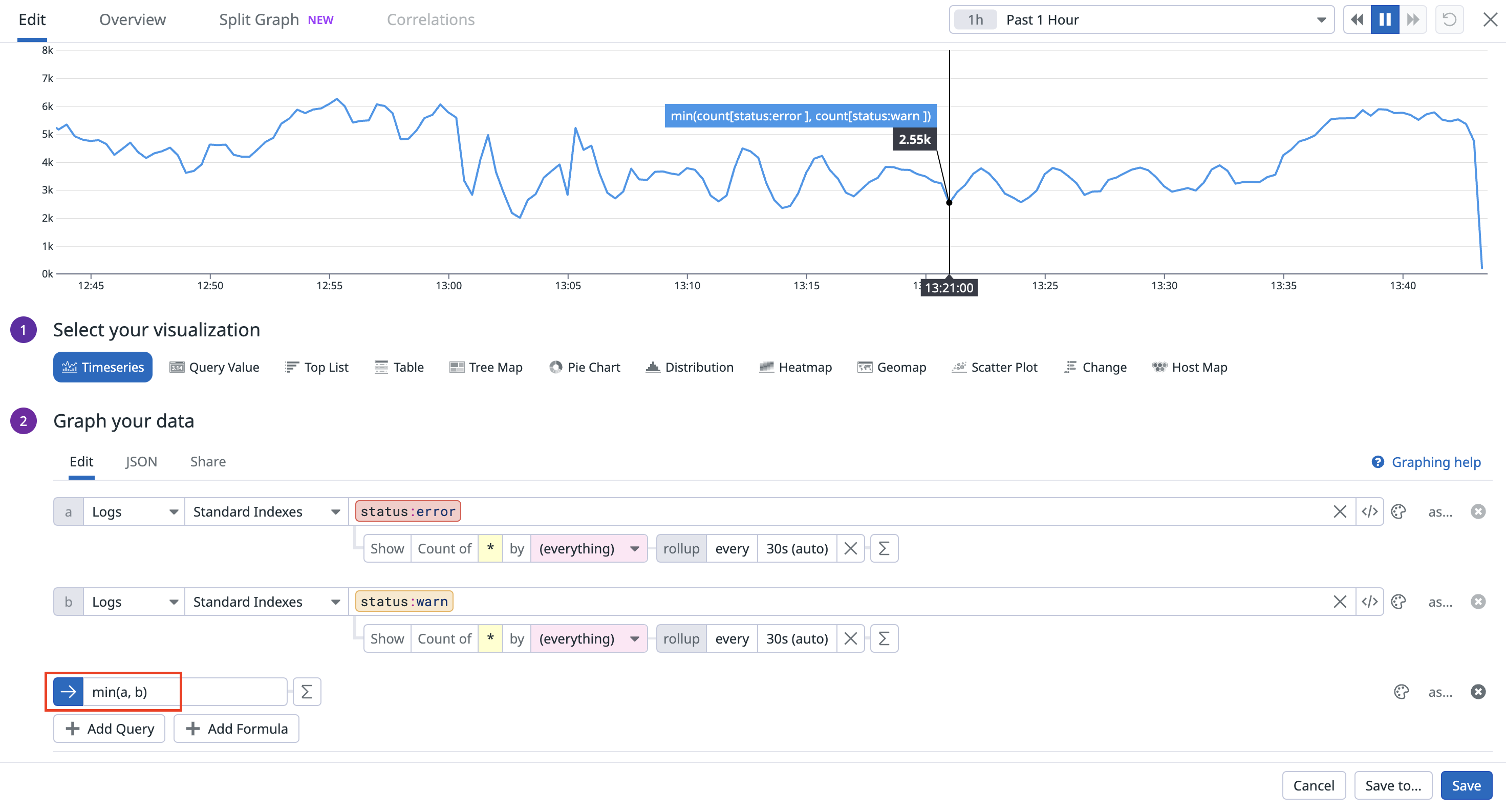
Additionally, you can also calculate the maximum (or minimum) between two queries on different products. Here is another example using the min operator to find the minimum between logs with error statuses and warning statuses.
min(status:error, status:warn)
Create an alias
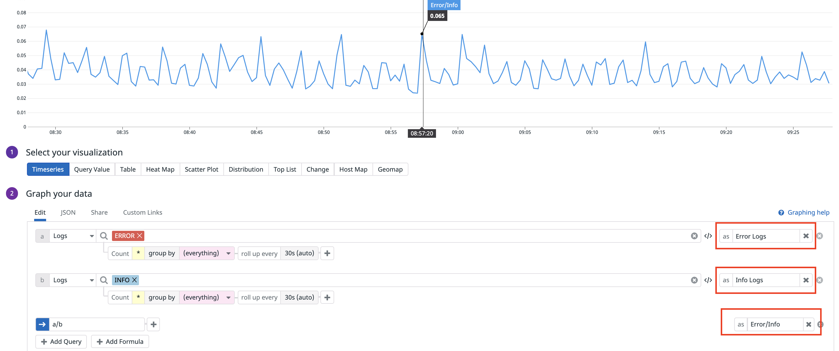
You can create a custom alias for your data sources to make it easier for your users to interpret the graph results.
Create a title
If you do not enter a title, one is automatically generated based on your selections. However, it is recommended that you create a title that describes the purpose of the graph.
Save
Click Done to save your work and exit the editor. You can always come back to the editor to change the graph. If you make changes you don’t want to save, click Cancel.
Additional options
Event overlays
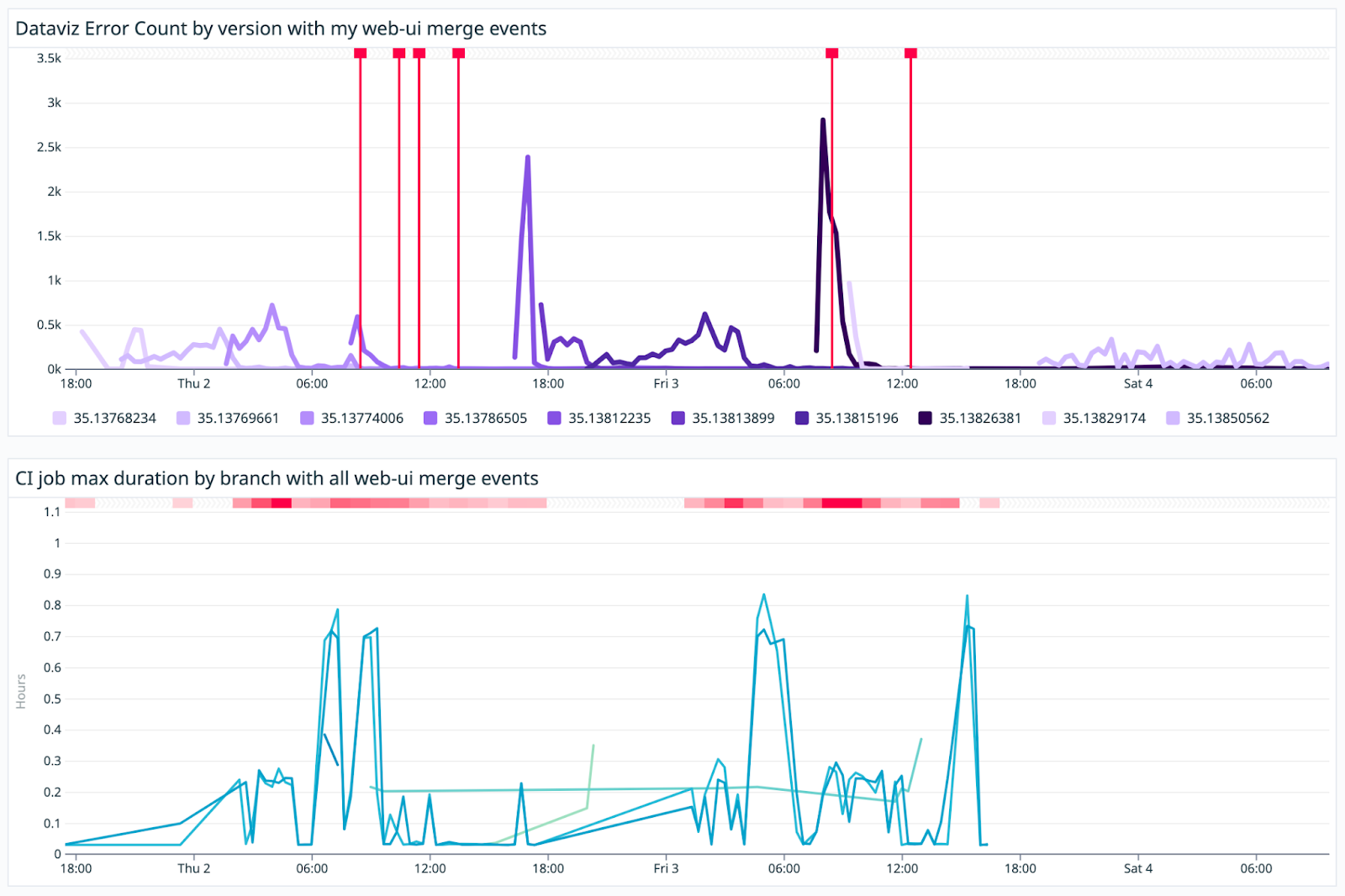
View event correlations by using the Event Overlays section in the graphing editor for the Timeseries visualization. In the search field, enter any text or structured search query. Events search uses the logs search syntax.
The event overlay supports all data sources. This allows for easier correlation between business events and data from any Datadog service.
With the event overlay, you can quickly see how actions within the organization impact application and infrastructure performance. Here are some example use cases:
- RUM error rates with deployment events overlaid
- Correlating CPU usage with events related to provisioning extra servers
- Correlating egress traffic with suspicious login activity
- Correlating any timeseries data with monitor alerts to ensure that Datadog has been configured with the appropriate alerts
Split graph
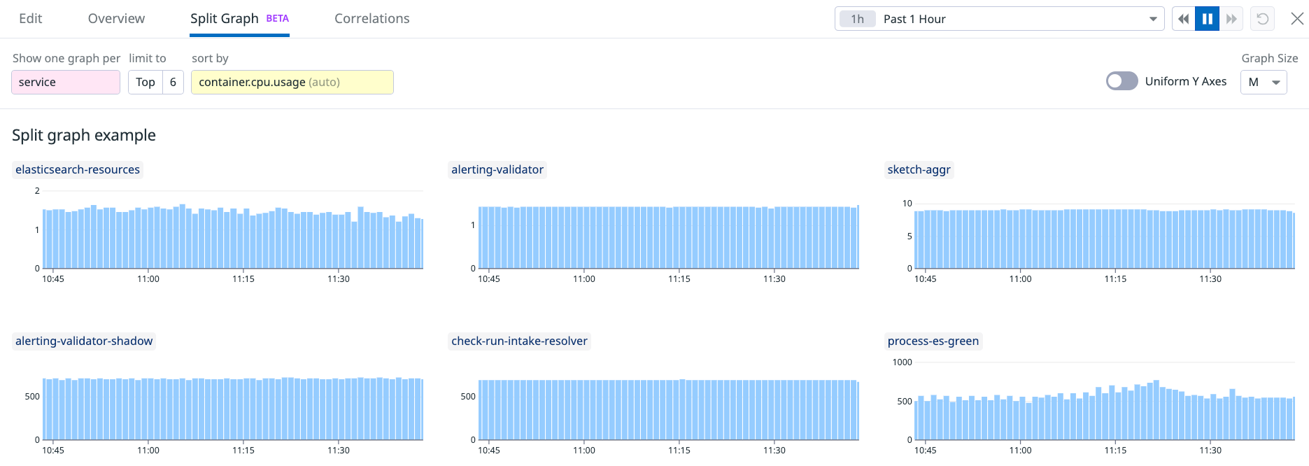
With split graphs, you can see your metric visualizations broken out by tags.
- Access this feature through the Split Graph tab when viewing graphs.
- You can change the sort by metric to see the relationship between the data you are graphing and other metrics.
- Limit the number of graphs that are displayed by changing the limit to value.
Further Reading
Additional helpful documentation, links, and articles:
