- Principales informations
- Getting Started
- Datadog
- Site Datadog
- DevSecOps
- Serverless for AWS Lambda
- Agent
- Intégrations
- Conteneurs
- Dashboards
- Monitors
- Logs
- Tracing
- Profileur
- Tags
- API
- Service Catalog
- Session Replay
- Continuous Testing
- Surveillance Synthetic
- Incident Management
- Database Monitoring
- Cloud Security Management
- Cloud SIEM
- Application Security Management
- Workflow Automation
- CI Visibility
- Test Visibility
- Intelligent Test Runner
- Code Analysis
- Learning Center
- Support
- Glossary
- Standard Attributes
- Guides
- Agent
- Intégrations
- OpenTelemetry
- Développeurs
- Authorization
- DogStatsD
- Checks custom
- Intégrations
- Create an Agent-based Integration
- Create an API Integration
- Create a Log Pipeline
- Integration Assets Reference
- Build a Marketplace Offering
- Create a Tile
- Create an Integration Dashboard
- Create a Recommended Monitor
- Create a Cloud SIEM Detection Rule
- OAuth for Integrations
- Install Agent Integration Developer Tool
- Checks de service
- IDE Plugins
- Communauté
- Guides
- API
- Application mobile
- CoScreen
- Cloudcraft
- In The App
- Dashboards
- Notebooks
- DDSQL Editor
- Alertes
- Infrastructure
- Métriques
- Watchdog
- Bits AI
- Service Catalog
- API Catalog
- Error Tracking
- Service Management
- Infrastructure
- Universal Service Monitoring
- Conteneurs
- Sans serveur
- Surveillance réseau
- Cloud Cost
- Application Performance
- APM
- Profileur en continu
- Database Monitoring
- Agent Integration Overhead
- Setup Architectures
- Configuration de Postgres
- Configuration de MySQL
- Configuration de SQL Server
- Setting Up Oracle
- Setting Up MongoDB
- Connecting DBM and Traces
- Données collectées
- Exploring Database Hosts
- Explorer les métriques de requête
- Explorer des échantillons de requêtes
- Dépannage
- Guides
- Data Streams Monitoring
- Data Jobs Monitoring
- Digital Experience
- RUM et Session Replay
- Product Analytics
- Surveillance Synthetic
- Continuous Testing
- Software Delivery
- CI Visibility
- CD Visibility
- Test Visibility
- Exécuteur de tests intelligent
- Code Analysis
- Quality Gates
- DORA Metrics
- Securité
- Security Overview
- Cloud SIEM
- Cloud Security Management
- Application Security Management
- AI Observability
- Log Management
- Pipelines d'observabilité
- Log Management
- Administration
Service Map
Cette page n'est pas encore disponible en français, sa traduction est en cours.
Si vous avez des questions ou des retours sur notre projet de traduction actuel, n'hésitez pas à nous contacter.
Si vous avez des questions ou des retours sur notre projet de traduction actuel, n'hésitez pas à nous contacter.
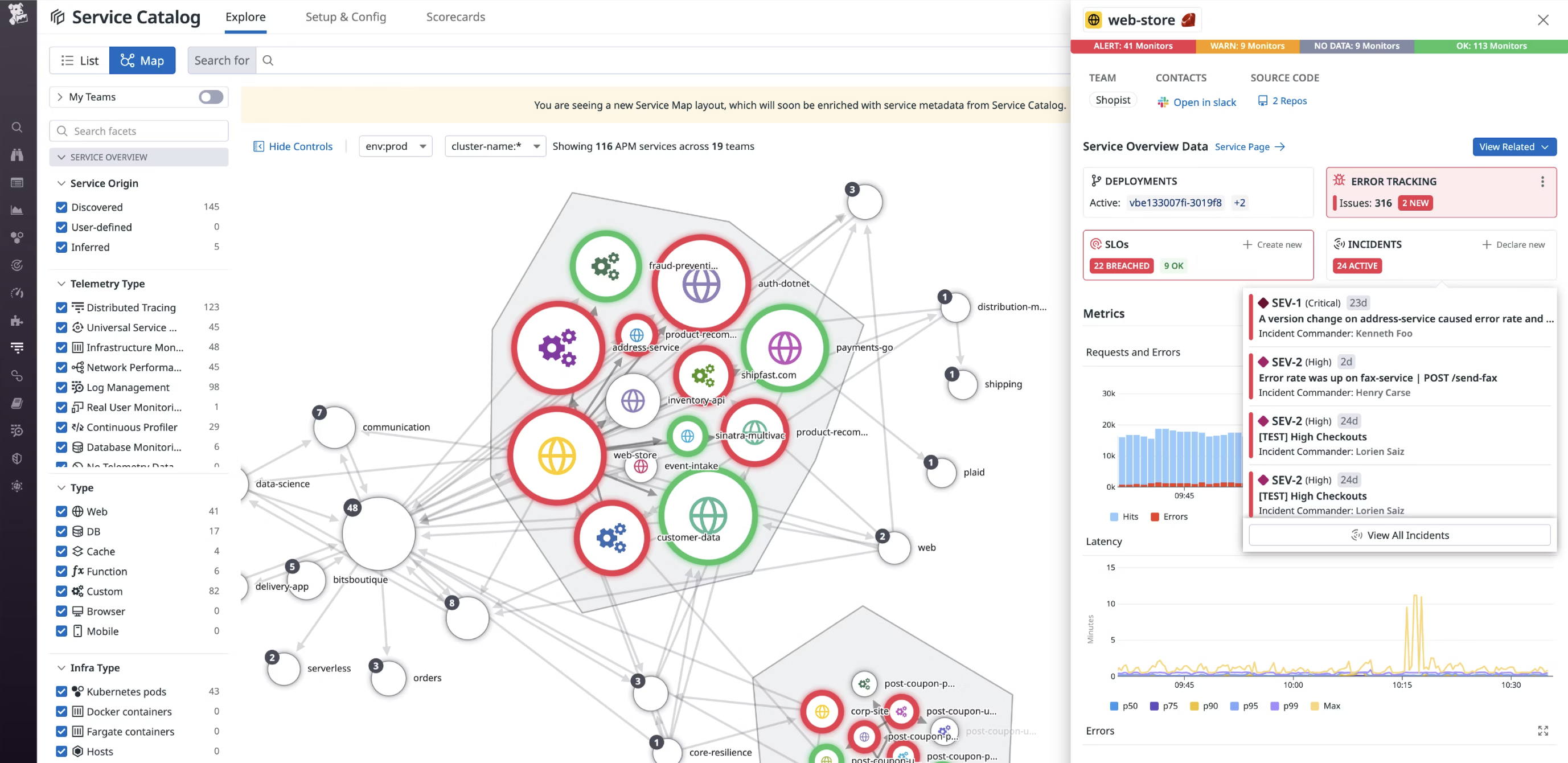
The Service Map decomposes your application into all its component services and draws the observed dependencies between these services in real time, so you can identify bottlenecks and understand how data flows through your architecture.
Setup
The Service Map visualizes data collected by Datadog APM and RUM. Setup is not required to view services.
Ways to use it
The Service Map provides an overview of your services and their health. This cuts through the noise and isolates problem areas. Also, you can access other telemetry collected by Datadog directly from this view.
Identifying a service’s dependencies
The service map provides a complete picture of a service’s dependencies, including those in different environments. For example, even if your service is only deployed in environment prod, the map reveals its connections to services in staging (and other environments).
Grouping by Team or Application
The Service Map can be grouped by team or application to create a clear picture of service ownership and application dependencies. This is particularly useful as it enables visualization of complex microservice architecture on a more granular level to help organizations quickly reach the information they need.
Filtering versus changing scopes
The Service Map can be filtered using facets or a fuzzy string match on service names. Facets are tags that Datadog automatically applies to service data, and include service type (for example, web server, database, cache), last deploy time, or monitor status. Filtering is particularly useful in a microservices environment with hundreds or thousands of nodes. Services can also be filtered by incident status to identify those involved in an ongoing or resolved incident and extract key information from the associated Service Page including incident data, resources, and Datadog Teams information. In addition, you can scope the Service Map to a specific time range, which helps keep track of your evolving architecture.
Services are also scoped by env, and optionally a Second Primary Tag. Using the dropdowns to select a different scope draws an entirely different map consisting of the services within that scope. These services cannot call or be called by services in other environments.
Inspection
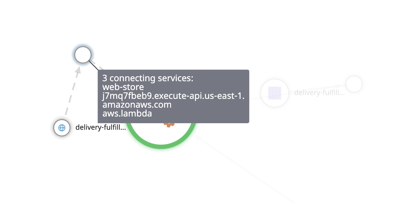
Mousing over a service highlights it and shows its request traffic as animated lines to better emphasize directionality.
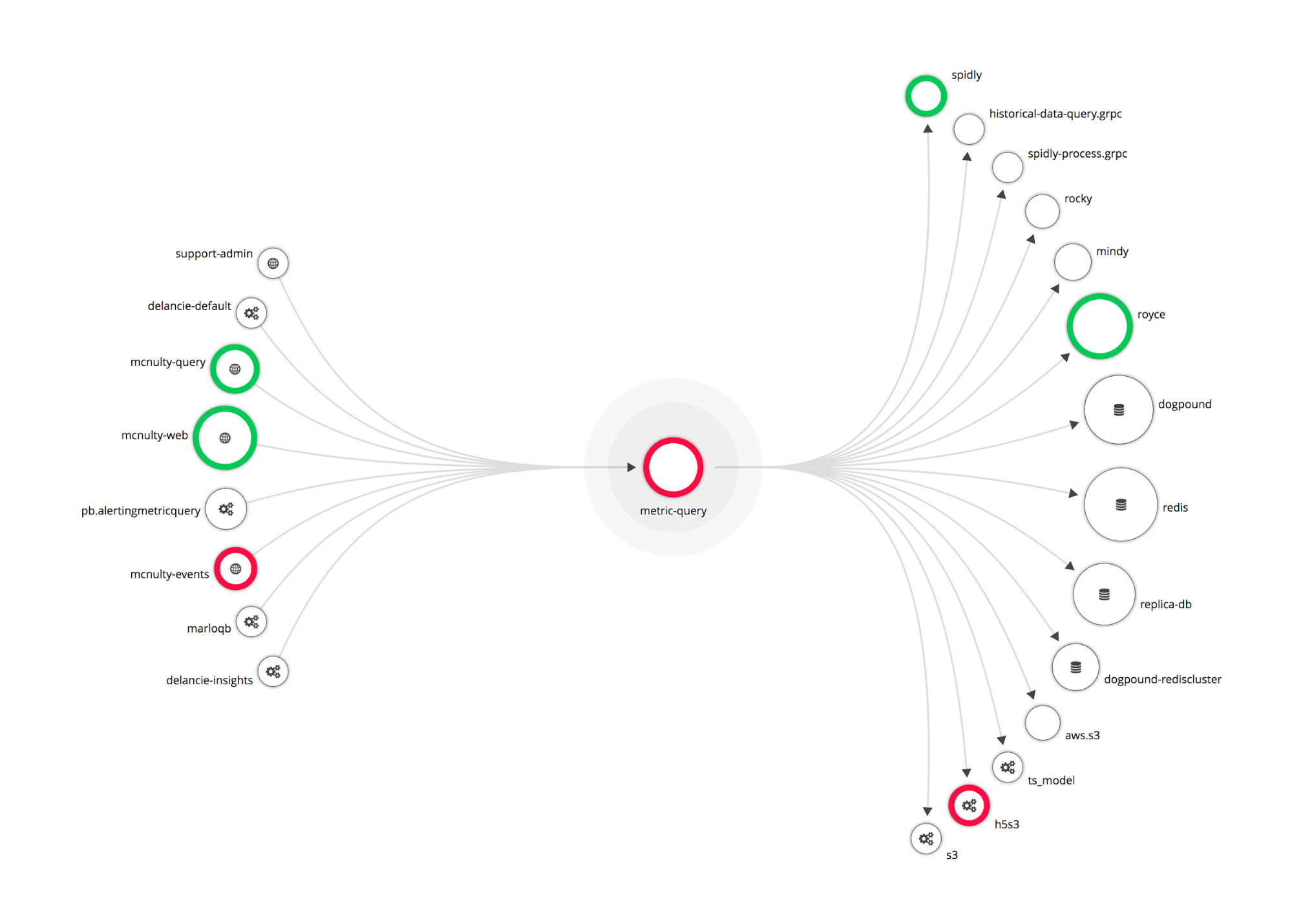
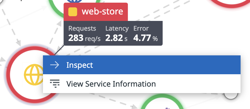
Clicking a service offers you the option to inspect that service. This isolates the service, displays the source of requests from other services, and the requests for data sent by this service to other services. Generally, the services on the left are closer to your customers, and the ones on the right are more likely root causes.
On the inspection page, each node can be inspected allowing you to pivot around the Service Map one dependency at a time.
A node is collapsed when there are two services in the filter (applied through the search bar or facets) that are connected by one or more services which are not in the filter.
The “service” tag
Clicking on a service reveals further filtering options:
The service tag has a special meaning in Datadog, and is used both to identify APM services and to link them to other parts of the product.
The following screenshot shows a dashboard query for service:fse-auto-process. This is tagged automatically by APM.
Using this tag on your Host Map or logs with the same key allows Datadog to join applications to logs, infrastructure, or custom business metrics. On the visualization menu shown above, each option pivots to the appropriate view of the collected data scoped to your service.
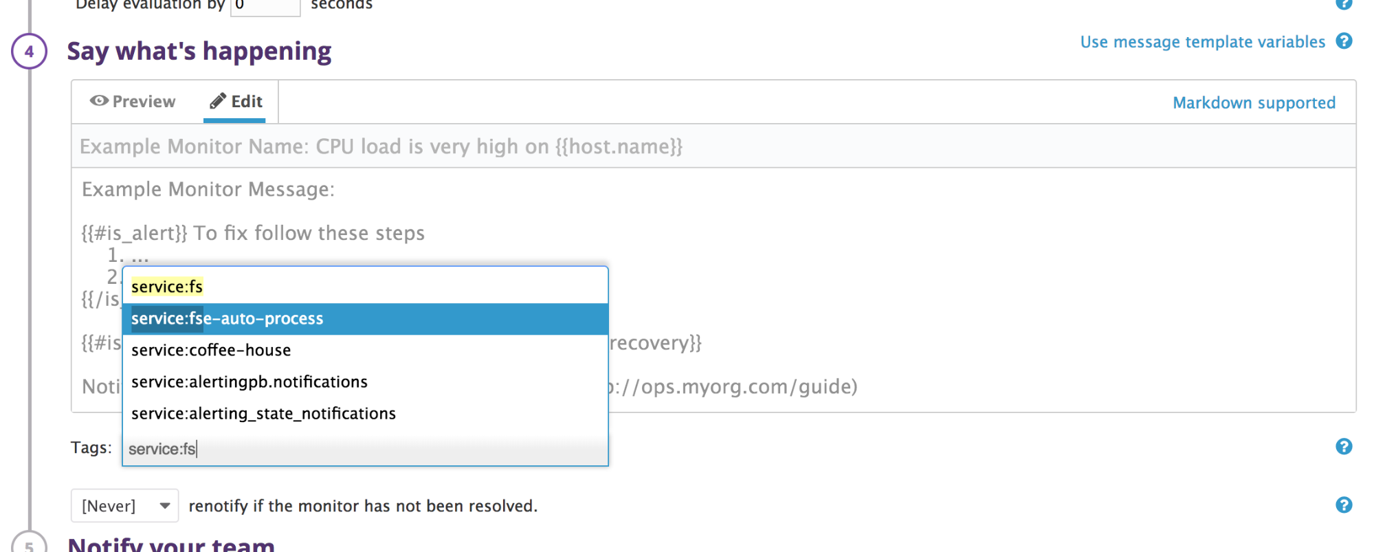
Additionally, monitors can be tagged by service in the Say what’s happening section. This allows you to associate monitors for any metric, including custom business metrics, with your services. The status of monitors is exposed directly on the Service Map.
Data freshness and meaning
Nodes and edges
Nodes represent services exactly as instrumented in APM and match those in your Service Catalog. Edges represent aggregate calls from one service to another. These interactions are shown on the flame graph for each individual trace.
New services or connections appear within moments of being instrumented and age out if there are no corresponding traces seen for 30 days. This takes into account services that do work infrequently, but are an important part of a functioning system.
Color
If a monitor is enabled for a service, the circumference has a weighted border colored with green, yellow, red, or grey, based on the status of that monitor. If multiple monitors are defined, the status of the monitor in the most severe state is used.
Monitors are not constrained to APM monitors. The service tag, described above, can be used to associate any monitor type with a service.
Availability
The Service Map is rendered based on complete traces that include the root spans. When some spans are missing during the query window you specify, the map view may be unavailable for that time period. This may happen when APM connection errors occur and spans get dropped.
Further Reading
Documentation, liens et articles supplémentaires utiles:
