- Essentials
- Getting Started
- Datadog
- Datadog Site
- DevSecOps
- Serverless for AWS Lambda
- Agent
- Integrations
- Containers
- Dashboards
- Monitors
- Logs
- APM Tracing
- Profiler
- Tags
- API
- Service Catalog
- Session Replay
- Continuous Testing
- Synthetic Monitoring
- Incident Management
- Database Monitoring
- Cloud Security Management
- Cloud SIEM
- Application Security Management
- Workflow Automation
- CI Visibility
- Test Visibility
- Test Impact Analysis
- Code Analysis
- Learning Center
- Support
- Glossary
- Standard Attributes
- Guides
- Agent
- Integrations
- OpenTelemetry
- Developers
- Authorization
- DogStatsD
- Custom Checks
- Integrations
- Create an Agent-based Integration
- Create an API Integration
- Create a Log Pipeline
- Integration Assets Reference
- Build a Marketplace Offering
- Create a Tile
- Create an Integration Dashboard
- Create a Recommended Monitor
- Create a Cloud SIEM Detection Rule
- OAuth for Integrations
- Install Agent Integration Developer Tool
- Service Checks
- IDE Plugins
- Community
- Guides
- API
- Datadog Mobile App
- CoScreen
- Cloudcraft
- In The App
- Dashboards
- Notebooks
- DDSQL Editor
- Sheets
- Monitors and Alerting
- Infrastructure
- Metrics
- Watchdog
- Bits AI
- Service Catalog
- API Catalog
- Error Tracking
- Service Management
- Infrastructure
- Application Performance
- APM
- Continuous Profiler
- Database Monitoring
- Data Streams Monitoring
- Data Jobs Monitoring
- Digital Experience
- Real User Monitoring
- Product Analytics
- Synthetic Testing and Monitoring
- Continuous Testing
- Software Delivery
- CI Visibility
- CD Visibility
- Test Optimization
- Code Analysis
- Quality Gates
- DORA Metrics
- Security
- Security Overview
- Cloud SIEM
- Cloud Security Management
- Application Security Management
- AI Observability
- Log Management
- Observability Pipelines
- Log Management
- Administration
Compare a Service's latency to the previous week
2 minutes to complete
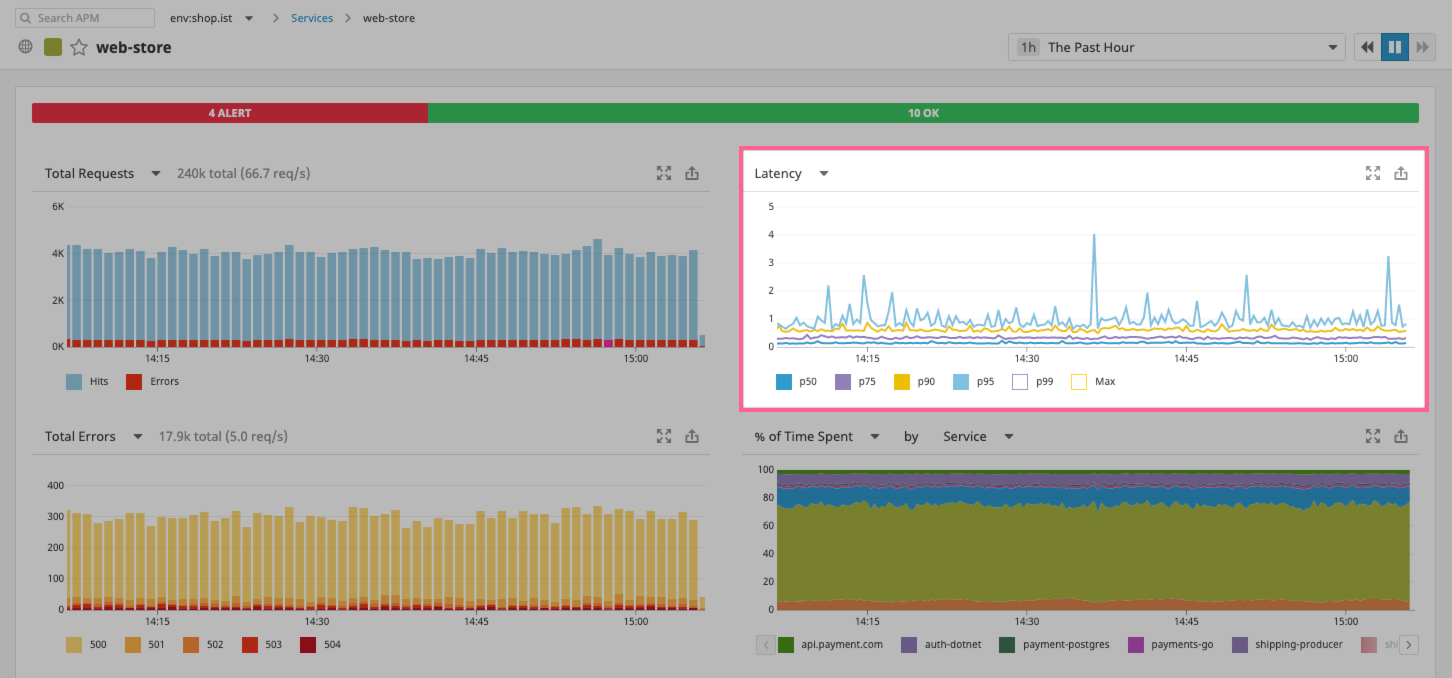
Datadog can show you the latency of your application over time and how it compares to similar moments in previous time frames such as last week or month. This example shows a web server for an e-commerce platform and monitors the latency performance for the server has seen over the past month.
Open the Service Catalog.
This page contains a list of all services providing data to Datadog. You can search over your services by keywords, filter them by
envtag, and set the time frame.Search and open a relevant and active service.
This example uses the
web-storeservice because it is stable. Double-check that issues have not appeared over the last month.Click the service to see its Service page, which shows analyses of throughput, latency (including percentile distribution), and errors, a summary of the active Datadog monitors for the service, and a breakdown of the resources made available by the service.
Find the Latency graph on the top of the Service page and deselect all the percentiles from the legend leaving only the p50 option, then Expand the Latency graph to view the full screen mode where you can conduct a more comprehensive analysis.
Datadog APM allows you to compare the different percentiles of latency for the service over time but also to view the full distribution of latencies in the Latency Distribution graph below.
- Add the previous week’s p50 performance by checking the
Weekoption in the Compare to Last section on the right.
Note: As you conduct your analysis you can export this graph to any dashboard from the Service view, and display this data alongside any other chart generated in Datadog, including your custom metrics, host-level information, and logs.
Further Reading
Additional helpful documentation, links, and articles:


